VSI provides a graphical front-end to monitor, analysis and diagnosis your video stream performance and Quality of Experience. A variety of highly-functional dashboards and settings allow you to focus and customize your analysis and data viewing.
In most dashboards, you set the filters based on which data is displayed and you specify date ranges to narrow the display to spikes in metrics or performance anomalies. In Trends, Diagnostics, and other drill-downs, select dimension values for on-demand filtering.
Choose one of these topics to learn more about using Conviva VSI.
- Quick Guide
- Navigation
- Invite a User (Admin)
- Responding to Invite
- Filters
- Layouts
- Dashboards
- Diagnostics
- API Management
- Metric Dictionary
- MyProfile Settings
About Dates and Times
All dates and times are displayed in VSI based on a single time zone setting for your account. This means that if your account is set to Eastern Standard Time and you're in California, you see all data in Eastern Standard Time. The time zone setting for your account, in UTC designation, appears in the account selection box at the top of each VSI page.
UTC stands for Coordinated Universal Time and is the main time standard used to regulate clocks throughout the world. In most cases, UTC is the same as the previous standard, GMT (or Greenwich Mean Time). All time zones are shown as positive or negative offsets from UTC. For example, the Pacific Time Zone is shown as UTC-8; the Eastern Time Zone is UTC-5.
Normally, Conviva time zones do not change with Daylight Savings Time. Instead, Conviva maintains the same time zones all year round. If a customer requests it, however, we can shift time zones for the account to DST. Switching between DST and Standard time has a curious affect on metrics twice a year. Instead of regular 24 hour days, you have a 23 hour day when DST starts and a 25 hour day when it ends.
To shift your account to DST, contact Conviva's Customer Support group.
About Date Ranges
The date range for a dashboard determines the data that's displayed: real-time, historical, or both. Real-time data tells you what has been happening in the past minute. Historical data can include a day at a time, a week, a month, or another date range that you select. Here's a summary of what the various pages display.
When you are viewing a dashboard or other page you can select one of the predefined date ranges or create a custom range. Click the date range in the upper right.
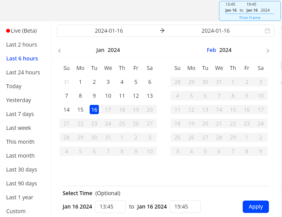
A custom range can be a pre-defined range or any number of days that you select. The first click sets the start date, and the second click sets the end date.
Note: From the kebab icon, you can enable the display of date comparison metric values from the previous period. For example, selecting date comparison for the This week period, displays comparison metrics from the previous week.
Use a wide time range for performance monitoring and user behavior analysis, from the last year to the last 2 hours or real-time. For data analysis within the last 24 hours, narrow the time range to minutes.
Exporting data
Depending on the analysis needs, export data from a dashboard or other page for use elsewhere. Click Export in the kebab or hamburger menu to generate a .csv file for import into a spreadsheet or other analytical application.
For more details, see Export Data.
Note: If the dimension table contains a blank column, the system excludes the blank columns during export.
Also, use Executive Emails to share performance data with key stakeholders.
Sharing
You can share snapshots of dashboards with other VSI users by clicking Share in the Action bar. Sharing is supported in Trends, Overview, MetricLens, Real-Time, Compare, and Viewers dashboards.
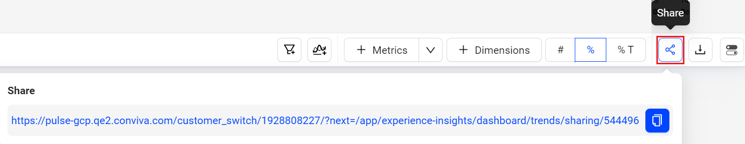
Clicking the Share icon saves a 30-day snapshot of the item and generates a link for collaboration, shared by copying and pasting the link.
When a user opens the link, they see an exact copy of the dashboard you shared. They can change how Conviva VSIpresents the data in the snapshot, but cannot change data that are part of the snapshot. For example, they can deselect metrics to hide them, but they cannot change the dimension or time series.
Note: Special character and emojis are not supported in the shared links.
Saving
In a shared dashboard, click the kebab icon to Save the dashboard for re-use and further collaboration.
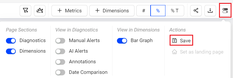
Saving shared dashboards is supported in Overview, Trends, MetricLens, Real-Time, Compare, and Viewers dashboards.
Note: Only shared Overview, MetricLens, Trends, Real-Time, and Viewers dashboards can be saved. Compare dashboards can be saved without sharing. A blue dot indicates that the dashboard is unsaved.
Saved Dashboards appears in the Saved Dashboard tab, similar to Trends.
In the Saved Dashboards tab,
-
My Dashboards displays the private saved boards.

You can edit the data after the dashboard has been saved.
For more information on save, share and delete the public saved dashboards, see My Dashboard.
-
Public Dashboards displays the public saved boards.
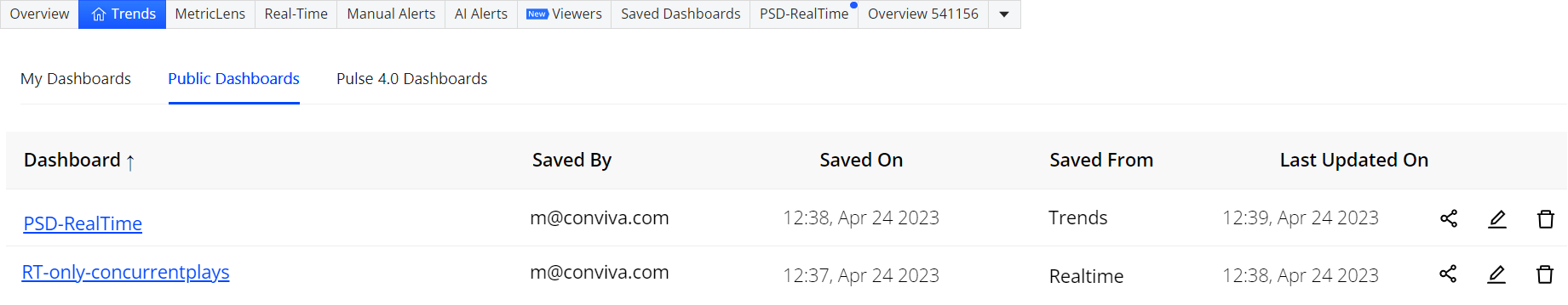
For more information on save, share and delete the public saved dashboards, see Public Saved Dashboard.
The table lists the supported save and share options.
| Dashboard | Save Available | Share Available |
|---|---|---|
| Trends | Yes | Yes |
| Compare | Yes | Yes |
| Error Analysis | Yes | Yes |
| Manual Alerts | No | No |
| Alert Diagnostics | No | Yes |
| AI Alerts | No | No |
| AI Alert Diagnostics | No | Yes |
| Real-Time (NOC) | No | Yes |
| MetricLens | No | Yes |
| Overview | No | Yes |
| Viewer Timeline | Yes | Yes |
| Viewer Module | Yes | Yes |
Cloning
Cloning a saved dashboard creates a copy of the dashboard, enabling customization based on the original dashboard settings, for example, expanding the date range. This feature simplifies collaboration and updates while preserving the original saved dashboard.
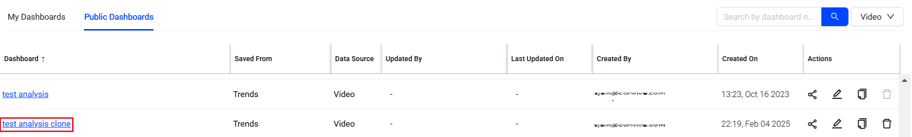
For more information on cloning the public saved dashboards, see Public Saved Dashboard and clone private saved dashboard, see My Dashboard.
Layouts
You can select from multiple layout options to enhance your experience and customize the interface to fit your needs. These new layouts allow you to tailor the dashboard’s appearance, giving you greater flexibility to interact with data in a way that aligns with your workflow and preferences.
![]()
For more information on different layouts, see Layouts in Trends.
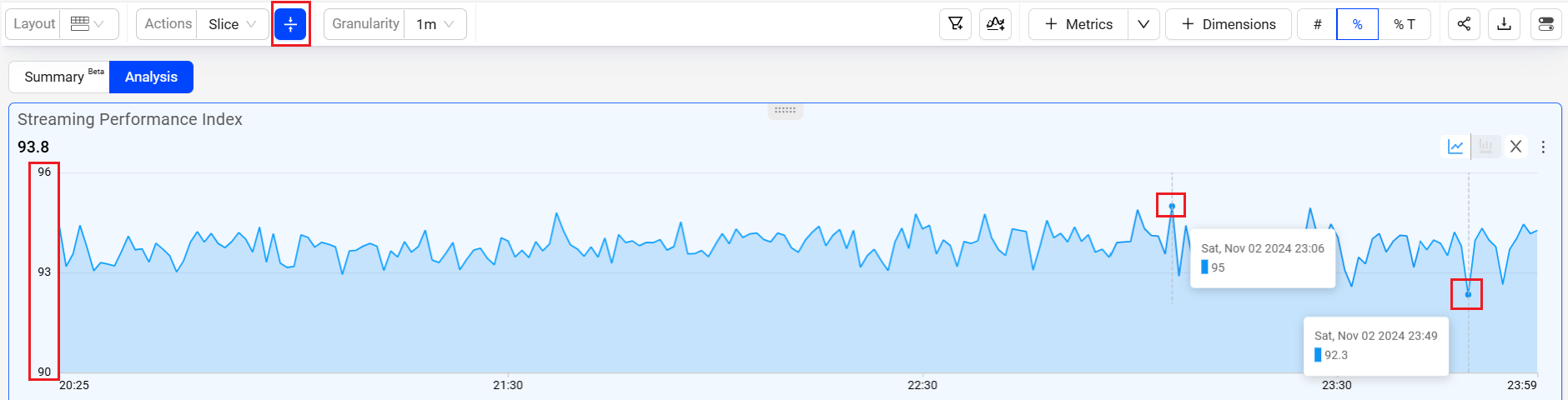
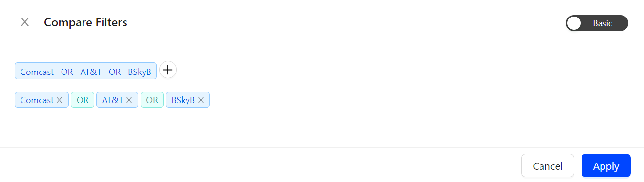
Dynamic Y-Axis
Dynamic Y-Axis narrows the granularity of the y-axis range to focus more precisely on the displayed data points. Pulse calculates the maximum and minimum values, adds appropriate buffers, and determines whether to include the zero position in the y-axis. Excluding the zero position often improves the clarity and interpretation of scatter charts. For example, the y-axis range changes from 0 – 100 to 50 – 100 when data points fall only between 60 and 100.
Image: Dynamic Y-axis displays more focused axis points
For more information on Dynamic Y-Axis, see Dynamic Y-Axis.
Metrics and Dimension Metrics
Metrics
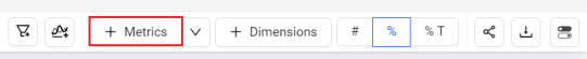
To add the metrics to the Metric widgets and the dimension table,
-
Click the Metrics button in the action bar, to see the metrics slider.
-
Select the metrics from the metric slider and click Apply.
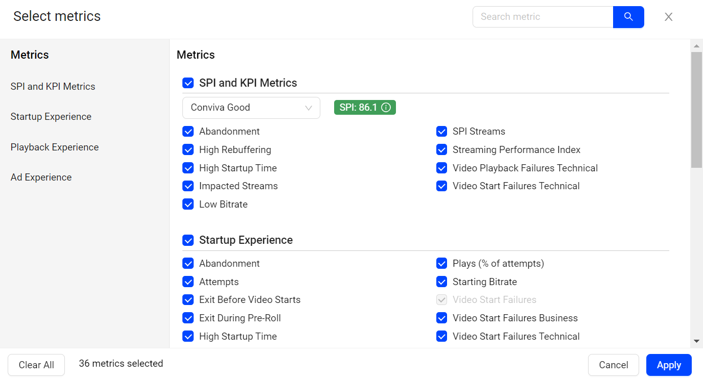
The selected metrics appears in the metric cards and the dimension table.
Dimension Metrics
To add the metrics to only the dimension table,
-
Click the drop-down next to Metrics button and click Dimension Metrics, to see the metrics slider.
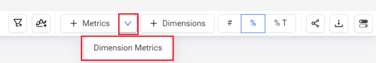
-
Select the metrics from the metric slider and click Apply.
The selected metrics appears as a new column in the dimension table.
Notifications
In addition to the alerting and APIs, Conviva VSI provides several ways to receive additional notifications about alert conditions.
- AI Alert Email Subscription
- AI Alert Forwarding (Ecosystem Module)
- Setting Webhook Notifications (AI alerts)
- Automatic Insights
Each type of notification enables different levels of information and functionality. For example, you can use webhooks to receive proactive notifications and data when alert conditions occur. AI alert forwarding enables you to share AI alerts with ecosystem partners.
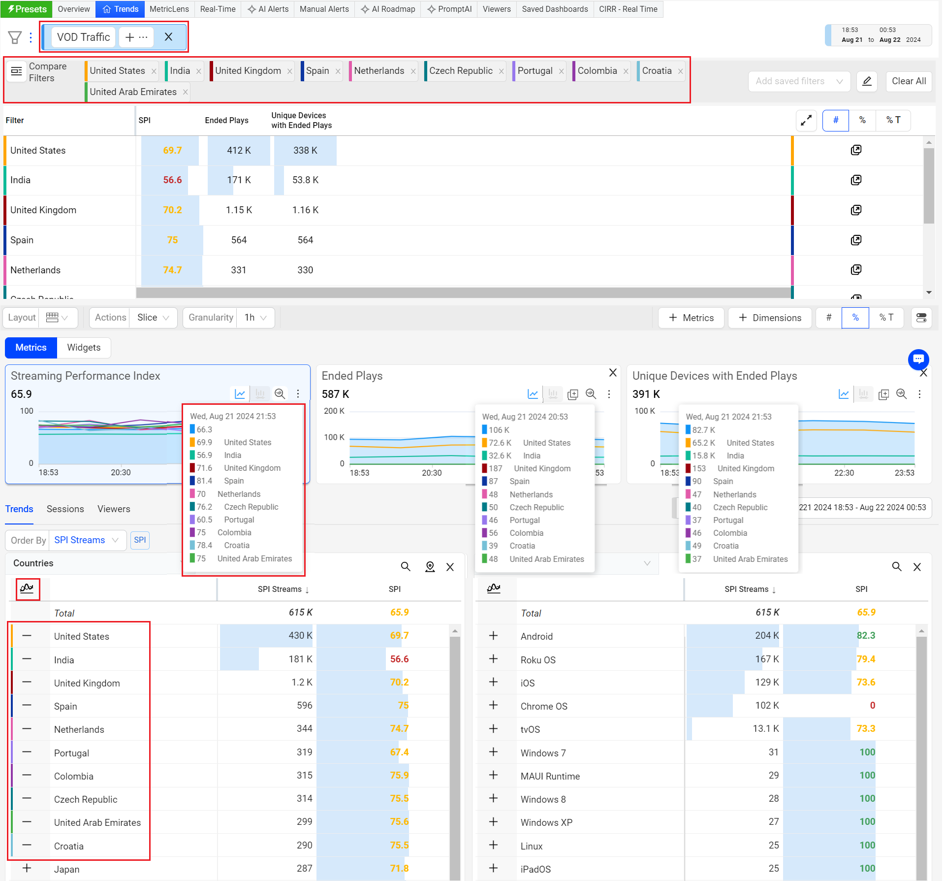
Comparisons
Time Series comparisons enable you to select metrics and dimension values for comparative analysis in a separate dashboard. Because the metric and dimension values are determined by the current filter settings, make sure the current filter settings, such as All Traffic, Live, or VOD, represent the data set that intended for time series comparisons.
Click the Compare button above the dimension names to enter Compare mode.
In Compare mode, the metric list shows the Top Trends By metric selected as the compare default metric. In addition, radio buttons appear next to the dimension names and values so they can be easily selected for the comparison. Other metrics can be added in the Compare view.
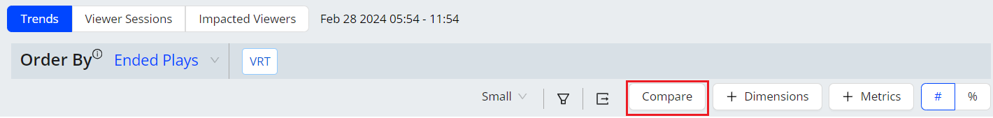
Click the dimension values to apply filters to the data. There are several ways to build and customize filters for comparisons. Up to 20 filters can be applied:
- Click a dimension name to create filters for the top 10 dimension values. The values appear in the filter panel.

- Click dimension values in different dimension columns to build logical AND/OR filter rules (Comcast AND Roku AND New York)

Click dimension values in the same column to build logical OR filter rules (Roku OR Amazon Fire TV OR Apple iPhone)
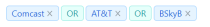
The Filter bar populates with the specified filters and filter settings, along with filter options:
- Compare filters indicates the current filter you can edit or create
- Plus-sign adds another filter to the filter pane
- Cross mark removes the filter
After the filter settings are selected and appear in the filter panel, click the Apply button to view the comparison data in the Comparison dashboard. When viewing the data, click Filters and Metrics to change the filter and metric settings. The table summary displays the average metric values for the selected time period.

Hover over a data point to display the filter values.

Click a filter in the Filter bar or a filter value range to highlight the values of that filter.

Hover over the tile move icon to drag the metric tile to a new location. Metric tiles can be re-positioned to highlight comparisons.
Click the toggle icon to Save and/or Share the dashboard for re-use and collaboration.
![]()
For more details, see Comparison Use Cases.
Compare Integrated in Trends
Trends offers instant comparison in addition to the Compare dashboard. Quickly compare filters for the top five dimension entities or across a custom dimension filters.
For more information on Compare Integrated in Trends, see Compare.
Dimension Table Compare
Dimension Table Compare displays comparitive percentage values in the dimension tables so you can directly identify which dimension values contributed most to the spike or drop (in percentage) within the table. This feature also displays the shaded comparitive area in the metric widget time series, to help clarify the scope of the impacts. Hovering over the percentage value displays the absolute value of the shaded area. With this feature, you can efficiently analyze the data, and detect any anomalies to provide a better user experience.
You can also save, share, and export the table-compare data.
This feature offers two distinct modes, Date-on-Date (DoD) Compare Mode and Slice Mode, each designed to cater to different user needs and scenarios.
Note: Turning the Date Comparison feature toggles off any secondary feature settings. The Dimension Table Compare feature is not supported for Live mode.
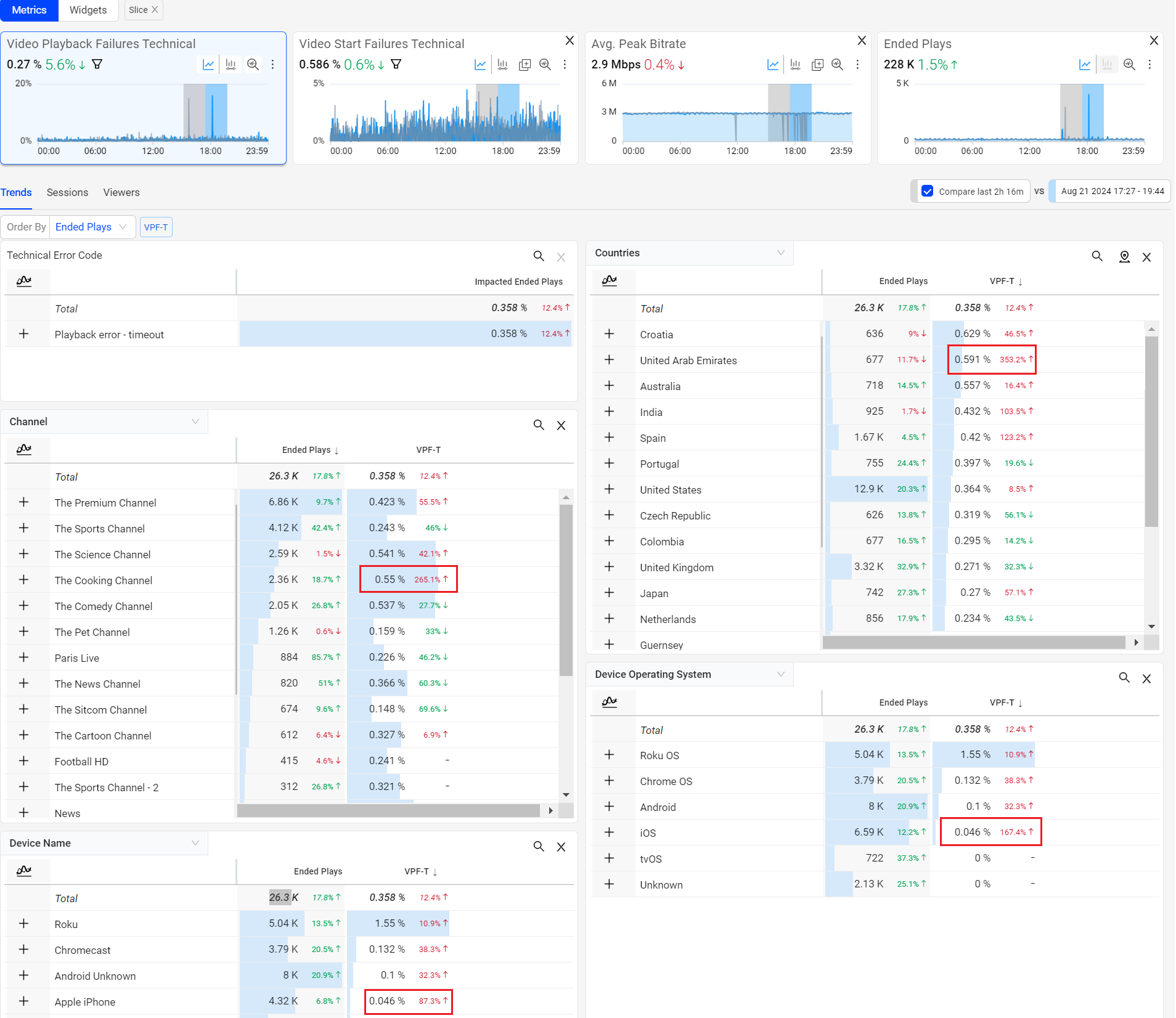
For more information on Dimension Table compare details, see Table Compare.
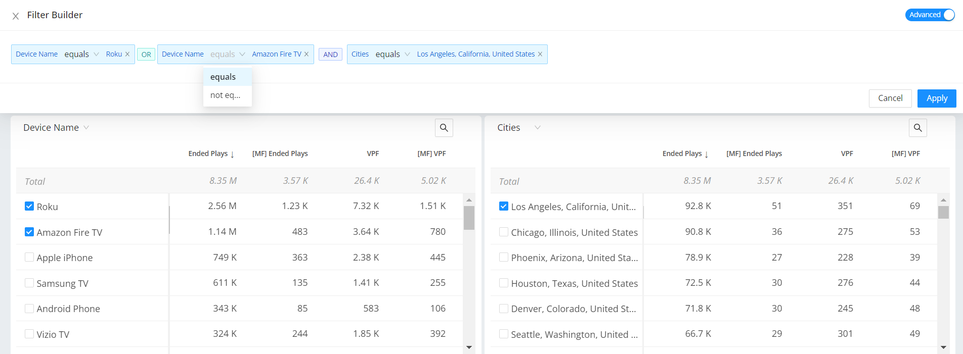
Filter Builder
Easily visualize side-by-side comparisons based on advanced filter settings, in the dimension tables with links to Trends.
After zoom, select and dimension filters, you can create the filters to see the specific data. Along with the single click filters you can create dimension filters based on equals and contains filter options.
For example, create a dimension filter for asset analysis that does not contain video trailers.
Trends allows you to create a complex filter with conditions easily. Also, you can filter the unknowns and compare the between Basic and Advance modes using the toggle.
The Advanced option allows you to easily see the conditions applied and modify the filters. This advance mode allows you to change the condition equals and not equals on the fly. For more details, see Filters.
|
|
Inline Filters
Using the filter builder in Trends enables focused data analysis along with inline filter creation and updates.
-
Inline filter rule addition, modify operators, and directly apply the filter rule.
-
Save inline settings to create new filters.
-
Open filter builder for a full view of filter creation and management.
-
Open Filter Management to browse saved filters, and directly apply to Trends.
For more information, see Filter Builder.
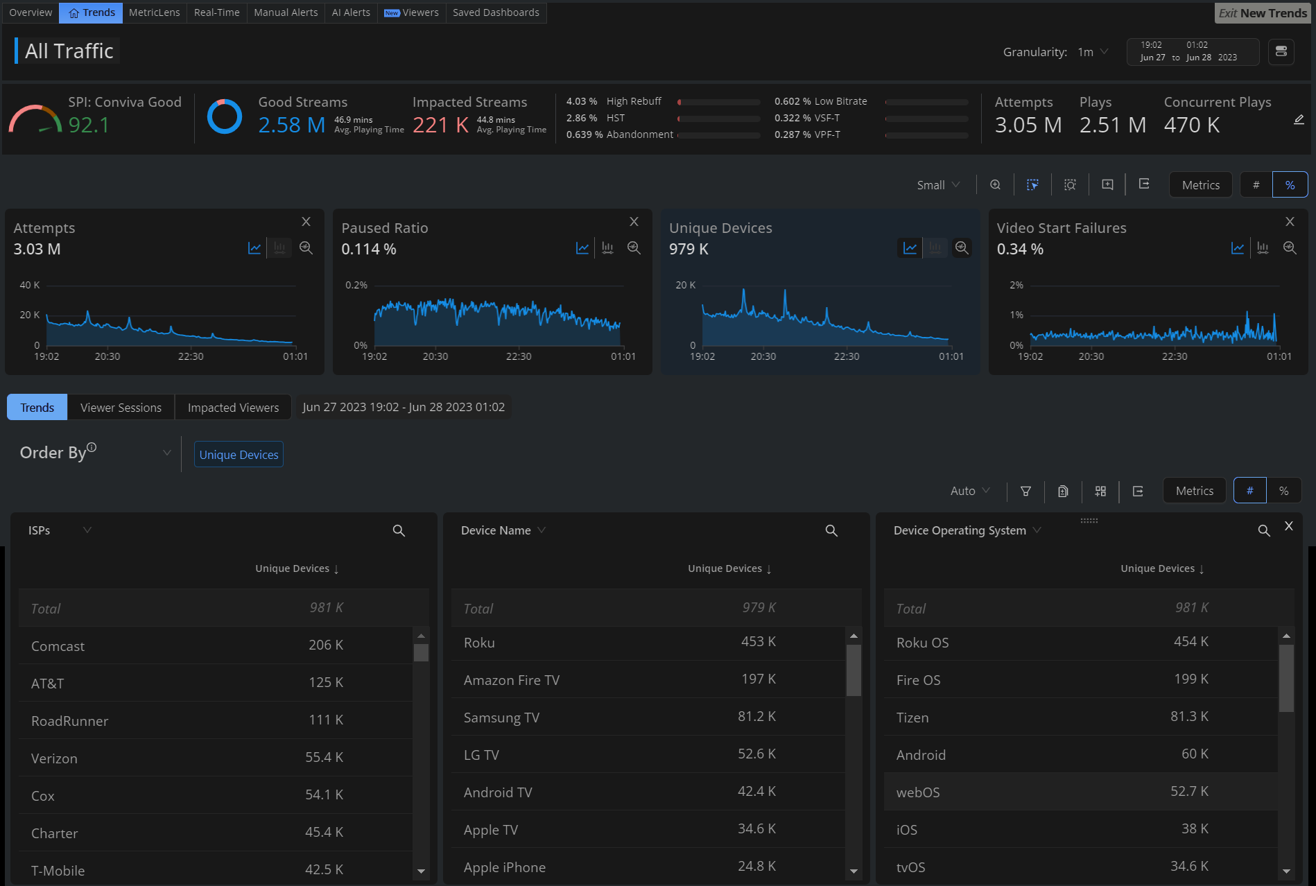
Time Granularity
The Trends page, including Diagnostics and Compare, supports enhanced granularity levels, such as:
-
1 min, 5 min, 15 min, 30 mins and 1 day (24 hours) for 1-hour intervals
-
1 hour, 6 hours, 12 hours, 1 day, and 7 days for 30-day intervals
For more information, see Time Granularity.
Annotations
Annotations allow you to mark the anomalies in the timeseries during the data analysis within the selected time interval in Trends dashboard and Compare. Also, it enables you to add comments making it a collaboration tool.
You can add and save the annotations in the following two levels:
-
Metric: Annotation is visible for selected metric across all dashboards.
-
Dashboard: Annotation is visible for all metrics across all dashboards.
For more information, see Annotations.
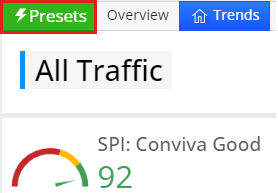
Presets
Trends offers pre-defined feature options as quick starting points to provide access to commonly used metrics and metadata use cases. Users can customize these pre-defined selections as needed and save them as public or private dashboards.
To access the preset use cases,
-
Click Presets on the Pulse
Present Usecases dashboard is displayed.
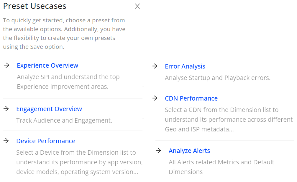
-
Select the preset usecase from the displayed list to see the selected dashboard.
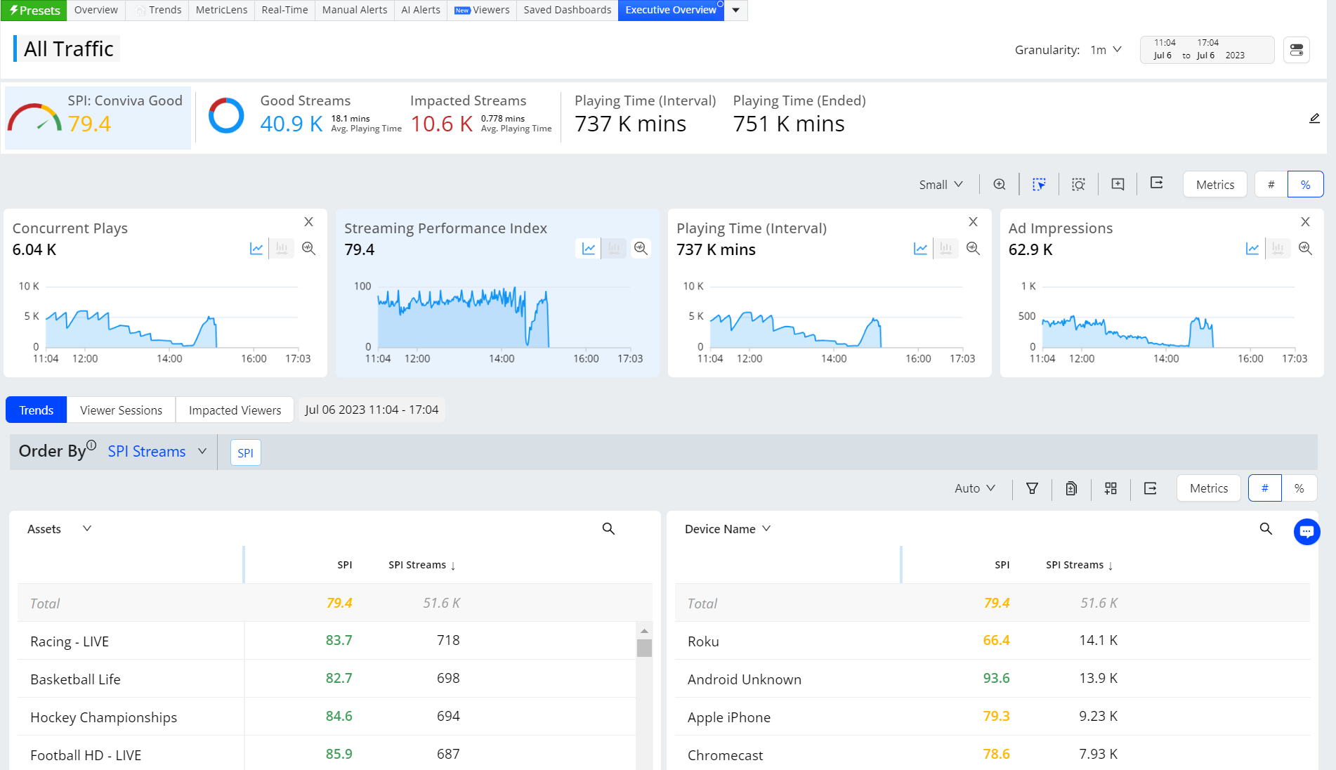
| Presets | Description |
|---|---|
| Executive Overview | This dashboard enables you to track SPIs by monitoring metrics such as Concurrent Plays, SPI, Playing Time, and Ad Impressions. |
| Experience Overview | This dashboard enables you to analyze the SPIs to identify the anomalies and understand the top experience improvement areas by monitoring metrics such as Concurrent Plays, SPI, Video Start Failures Technical, Exit Before Video Start, High Rebuffering, High Startup Time, Video Playback Failures Technical, and Low Bitrate. |
| Engagement Overview | This dashboard helps you track Audience and Engagement details by monitoring metrics such as Ended Plays, Unique Devices with Ended Plays, Ended Plays Duration, Minutes/ Ended Play, Minutes / Unique Device, and Average % Complete. |
| Device Performance | This dashboard helps you understand the selected device performance by monitoring metrics such as Streaming Performance Index, Video Start Failures Technical, Exit Before Video Start, High Rebuffering, High Startup Time, Video Playback Failures Technical, Low Bitrate, Video Start Time, Connection Induced Rebuffering Ratio, and Bitrate. |
| Error Analysis | This dashboard helps you analyze startup and playback errors by monitoring metrics such as Attempts, (Selected) Video Start Failures Technical , Video Start Failures Business, Ended Plays, Video Playback Failures Technical, and Video Playback Failures Business. |
| CDN Performance | This dashboard helps you analyze the performance across different Geo and ISP meta data by tracking Interval Minutes Played, Concurrent Plays, Connection Induced Rebuffering Ratio, (Selected) Video Start Failures Technical, Video Playback Failures Technical, Video Start Time, and Bitrate. |
| AI Alerts |
This dashboard helps you analyze the fired AI Alerts related Metrics and default dimensions by monitoring metrics such as Concurrent Plays, Video Start Failure Technical, EBVS, Video Start Time, Connection Induced Rebuffering Ratio, (Selected) Video Playback Failures Technical, High Rebuffering, High Startup Time, Abandonment, Impacted Streams, Ad Rebuffering Ratio, and Ad Start Failure. For more information on AI Alerts, see AI Alerts. Custom dimensions enhance AI Alerts to display the list of scanned dimension values and dimension combinations analyzed by the AI alert system, and allow the addition of new dimensions and dimension value combinations. You can configure custom dimensions as single dimensions or in groups of two or three dimensions to focus AI alerting on specific performance areas, such as an underperforming channel or CDN edge server / OS family combination. To clarify the AI alert process, the AI Combinations page shows the available dimension groups and dimension value combinations in groups of single and combined values so you can better understand the AI alert scanning process and the valid dimension/value combinations actively monitored for AI alert conditions. For more information on AI Alerts custom dimension, see AI Alerts Custom Dimension. |
| Ad Reach & Frequency | This dashboard helps you track Ad Reach and Frequency to understand Ad Load and how for many Ad Impressions the Ad is watched completely by monitoring metrics such as Ad Impressions, Ad Unique Devices, Ad Frequency / Unique device, and Ads completed. |
| Ad Performance | This dashboard helps you analyze Ad Performance and User Experience by monitoring metrics such as Ad Impressions, Ads Completed (% of Ad Impressions), Ad Average Bitrate, Ad Start Failures, Ad Playback Failures, and Ad Rebuffering Ratio, |
Dark Mode
Conviva VSIsupports dark mode to switch to a black background with a lighter color palette for UI elements, labels, and values.
Use the Dark Mode toggle in the menu bar to change the display mode.
Alerts
To receive proactive notifications, VSI supports manual alerting along with AI alerts and automatic insights. VSI also supports Webhooks for automated notifications to external systems when a manual or AI alert fires within Conviva.
For more information about creating and managing alerts, see these topics:
- Managing Alerts
- Setting Webhook Notifications
- Business Error Configuration
- AI Alerts
- Automatic Insights
Streaming Performance Index (SPI)
Along with metrics and metadata, VSI provides a streaming performance index to help you quickly identify performance issues across dimensions, such as player, asset, and country.
Use the SPI to view a visual indicator of your KPIs and metric performance over the selected period. Also, quickly determine the number and percent of impacted streams. A stream is impacted when it fails to meet one or more of the KPI settings.
Conviva formulates a unified streaming performance KPI based on the percentage of streaming sessions with good or best viewing experience. This KPI represents the Conviva Streaming Performance Index, and is based on the percentage of streams with:
-
No errors (VSF-T or VPF-T)
-
No or very low Rebuffering (using CIRR)
-
Acceptable picture quality based on average peak bitrate for different screen sizes
-
Acceptable Video Start Time
-
No EBVS if the viewer was waiting a long time before exiting.
Conviva provides KPI settings based on Good and Best performance. You can also set custom KPI settings to match your specific performance goals.
 Good Performance KPI Settings
-
No Errors (VSF-T or VPF-T)
-
VST-T < 10sec
-
EBVS wait time < 10sec
-
Avg. Peak Bitrate > 800Kbps for TV screens
-
Avg. Peak Bitrate > 400Kbps for desktop or tablets
-
Avg. Peak Bitrate > 200Kbps for mobile devices screens
-
CIRR < 0.4%
-
CIRT < 2sec
Best Performance KPI Settings
-
No Errors (VSF-T or VPF-T)
-
VST-T < 10sec
-
EBVS wait time < 8sec
-
Avg. Peak Bitrate > 2Mbps for TV screens
Note: Encoding compression are not considered in the bit rates. -
Avg. Peak Bitrate > 800Kbps for desktop or tablets
-
Avg. Peak Bitrate > 400Kbps for mobile devices screens
-
CIRR < 0.02%
-
CIRT < 1sec
For more details about configuring and using SPI, see SPI, Overview Dashboard and Executive Emails.
SPI SPI Navigation Export Dark Mode Share Save Presets Presets