The Dimension Table Compare feature displays comparitive percentage values in the dimension tables so you can directly identify which dimension values contributed most to the spike or drop (in percentage) within the table. This feature also displays the shaded comparitive area in the metric widget time series, to help clarify the scope of the impacts. Hovering over the percentage value displays the absolute value of the shaded area. With this feature, you can efficiently analyze the data, and detect any anomalies to provide a better user experience.
You can also save, share, and export the table-compare data.
This feature offers two distinct modes, Date-on-Date (DoD) Compare Mode and Slice Mode, each designed to cater to different user needs and scenarios.
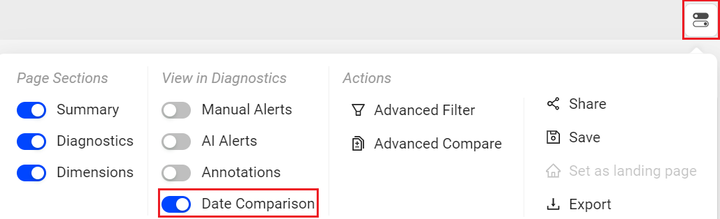
Note: Turning the Date Comparison feature toggles off any secondary feature settings. The Dimension Table Compare feature is not supported for Live mode.
Date-on-Date (DoD) Compare Mode
-
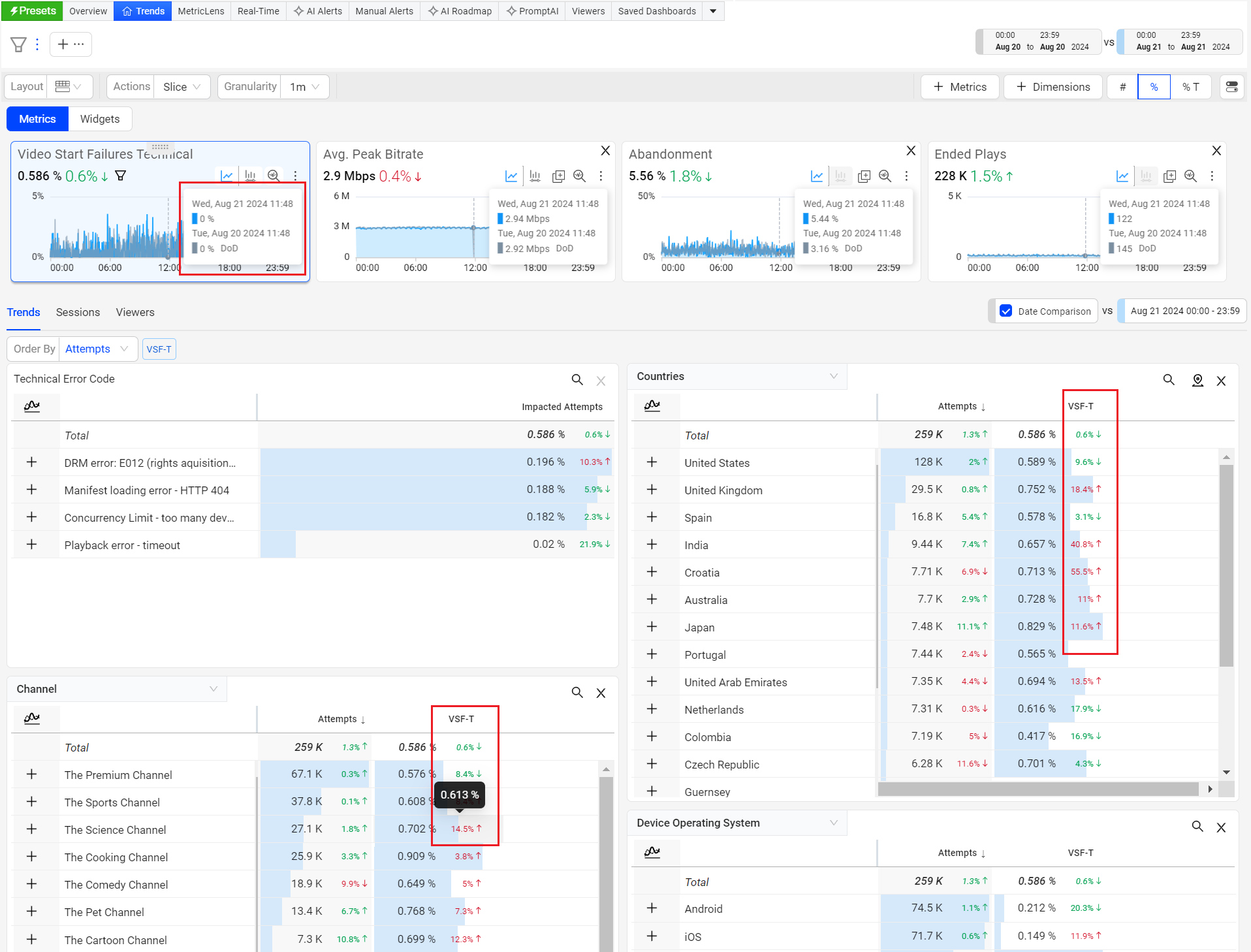
Displays percentage deviation next to the dimension values.
-
Hover the percentage to see the absolute value of the dimension tag.
Date Compare
-
Select a date range.
-
Click the hamburger icon next to the date picker.
-
Click the toggle button next to Date Comparison to enable date comparison.
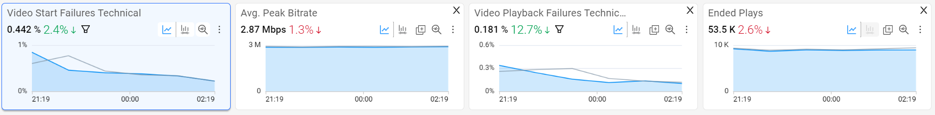
The diagnostics metric widgets are updated with a time line graph representing the previous day (same time-period) for Metric Compare in time-series (highlighted in grey).
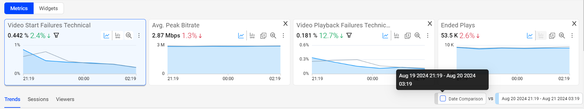
Hover on Date Comparison to see the compare date and time.
-
Select the Date Comparison checkbox.

-
A new column with the percentage values showing percentage up or down against each value in the dimension table. This helps you analyze the data and identify at what time the metric deviated.
-
Hover the percentage next to the dimension tag to see the absolute value.
-
Note: The compare percentage displayed in the diagnostics metric widget is controlled by the Date Comparison.
Slice Compare Mode
-
Allows you to manually select spike (or dip) in the metric time-series for analysis.
-
Dynamically updates the dimension table to show which dimension values are most responsible for the selected time slice.
-
Highlights dimension values with percentage deviations for the selected spike (or dip).
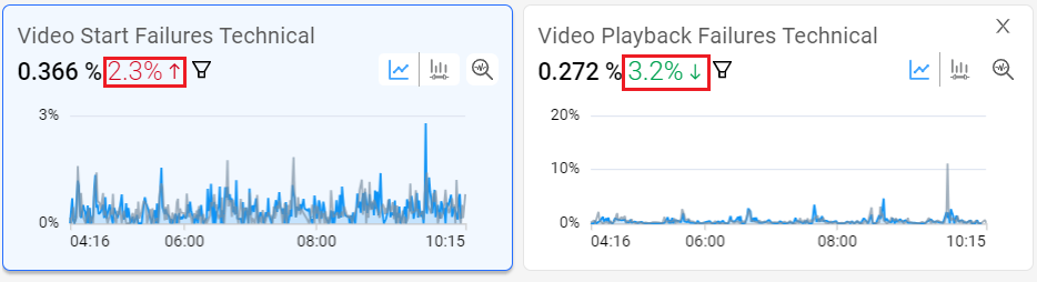
Slice Compare
-
Select a portion of the time series to create a slice across the spike.
The Table Compare button is activated showing the duration of selection (in this example 2 hours and 16 mins).

-
Select the checkbox next to Compare last 2h 16m.
-
The timeseries highlights the previous duration in grey color.
-
The dimension table refreshes to show the metric VPF-T increased across dimensions compared to the previous 2 hours and 16 mins.
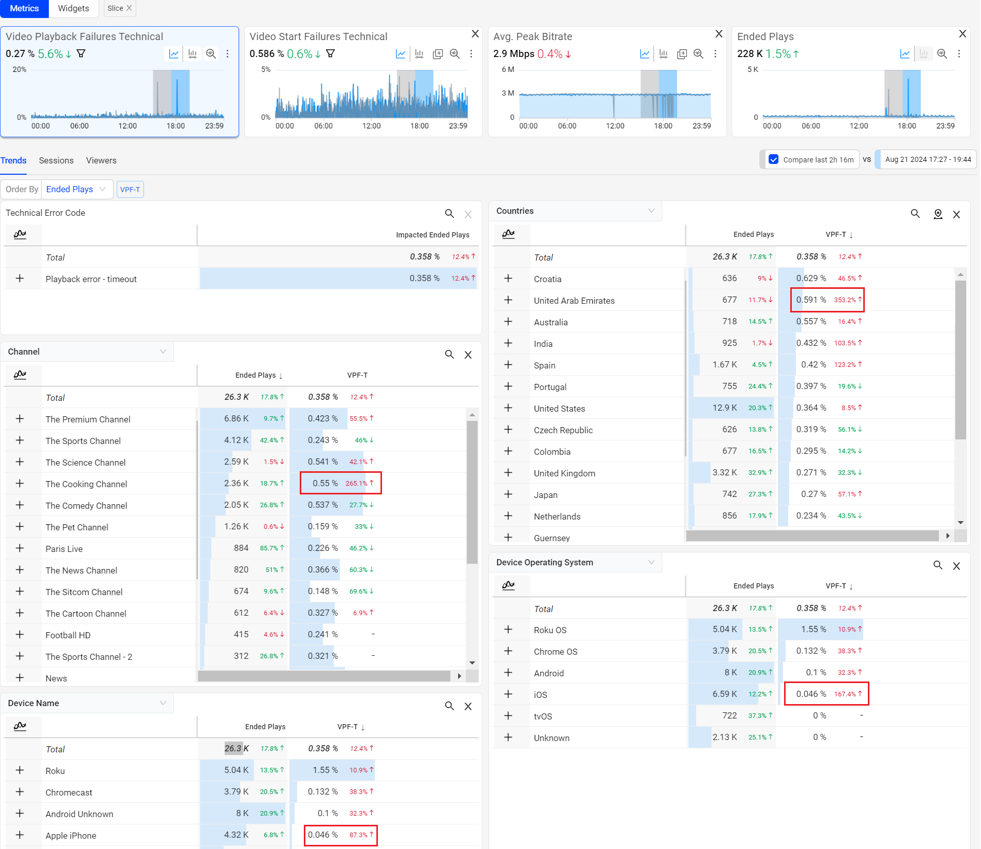
Note: The table comparison indicators display, "New" if the previous value was zero and "Same" if the current value matches the previous value. The maximum percentage is capped at 1000%.
-
Table Compare Table Compare Table Compare