What's New in Video 2024
2024 Releases
 2024 Releases: AI-Driven Automation - Actionability, Enhanced Analysis, and Improved User Experience
|
Automatic Insights |
Viewer Module |
Trends Enhancements |
Trends Enhancements (Cont'd) |
Metrics and Metadata |
2024 Releases
December 11, 2024
AI Alert Cohorts -- Combination Limit
|
|
Feature Update:
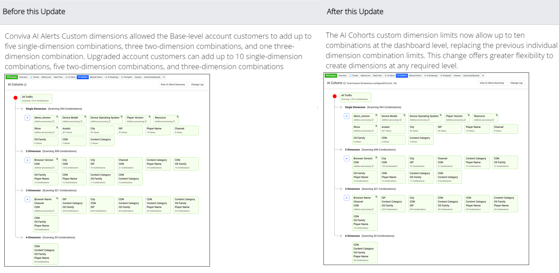
Updates to the AI Cohorts custom dimension limits to allow up to ten combinations at the dashboard level instead of individual dimension combination limits, providing flexibility to create custom dimensions at any required level.
Click to expand the image
Use Case:
Configure custom dimensions as single dimensions or in groups of two or three dimensions to focus AI alerting on specific performance areas, such as an underperforming channel or CDN edge server / OS family combination.
More Details: AI Cohorts.
Trends -- Dimension Table Compare Indicator
|
|
Feature Update:
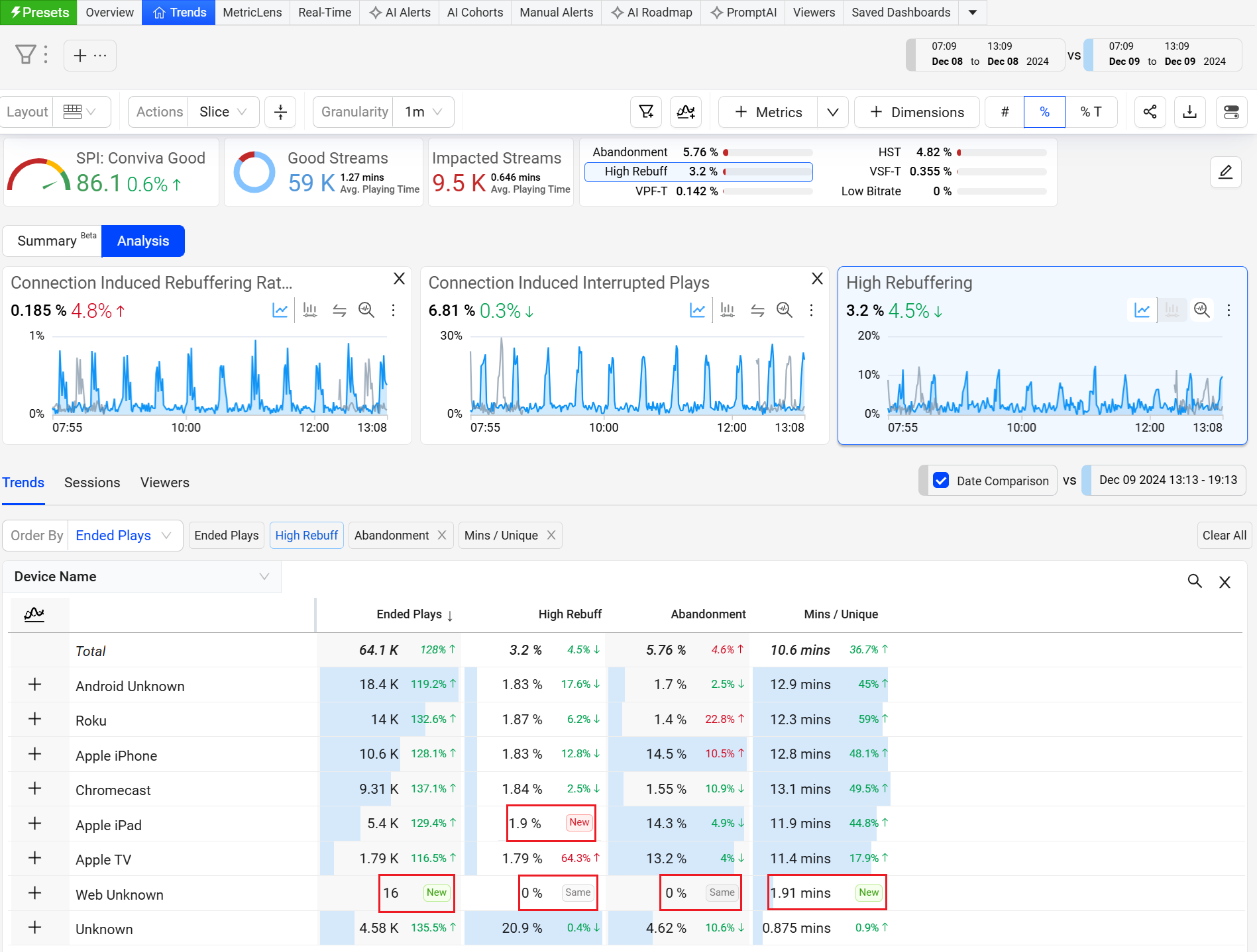
Updates to the dimension table with table compare indicators displays:
-
New : when the previous value was zero.
-
Same : when the value is same as before.
With this feature update, the dimension table more clearly indicates new and unchanged comparison values.
Click to expand the image
More Details: Table Compare.
November 21, 2024
Auto Insights -- Export Option
|
|
Feature Update:
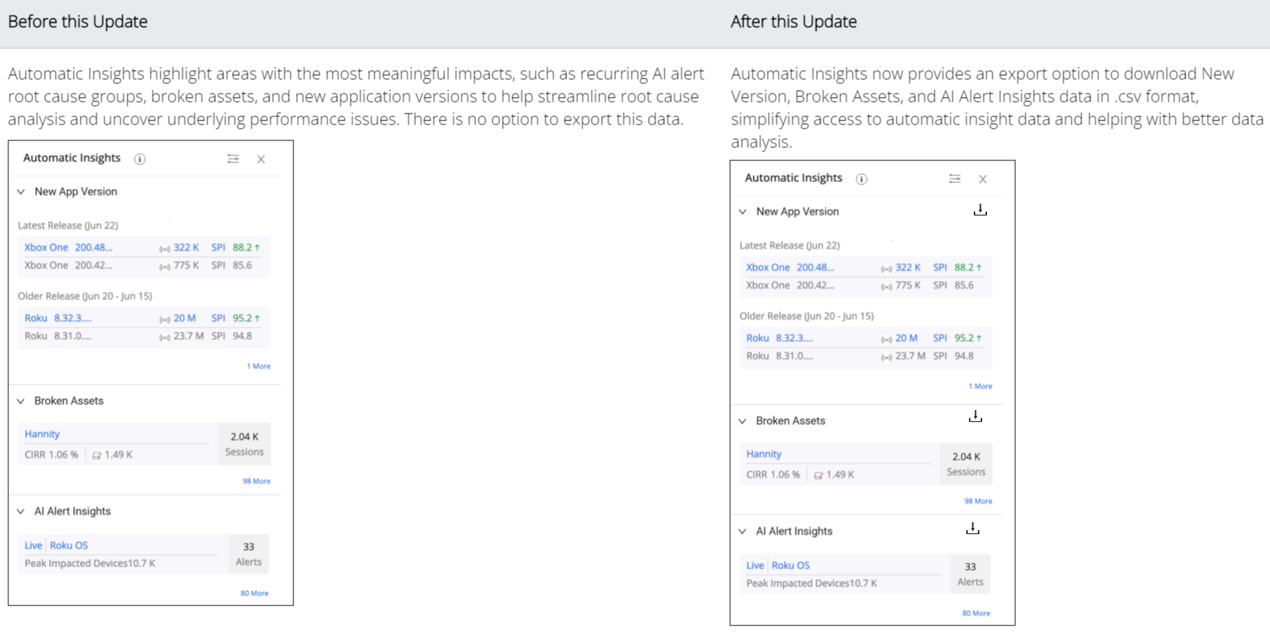
Enhances Auto Insights with an export option to download New Version, Broken Assets, and AI Alert Insights data in .csv format, simplifying the access to automatic insight data and enabling data integration with other visualisation tools.
Click to expand the image
Use Case:
Click the Export icon next to the New App Version to export its insights. Download the file and review the SPI Stream and SPI data across multiple release versions to evaluate the performance in spreadsheet format and combine the data with visualisation tools.
More Details: Automatic Insights.
Trends -- Viewers in Summary Tab
|
|
Feature Update:
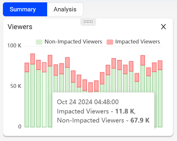
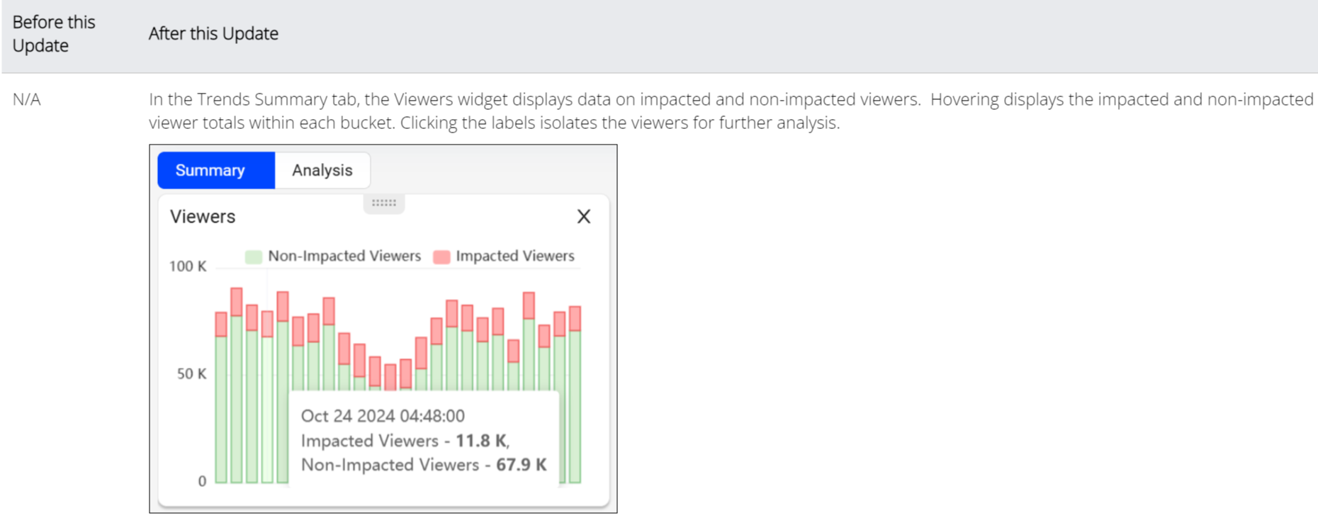
Introduces the Viewers Widgets in the Summary Tab, providing access to impacted and non-impacted viewer data in customizable stacked data buckets to quickly isolate issues impacting viewers. Selecting the Impacted Viewers label and clicking a data bucket displays those impacted viewers under the viewers tab.
Click to expand the image
Use Case:
Use the Viewers widget to quickly isolate the viewers impacted by a performance issue spike. In this widget, select the stacked bucket with a high percent of impacted viewers and click the impacted viewers label to focus on data for these viewers. In the Viewers tab, sort the impacted viewers according to the viewing experience issues, such as low SPI, high rebuffering, high startup time, abandonment.
More Details:Summary Tab.
November 7, 2024
Filter Management -- Bulk Filter Deletion
|
|
Feature Update:
Enhances the Filter Management with,
-
Bulk deletion option to remove multiple filters simultaneously.
-
Delete button to delete the selected filters.
This improvement streamlines the filter list and improves overall usability.
Click to expand the image
Use Case:
Use the search feature to limit the displayed filters by filter ID, such as "201" for filters with this number in the ID and click the Delete button, to see the Delete Filters popup screen.
More Details: Filter Management.
Trends -- Dynamic Y-Axis
|
|
Feature Update:
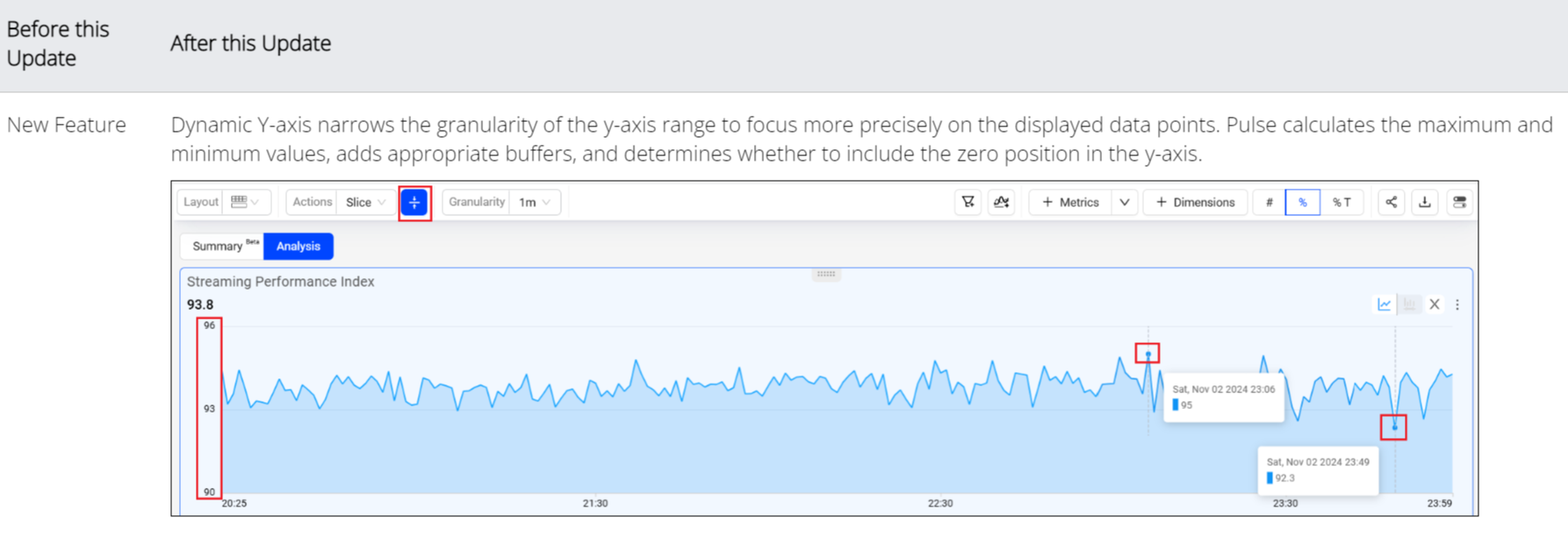
Introduces the Dynamic Y-Axis in Trends to narrow the granularity of the y-axis range to focus more precisely on the displayed data points. Pulse calculates the maximum and minimum values, adds appropriate buffers, and determines whether to include the zero position in the y-axis. Excluding the zero position might be especially helpful in interpreting scatter charts.
Click to expand the image
Use Case:
Select the SPI metric and click the Dynamic Y-Axis icon. Clicking the icon adjusts the y-axis to start at 90 and end at 96, based on the minimum data value of 91.7 and the maximum value of 94.2, with an added buffer instead of the default range (0-100). This adjusted display offers more precise insights into the timeline data points, enhancing the data analysis
More Details: Dynamic Y-Axis.
Trends -- Summary Panel
|
|
Feature Update:
Reintroduces the Summary Panel in the Trends section in the Analysis tab, enabling actionable insights with highlights of SPI, Impacted Streams, Improvement Opportunities, Aggregated Audience Summary, and Ad metric data. Use the Edit option to customize the displayed summary data, allowing a focused assessment of the performance, startup, and playback experience.
October 24, 2024
Trends -- Summary Tab (Beta)
|
|
Feature Update:
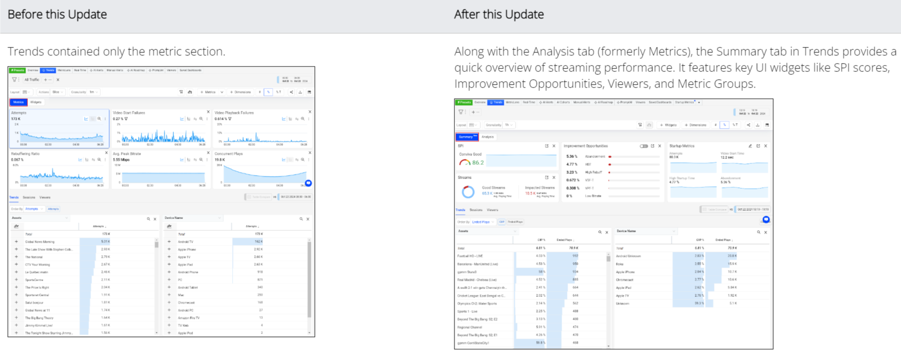
Introduces the Summary Tab in Trends to precisely analyze streaming performance data, featuring several key self-contained UI widgets, such as:
-
SPI score and impacted stream breakout.
-
Ranked improvement opportunities based on SPI threshold settings.
-
Customized metric groups for collective performance evaluation, such as video startup monitoring by grouping VST, EBVS, and Attempts metrics.
-
Viewers with the impacted and non-impacted streaming data
-
Trends dimensions drill-downs based on filters and selected data.
These summary data simplify the analysis of audience impacts, enabling the identification of overall performance baselines, critical improvement areas, and metric-based anomalies.
Click to expand the image
Use Case:
Quickly isolate the sessions or viewers impacted by a performance issue. In the Trends Summary tab, click the most critical improvement opportunity in the Improvement Opportunities widget, such as Low Bitrate, to filter the summary dimension data to only sessions impacted by low bitrate. Use the Viewers widget to click the daily spike with the most impacted viewers, and then sort the viewer IDs in the Viewers tab to discover the viewer IDs most impacted. This helps in analyzing the overall application health.
More Details: Summary Tab.
Trends -- Metric Group in Summary Tab (Beta)
|
|
Feature Update:
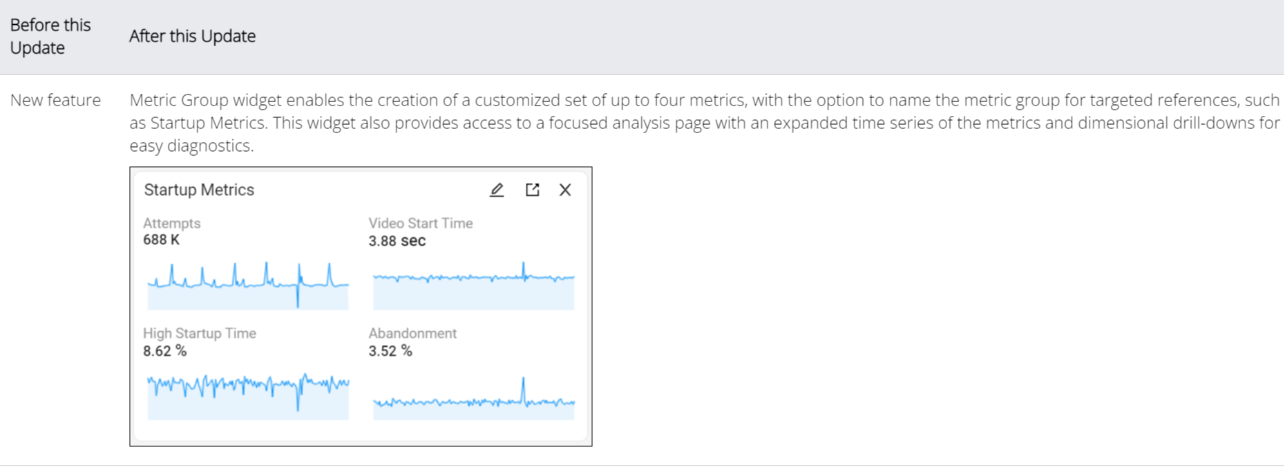
Introduces the Metric Group Widgets in the Summary Tab, enabling the creation of a customized set of up to four metrics displayed together in the same widget. Assign widget names for targeted references, such as Startup Metrics, and access a focused analysis page with expanded time series and dimensional drill-downs for efficient diagnostics of the metric group performance.
Click to expand the image
Use Case:
Create a metric group for startup-related metrics to analyze initial user engagement, including Attempts, Video Startup Time, High Startup Time, and Abandonment. This metric grouping enables quick access and comparison of key data points within a specific context for easier startup data analysis and anomaly detection, for example high video startup times leading to increased viewer abandonment.
More Details:Summary Tab.
Trends -- Viewers in Summary Tab (Beta)
|
|
Feature Update:
Introduces the Viewers Widgets in the Summary Tab, providing access to impacted and non-impacted viewer data in customizable stacked data buckets to quickly isolate issues impacting viewers. Selecting the Impacted Viewers label and clicking a data bucket displays those impacted viewers under the viewers tab.
Click to expand the image
Use Case:
Use the Viewers widget to quickly isolate the viewers impacted by a performance issue spike. In this widget, select the stacked bucket with a high percent of impacted viewers and click the impacted viewers label to focus on data for these viewers. In the Viewers tab, sort the impacted viewers according to the viewing experience issues, such as low SPI, high rebuffering, high startup time, abandonment.
More Details:Summary Tab.
AI Cohorts
|
|
Feature Update:
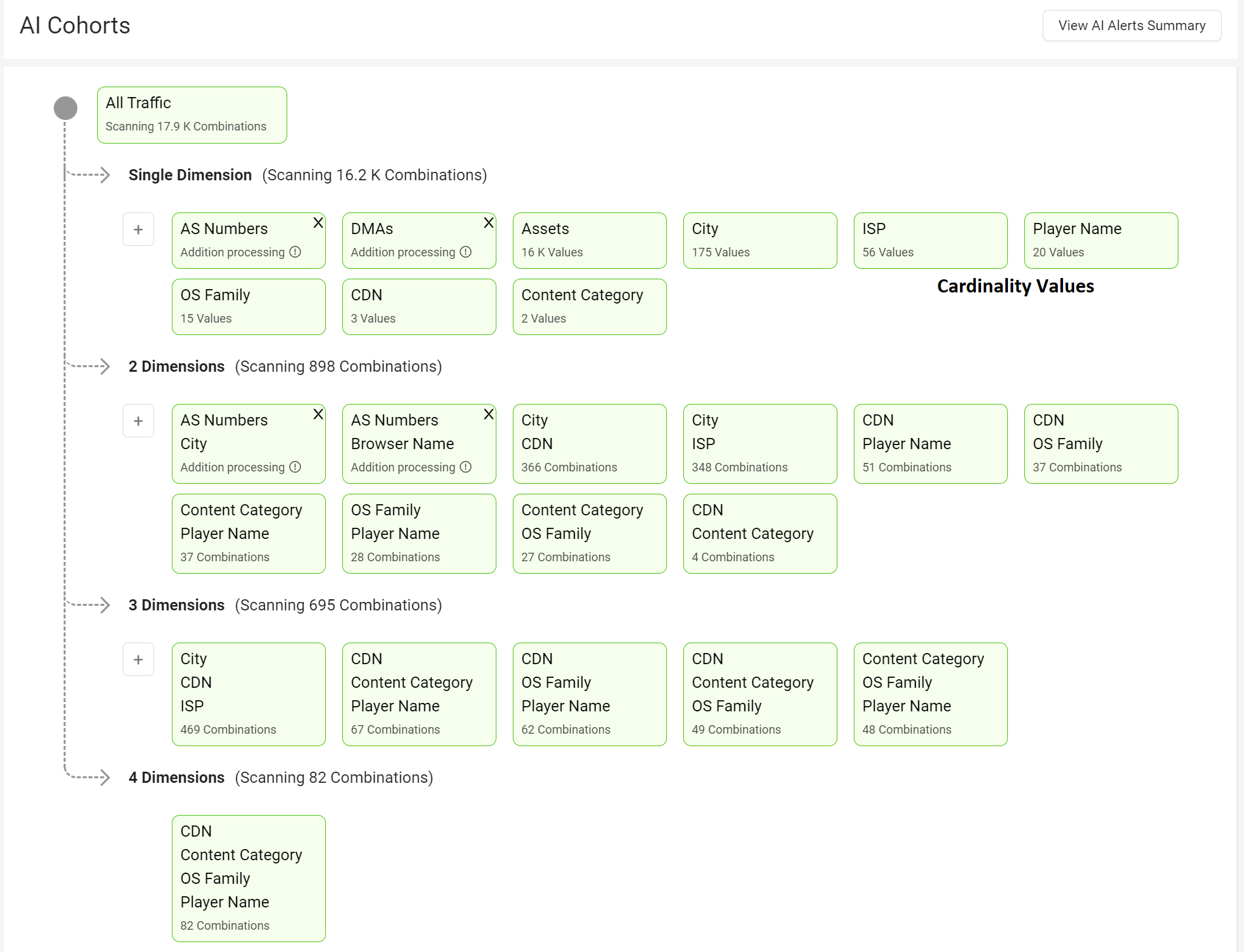
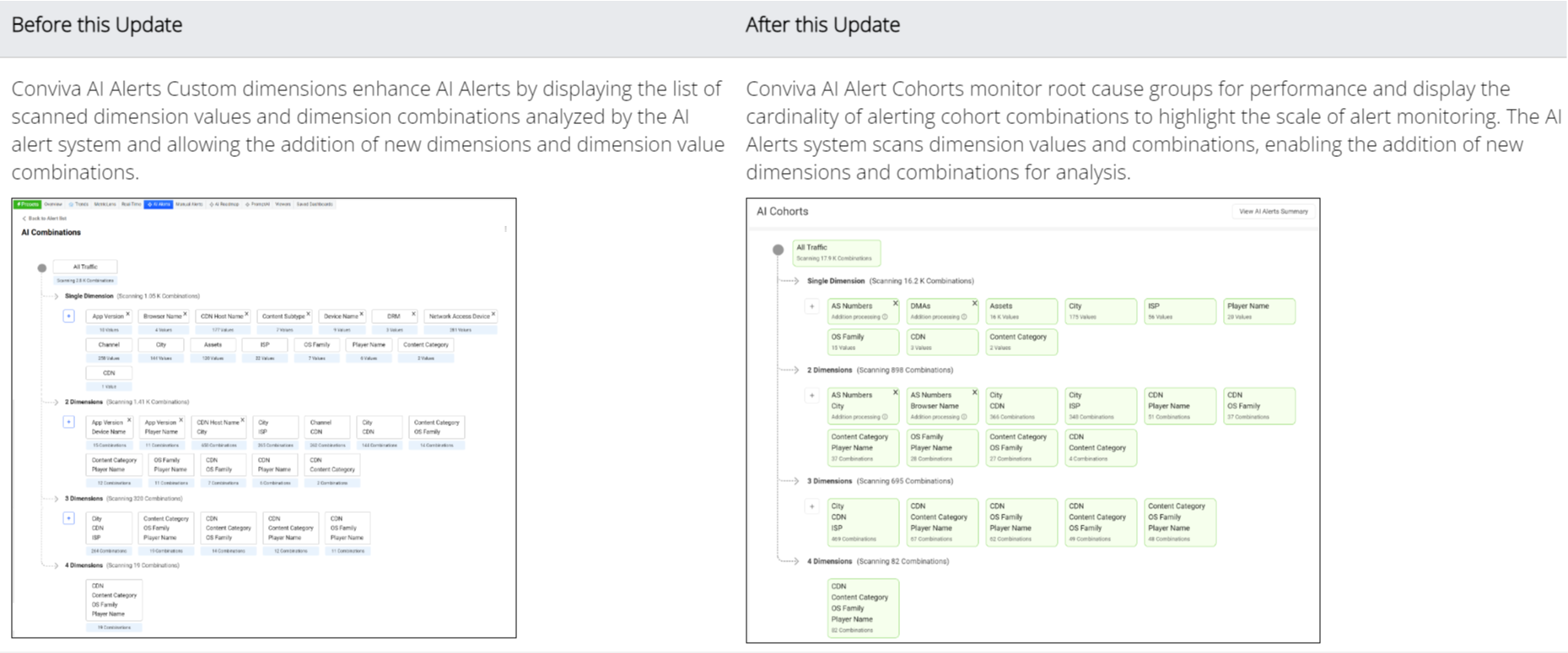
Introduces AI Cohorts page, which enables the cohort dimension display and configuration of custom dimensions as single or grouped dimensions for AI alerting. The AI Cohorts customize the monitored root cause groups for AI alert performance and display the cardinality of alerting cohort combinations, highlighting the scale of alert monitoring. The Conviva AI Alerting system continuously monitors specified cohorts for anomalies and establishes a baseline with an associated variation range for key metrics. Navigate to the AI Cohorts page from the AI Alerts dashboard or main navigation hamburger menu.
Click to expand the image
Use Case:
Configure custom dimensions as single dimensions or in groups of two or three dimensions to focus AI alerting on specific performance areas, such as an underperforming channel or CDN edge server / OS family combination.
More Details: AI Cohorts.
Trends -- Analysis (formerly Metrics)
|
|
Feature Update:
Renames the Trends Metrics tab to Analysis. The dimension tables and metrics widgets now appear under the Analysis tab.
Click to expand the image
Date Picker -- Last 24 Hours Interval Includes Minutes
|
|
Feature Update:
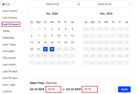
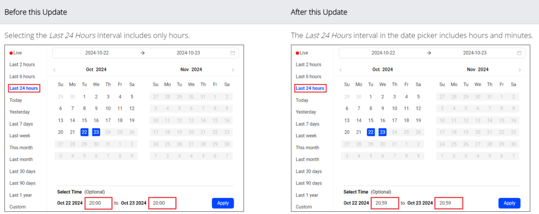
Updates the Last 24 hours interval in the date picker to include hours and minutes for precise time selection.
Click to expand the image
Use Case:
The Last 24 hours interval in the date picker populates the hour and minute based on the system time. In this example, selecting the Last 24 hours on October 24, 2024 at 11:45, populates the time range as October 23, 2024, 11:45 to October 24, 2024, 11:45. This enables accurate time-based analysis of the selected metrics to evaluate the system performance.
October 9, 2024
Enhanced Share Feature
|
|
Feature Update:
Updates Share in VSI with a new UI and auto-copy functionality. Clicking the Share button creates a 30-day snapshot of the current dashboard and automatically copies the shareable link for collaboration.
Click to expand the image
Use Case:
Create a slice in a Trends metric widget highlighting a metric spike and share the Trends data with other users for collaboration.
More Details: Trends, and Basics.
Trends -- Dimension Metrics Selection
|
|
Feature Update:
Updates the Metric selection in Trends with an option to add the metrics only to the dimension table.
-
Adds a new Dimension Metrics button in Trends.
-
Selecting the metric in dimension metrics adds a new column of the selected metric in the dimension table.
Click to expand the image
Use Case:
To analyze start-up metrics in Trends, select Video Start Time, Attempts, and Abandonment from the metric selector. Additionally, select the metric High Rebuffering from Dimension Metrics to add the High Rebuffering metric column in the dimension table for more comprehensive data analysis.
More Details: Trends.
October 2, 2024
Enhanced ISP Name Reporting (October 3, 2024 09:00:00 UTC)
Feature Update:
Conviva is enhancing ISP name reporting in Conviva Video, SSD/Connect, and APIs with more up-to-date and granular ISP naming and reduced Unknow ISP values. This update also significantly reduces the time to roll out future ISP name updates.
Enhanced ISP names appear in:
-
Video filters using ISP dimension values
-
Video ISP dimension lists
-
SSD and Connect data files
-
Video APIs
Updates to ISP names references in Pulse filters, API responses, and custom processing of SSD/Connect files are required to match the enhanced ISP names.
Examples of common ISP name enhancements.
|
Previous ISP Name |
New ISP Name(s) |
|---|---|
| Comcast |
Comcast Cable, Comcast Business, Xfinity Wifi, … |
| RoadRunner/Charter/Brighthouse |
Spectrum, Spectrum Business |
|
AT&T |
AT&T Internet, AT&T Wireless, AT&T Business |
|
Verizon |
Verizon Fios, Verizon Fios Business, … |
|
BSkyB |
Sky Broadband |
|
Cox |
Cox Communications, Cox Business |
|
Qwest |
CenturyLink |
|
France Telecom |
Orange, Orange Espana, … |
|
Vodafone |
Vodafone Germany, Vodafone UK, … |
Reach out to your Conviva representative or contact Conviva Support with any questions regarding the enhanced ISP name reporting.
September 27, 2024
AI Alert Email Subscription by Severity Level
|
|
Feature Update:
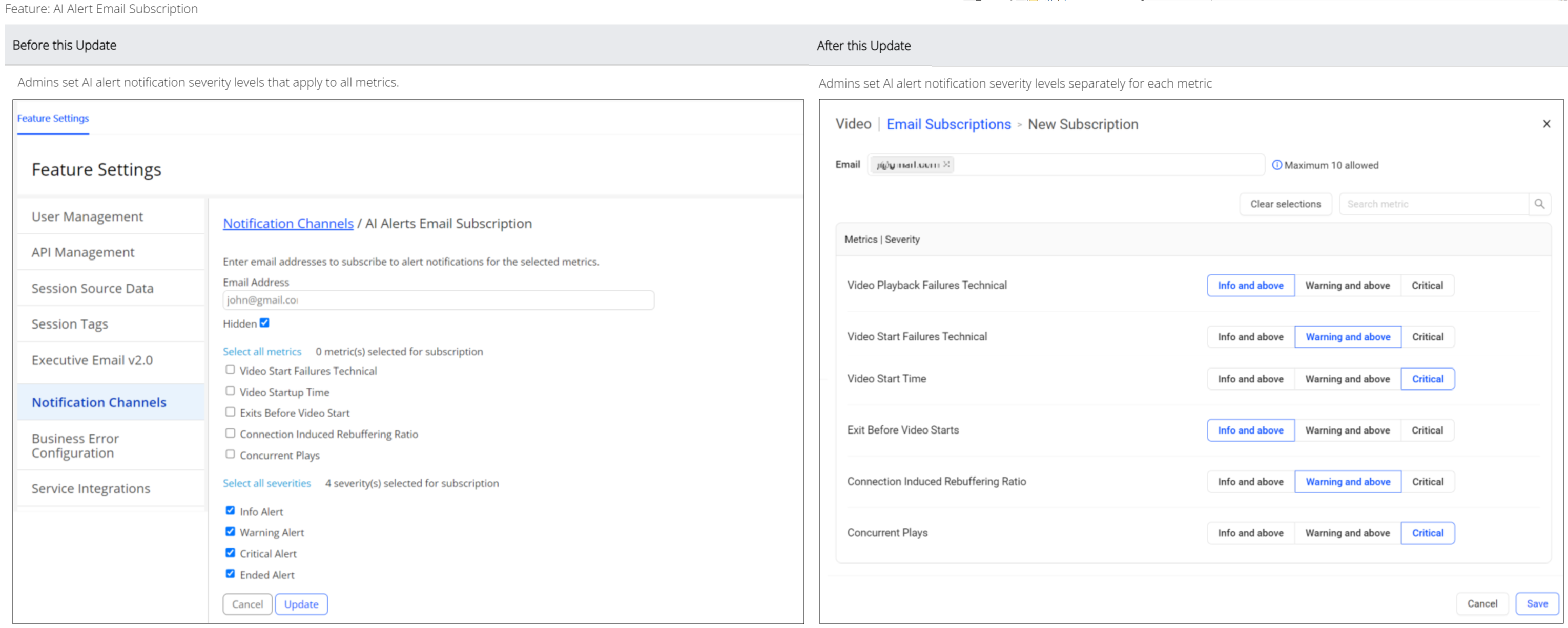
Enhances the AI Alert Email Subscription with severity level selection and new UI controls.
-
Assign severity levels (Info and Above, Warning and Above, Critical) to each selected metric for more granular control over AI alert prioritization and alert notification based on predefined severity levels.
-
Easily access UI controls with a New Subscription button along with Edit and Unsubscribe icons for a better user experience.
These enhanced severity-based notification settings enable more focused awareness of critical performance issues, allowing timely troubleshooting and optimization.
Click to expand the image
Use Case:
Set up targeted AI alert notifications based on alert severity levels to focus on issues leading to failures, while also alerting on only critical startup issues.
-
Alert on all severity levels by selecting the severity Info and Above for Video Playback Failures and Video Startup Failures.
-
Alert on Warning and Above, and Critical severity levels for Exit Before Video Starts, Connection Induced Rebuffering Ratio, and Concurrent Plays.
More Details: AI Alert Email Subscription.
Feature Setting - Notifications
|
|
Feature Update:
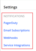
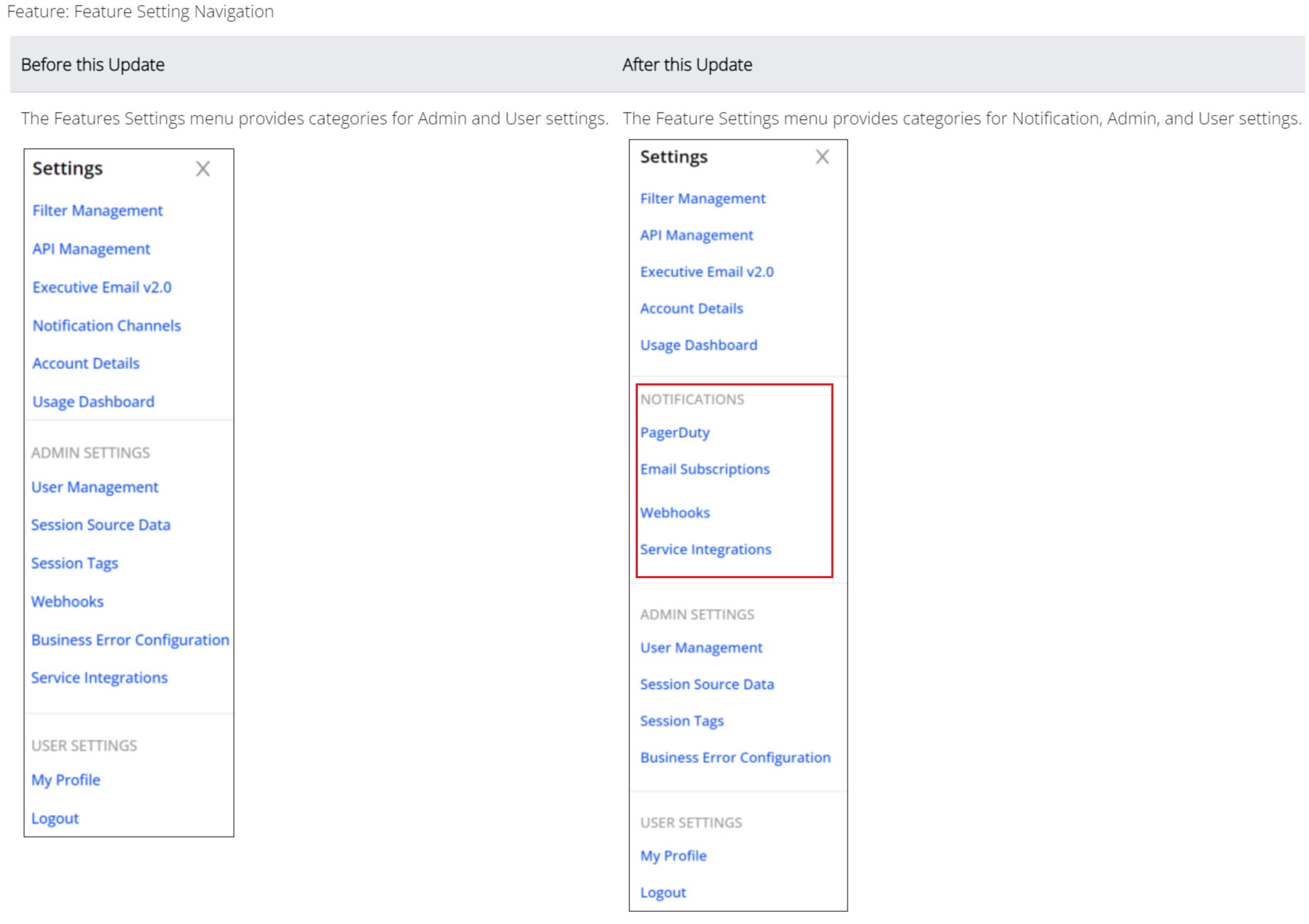
Updates the Feature Settings with a new Notifications section to enhance notification management, with easy navigation to notification settings, such as PagerDuty, Email Subscriptions, Webhooks, and Service Integrations.
Click to expand the image
More Details: Feature Settings.
Real-Time Audience Threshold Updates
|
|
Feature Update:
Enhances the Real-Time Thresholds with new Audience Threshold metrics, options to set custom threshold settings for all metrics, and aligns the sequence of metrics.
-
Adds new Audience Thresholds for Plays and SPI Streams metrics.
-
Enables custom threshold settings and saving for all metrics.
-
Allows the rearranging of the metric columns and aligns the sequence of metrics on the threshold page with the Real-Time dashboard to improve navigation and usability.
Click to expand the image
Use Case:
Set more thresholds for enhanced performance moniting.
-
For the Live traffic, select the metrics to be monitored.
-
Set the audience threshold for SPI, Impacted Streams.
-
Set and save the custom threshold for metrics.
-
View the Real-Time dashboard to monitor and analyze the performance.
More Details:Real-Time Dashboard.
Rearrange Metric Columns
|
|
Feature Update:
Adds a Rearrange icon to the metric labels in dimension tables so you can reorder metric columns. To rearrange metric columns, press and drag the metric label. Custom metrics and secondary metrics remain together when either metric is moved.
Click to expand the image
September 12, 2024
Filter Builder
|
|
Feature Update:
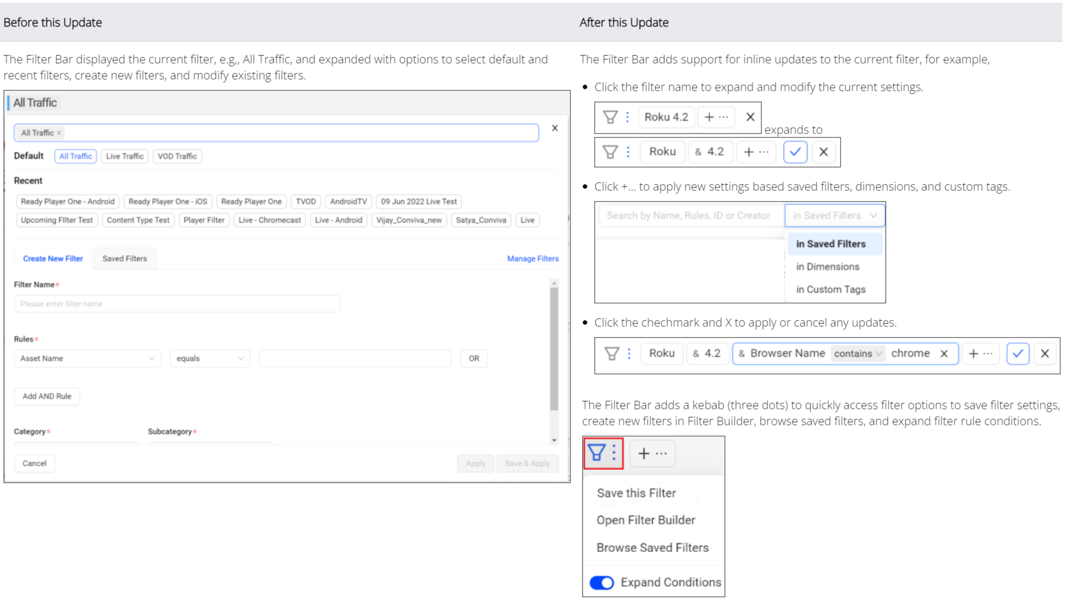
Enhances the Trends dashboard with Inline Filters to create and update filters using saved filters, dimensions, and custom tags without opening the filter builder pop-up screen. The filter icon (with three dots) provides quick access to the filter options to save filter settings, create new filters in the filter builder, and browse saved filters.
Click to expand the image
Use Case:
For example, create an inline filter with the Asset Name as Cricket League and the Device Name as Roku, Android, and Apple TV. This filtered data enhances the data analysis to quickly identify and focus on relevant data points and drill-down to the anomaly.
More Details: Filter Builder.
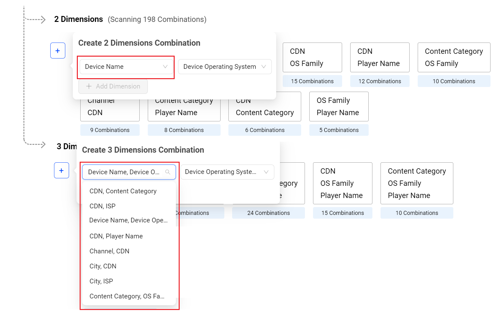
AI Alert Custom Dimension -- Scanning Combination
|
|
Feature Update:
Updates the AI Alert custom dimension scanning combination with,
-
Option to select the dimension combination from the parent level and any dimension supported in the account.
-
Restrict the addition of three dimensions from the first level directly to the third level as it breaks the root-cause chain at the second level.
This feature introduces a dimension combination box at the second and third levels to select combination values from the parent level (the second-level combination serves as the parent for the third level, and the third-level combination serves as the parent for the fourth level).
Click to expand the image
Use Case:
For example, create a second-level dimension combination by selecting the dimensions Device Name and Device Operating System without including the Device Operating System in the single-dimension list. Similarly, create a third-level dimension combination by adding Device Operating System Version to the second-level dimension combination of Device Name and Device Operating System, without adding Device Operating System Version in the single-dimension list.
More Details: AI Alerts Custom Dimensions.
August 22, 2024
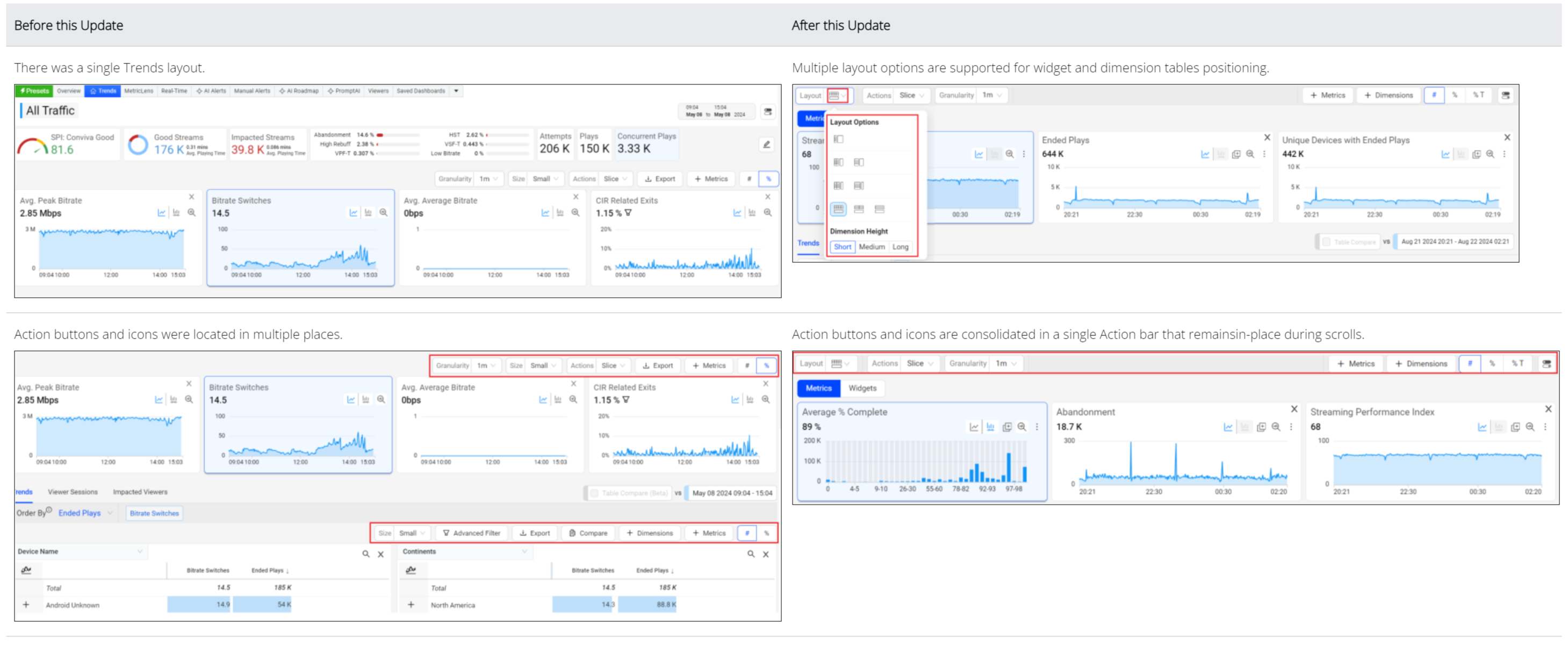
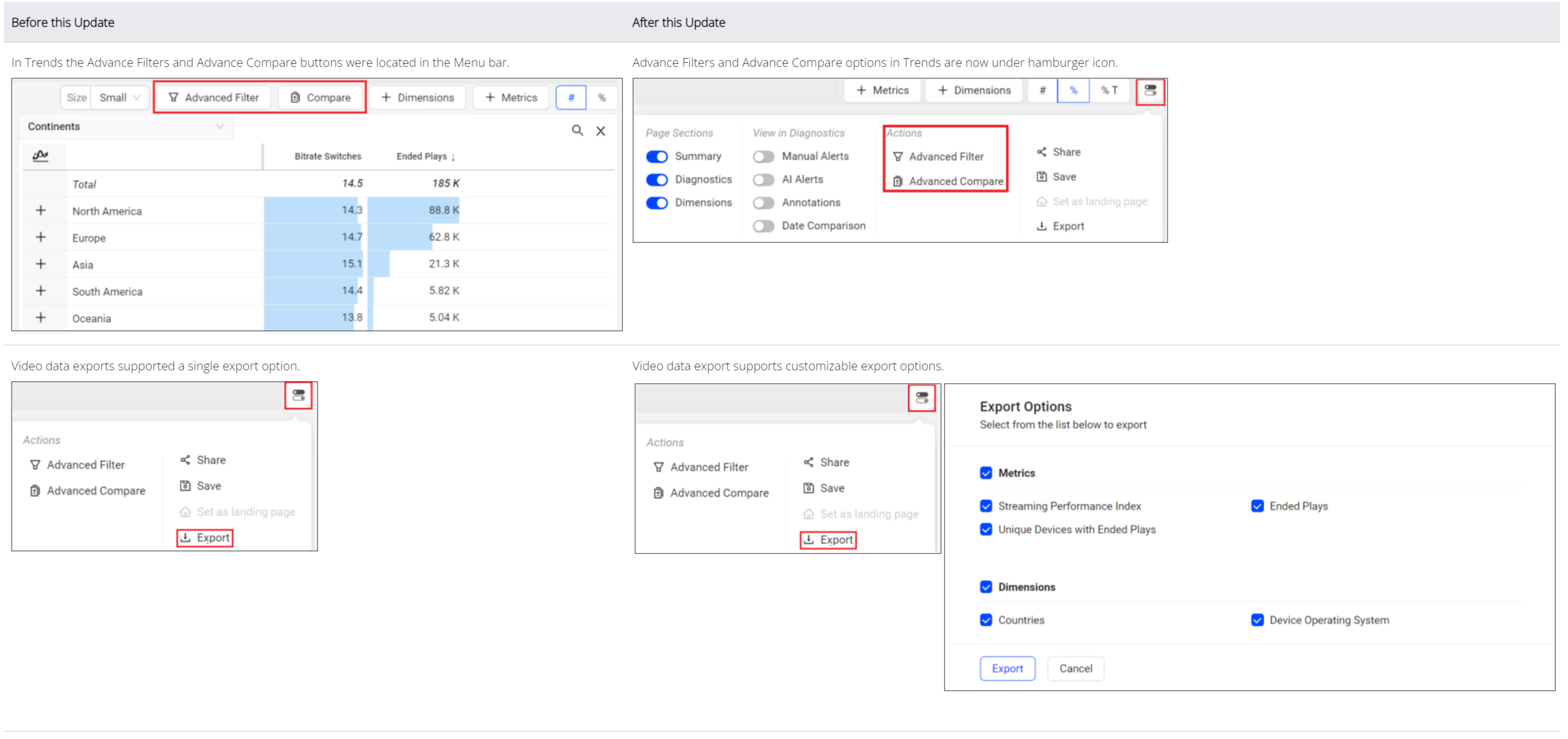
Trends -- Layouts, Metric Widgets, Action Bar, and Export

|
Feature Update:
Enhances the Trends dashboard with,
-
Multiple layout options for positioning metric widgets and dimension tables, enabling you to customize data displays to match your analytic preferences
The available layout options include:
-
Metric widgets on top, dimension tables below (default layout)
-
Metric widgets on the left and dimension tables on the right
-
Various metric widgets and dimension table sizes, allowing you to expand or contract the displayed metric time series and dimension table values
-
-
Sticky Action menu bar (always visible) for all actions you can perform
-
Adding metrics to dimension table
-
Append Metric: Click the metric card to append the metric on the dimension table
-
Replace Metric: Click Replace Metric in Dimension Table Icon on the diagnostic metric widget to append the metrics to the existing metrics in the dimension table
-
-
Right drawer Export Options list, allowing you to select the items you want to export
-
Advance Filter and Advance Compare options are now under the Actions menu
Click to expand the image
Use Case:
Select the layout option which allows you to tailor the dashboard’s appearance and functionality, giving you greater flexibility to interact with data in ways that align with your workflows and preferences.
More Details: Layout in Trends, and Trends.
Dimension Table Compare
|
Feature Update:
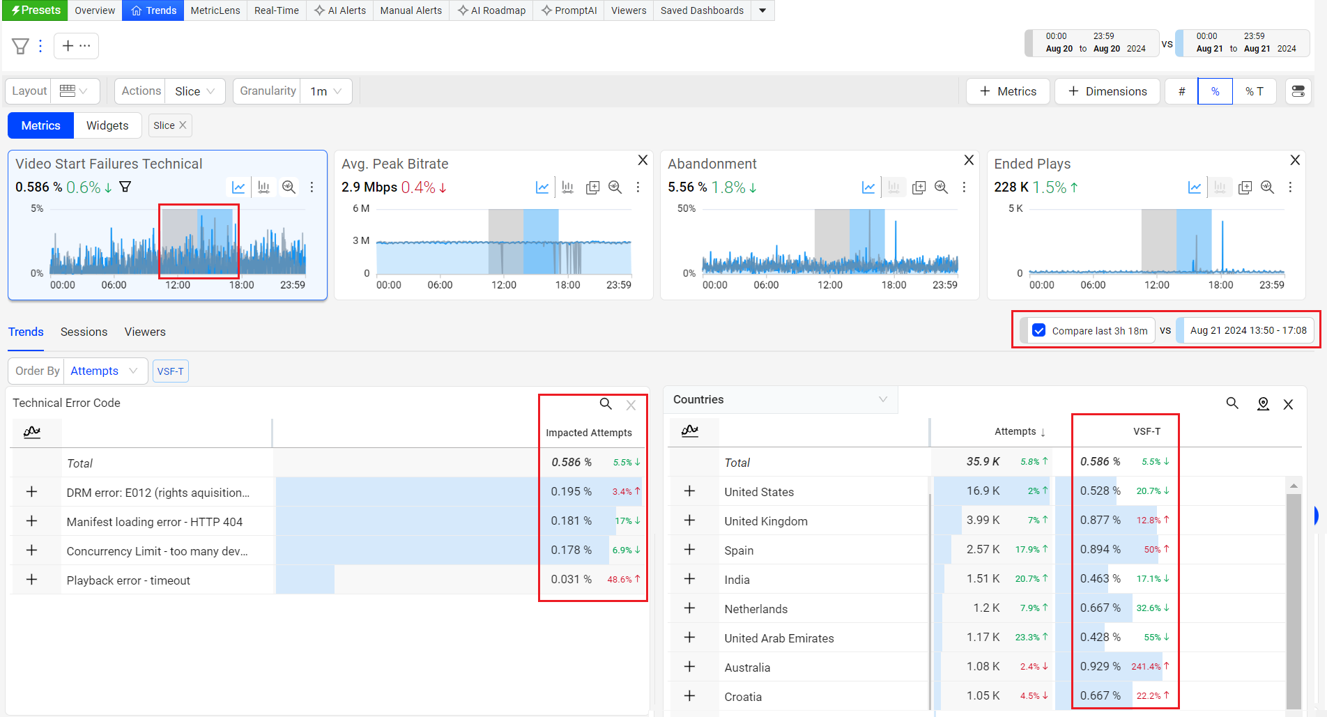
Enhances the dimension tables to display percentages and enables shaded compare periods in diagnostic metric widgets, significantly improving data visualization and analysis.
This feature update also includes a percentage up/down column in the dimension tables to highlight the impact of metric changes. In addition, a shaded (grey) area in the metric widget time series allows quick comparisons between the current and previous periods.
Click to expand the image
Use Case:
This new feature enable users to perform a deeper data analysis by providing them with an enhanced view of date or time slice comparsions.
In this example,
-
Create a slice across VSF-T spike.
-
Select the checkbox next to Compare prev 35m.
Timeseries updates to highlight the previous duration (in grey) and the dimension table refreshes to show VSF-T increased across dimensions.
More Details: Table Compare.
Webhooks
|
Feature Update:
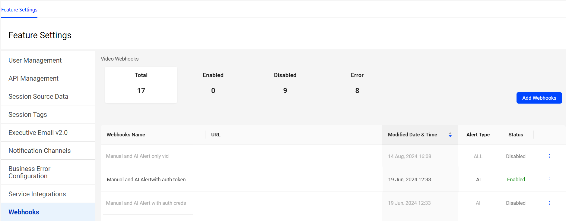
Updates Webhooks with a new UI, for a better user experience.
Webhooks enables automated notifications to external systems when an AI alert fires within Conviva. These notifications, delivered through HTTP POST requests to a specified URL on your server, allow seamless integration of Conviva alert events into external applications. This includes displaying alerts in aggregation systems or triggering workflows in applications like Pagerduty, JIRA or other support ticket systems.
Use Case:
Expand alert handling with webhooks enabled so that when ConvivaVSI detects an issue during ad playback failure, it generates an alert in Pulse and also sends the alert to other alerting systems as specified in the webhook server URL. For example, if PagerDuty is the configured integrated aggregation system, the alert triggers a notification in Pulse and PagerDuty, enabling coordinated incident notification and management. This expanded alerting provides more options for identification, especially outside of regular business hours, and resolution of ad playback issues, significantly improving overall alert response times.
More Details: Webhooks.
July 18, 2024
Remove Data Dip for Partial Data in the Last Time Series Data Bucket
Remove Data Dip for Partial Data in the Last Time Series Data Bucket

|
Feature Update:
Removes the last partial data bucket by dropping any partial data in the last time series data bucket if there is a delay in data ingestion, no data availability from the source, or only partial data available in the data bucket, based on the selected granularity and the specified date and time range.
Use Case:
For example, the date picker sets the range from 14 July at 1:30 pm to 14 July at 4:37 pm with a granularity of 5 minutes. The last time series data bucket spans from 4:35 pm to 4:37 pm, resulting in only 2 minutes of data, which would likely cause a dip in the time series due to partial data availability. Therefore, the partial data in that data bucket, which would cause an observable drop or dip in the last data bucket in the time series, is no longer shown.
More Details: Metric Dictionary and Trends.
July 3, 2024
Real-Time (NoC) Dashboard -- Green bar
Real-Time (NoC) Dashboard -- Green Bar
|
Feature Update:
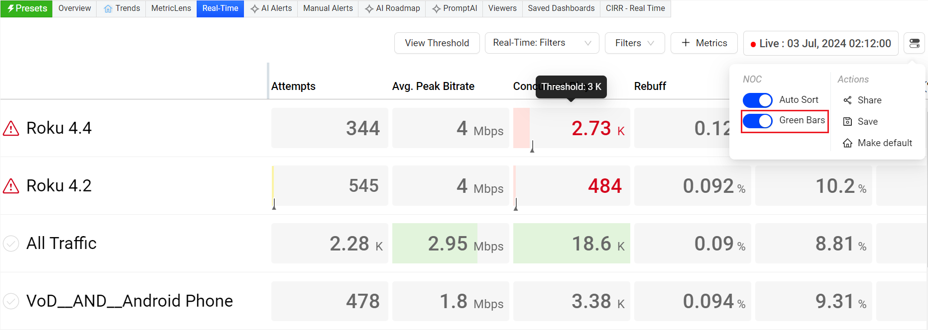
Enhances the Green bar in the Real-Time dashboard with,
-
A toggle (inside toggle settings) to switch on and off the green bars. When you need to focus on the Red or Yellow bars, you can switch off the green bars using this toggle.
-
The green bar appears only when the audience threshold is met, and the metric threshold (Conviva or custom) is set. Else, the background color remains grey.
Click to expand the image
Use Case:
This feature actively monitors critical streaming KPIs, indicating performance through green and red bars with threshold data for easier analysis and quick identification of changes in QoE metrics. When you need to focus on the red or yellow bars, you can switch off the green bars using the toggle for a better user experience.
More Details: Real-Time.
June 12, 2024
Percentage of Total

|
Feature Update:
Enhances the dimension data in Trends and MetricLens with Percentage of Total, indicating the percentage of impacted sessions for the displayed dimension values. In this example, the United States value had 54.9% of the total sessions with VSF-T in the country dimension. Similarly, the North America dimension value had 55.4% of the total sessions with VSF-T in the continent dimension.
Click to Expand
Use Case:
This new feature details the impacted percentage contribution of dimension entities, offering better insights during data analysis. For example, you can see the percentage of Ended Plays by geographic location or the percentage of Attempts from each browser.
More Details: Trends and MetricLens.
Viewer Module - Live Mode

|
Feature Update:
Updates the Viewer Module in Live mode to display the message Summary data is not applicable for Live Mode. The summary metrics compile data from all sessions within the selected time interval. Meanwhile, live mode displays data only from active sessions, potentially causing data point mismatches. Therefore, summary data is not applicable in live mode.
More Details: Viewers.
May 6, 2024
Drill-down from Custom Dashboard to Trends
|
Feature Update:
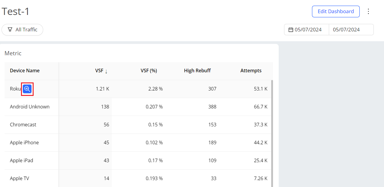
Enhances the Custom dashboard by adding a Focus button for detailed data analysis. This enables you to access an enhanced view of the selected dimension tag as a filter in Pulse.
This feature,
-
Provides the enhanced view of the selected metric along with the dimension data updated based on the filter applied.
-
Displays the Focus button next to the dimension tag on hover. Clicking the focus button enables you to view the dashboard with the selected dimension tag as the filter.
Click to Expand
Use Case:
This new feature provides a single-click option to drill-down to the selected dimension tag, providing an enhanced view of the selected dimension tag as a filter in Pulse. This allows you to have an in-depth data analysis.
More Details: Custom Dashboards.
Pulse UI change
|
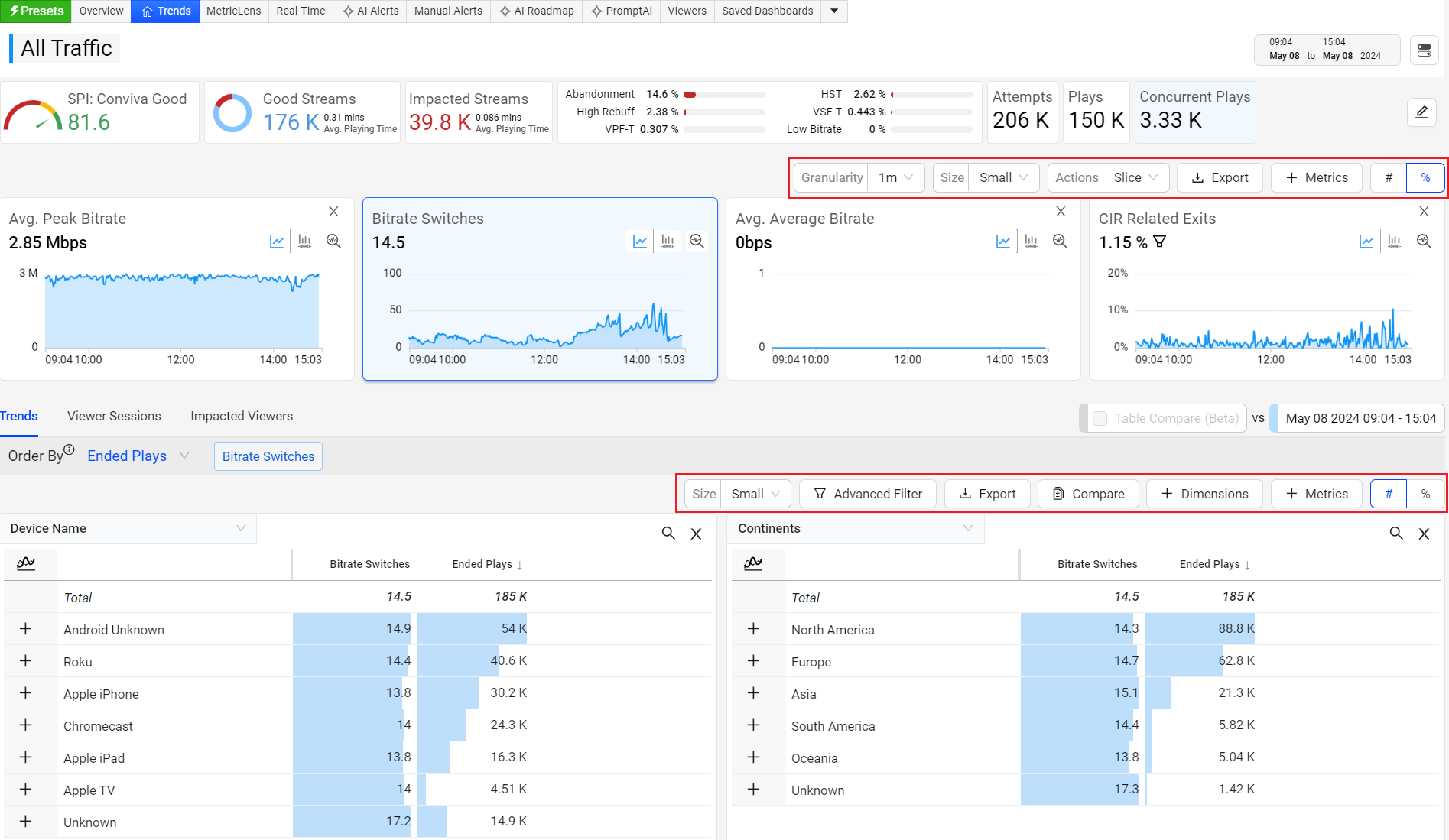
Feature Update:
Enhances the Pulse with the new design to make it consistent and space efficient. The changes include the font change, icons to tables and cells, also replace the Metric,and Dimensions pop-up windows with a right-drawer.
More Details: Trends.
Dimension Table Compare (Beta)

|
Feature Update:
Enhances the dimension tables to display percentages and enables shaded compare periods in diagnostic metric widgets, significantly improving data visualization and analysis.
This feature displays one additional column showing the percentage up or down against each value in the dimension table. Also, displaying the shaded portion (in grey) in the metric widget to compare the details in time series. This helps you to identify at what time the metric deviated.
Use Case:
This new feature enable users to perform a deeper data analysis by providing them with an enhanced view of date or time slice comparsions.
In this example,
-
Create a slice across VSF-T spike.
-
Select the checkbox next to Compare prev 35m.
Timeseries updates to highlight the previous duration (in grey) and the dimension table refreshes to show VSF-T increased across dimensions.
More Details: Table Compare.
April 25, 2024
Real-Time Dashboard (GA)

|
Feature Update:
Replaces the Real-Time dashboard with a new dashboard. Enhancing the dashboard with,
-
Colour coding indicators (Green / Yellow / Red) representing values below, nearing, or surpassing thresholds. The bar length reflects the metric's relative value within the column and hovering over a cell reveals the threshold data.
-
Improved threshold page with a single text box for Conviva and Custom threshold, with a blue reset button for reverting to Conviva values and a quick action tool on the column header to update the same custom value in the entire column.
-
View Threshold button for easy access to Manage Threshold page.
-
Auto Sort and Threshold toggle buttons on the Manage Threshold page for better user experience.
The Real-Time dashboard provides real-time QoE metrics for streaming intelligence. Users monitor critical streaming KPIs using selected filters and dimensions, with visual threshold indicators to identify metric changes quickly.
Use Case:
This feature actively monitors critical streaming KPIs, indicating performance through green and red bars with threshold data for easier analysis and quick identification of changes in QoE metrics.
More Details: Real-Time.
April 11, 2024
Filter Management Layout
|
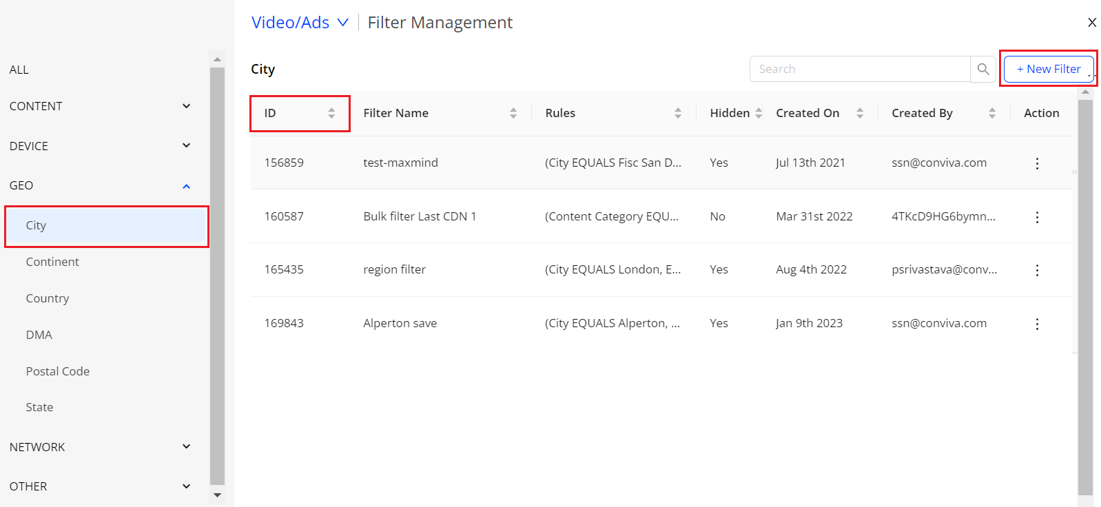
Feature Update:
-
Enhances the Filter Management with a Left Category pane providing different filter categories.
-
Introduces a New Filter option to enhance filter creation and a filter ID column for easier data sorting.
This feature displays the filter categories on the left category pane for easier data analysis. Also, providing a +New Filter button to create new filters and a filter ID column.
Use Case:
You can now easily sort the filters based on different categories. You can also create filters by clicking the New Filter button.
More Details: Filter Management and Creating Filters.
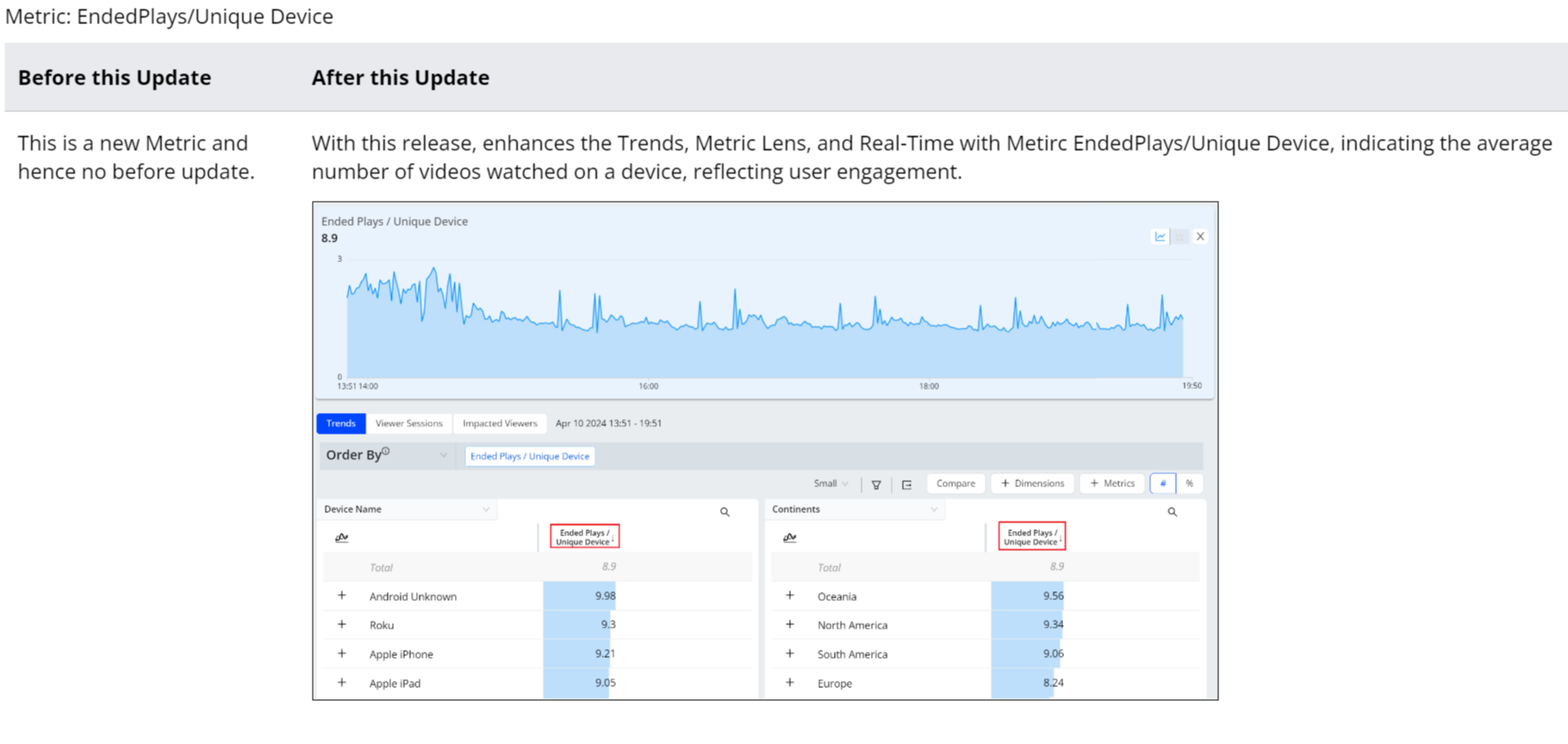
New Metric: Ended Plays/Unique Device
|
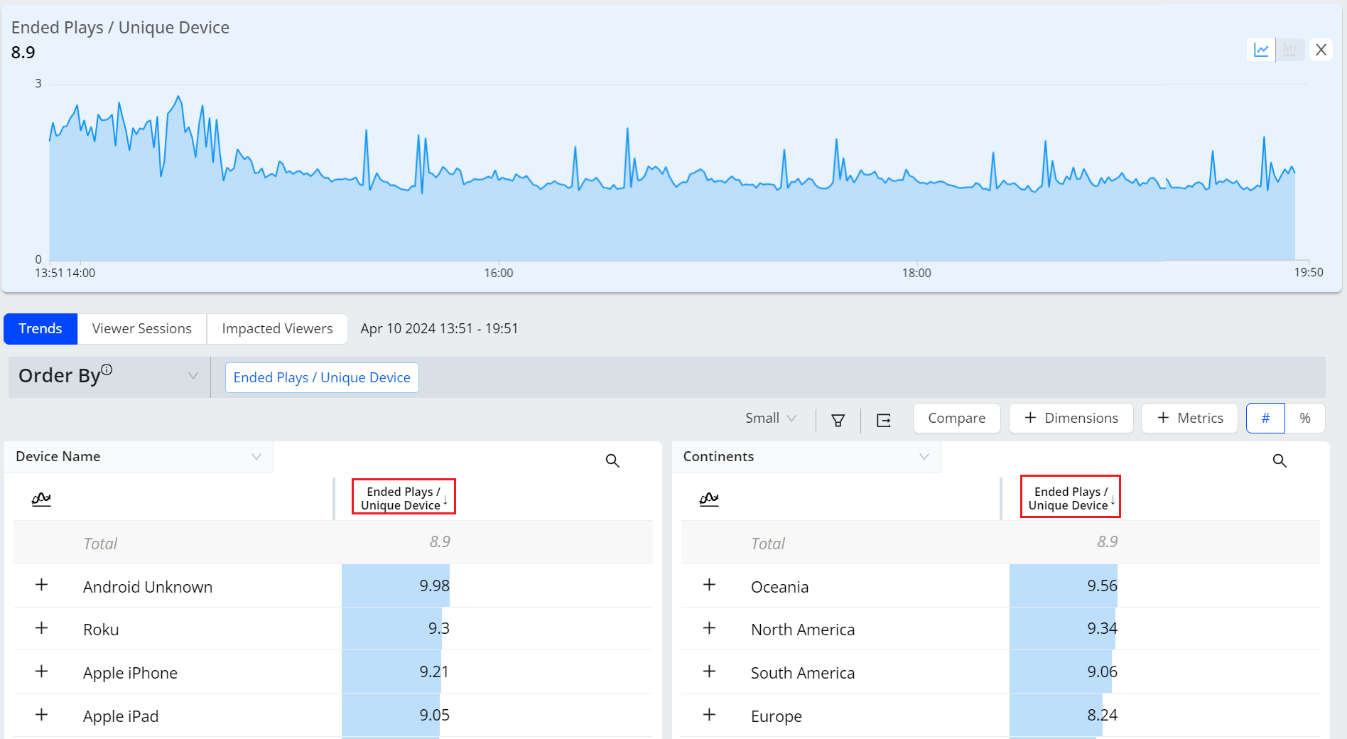
Feature Update:
Introduces the new Ended Plays/Unique Device metric, which helps you understand the number and percent of viewers who watched more videos on the same device and likely experienced higher engagement.
This new metric enhances the Trends, Metric Lens, and Real-Time with a new column for Ended Plays/Unique Device.
Use Cases:
This metric indicates the average number of videos watched on a device, reflecting user engagement. It can also highlight specific issues when there is an unusually high or low number of plays for a particular asset/device type, indicating potential playback/quality issues.
More Details: Ended Plays/Unique Device
AI Alert Diagnostics - Summary

|
Feature Update:
Enhances the AI Alert Diagnostics Dashboard with Cumulative Total Unique Devices details to the alert summary section to providing more insights to the alert summary. Cumulative Total Unique Devices refers to the total number of distinct devices that accessed or streamed content over a specific period of time. CTUD aggregates all these individual device counts over time, providing a comprehensive view of how many different devices have interacted with the streaming platform.
In this example considering there are 1000 devices, 255 devices attempt to play a video and out of which 137 devices exits before video starts. Hence the Cumulative Total Unique Devices (CTUD) is 255 and Cumulative Impacted Unique Devices (CIUD) is 137, which is 53.72%.
Use Case:
This feature allows to actively monitor Cumulative Total Unique Devices of an alert to track the platform's overall reach among users.
More Details: AI Alerts.
Real-Time Dashboard (Beta)

|
Feature Update:
Enhances the Real-Time dashboard with,
-
View Threshold button for easy access to Manage Threshold page.
-
Auto Sort toggle button and Threshold toggle button in Manage Threshold page for better user experience.
This feature provides the View Threshold button to easiler access to Manage Threshold page. Also the hamberger icon is introduced instead of a kebab Icon with Auto Sort and Threshold toggles in Real-Time and Manage Threshold page respectively.
The Real-Time dashboard shows real-time QoE metrics for streaming intelligence. Users monitor critical streaming KPIs with filters and visual indicators to identify QoE changes quickly.
Use Case:
This feature allows to actively monitor the performance of their most critical streaming KPIs, with clear green, yellow, and red bars indication with threshold data to easier data analysis quick identification and correlation of changes in QoE metrics.
More Details: Real-Time.
March 13, 2024
Single AI Alert Sensitivity Config Page
|
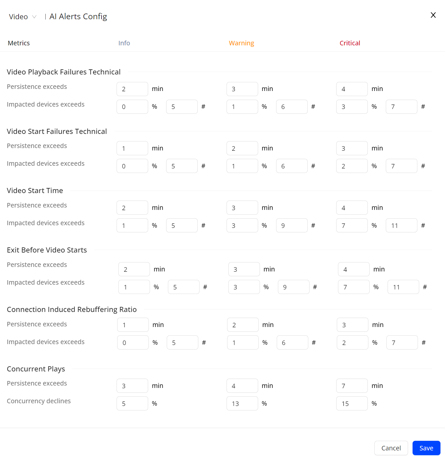
Feature Update:
Enhances AI Alerts Sensitivity with a single new right drawer config sensitivity page. This feature displays all the metrics in a single page, allowing you to set the severity values for all metrics simultaneously.
Use Case:
This feature lets you simultaneously set the severity values for all metrics while monitoring the AI Alerts.
More Details: AI Alert Sensitivity.
Deprecate Old Compare and Error Diagnostics
|
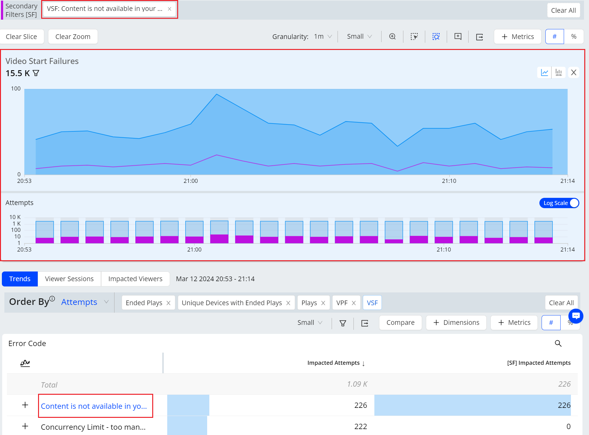
Feature Update:
Deprecates Old Compare and Error Diagnostics in Pulse. With this update, the saved compare and error diagnostics dashboards will now display within Trends. In addition to the Error diagnostics functionality, you can utilize all the benefits of Trends functionalities, such as adding more dimensions and switching between error codes, enabling better analysis.
Use Case:
This feature lets you utilize the functionalities of both Error diagnostics and Trends for deeper data analysis.
More Details: Error Code Diagnostics and Trends dashboard.
Filter Management Layout (Beta)

|
Feature Update:
-
Enhances the Filter Management with a Left Category pane providing different filter categories.
-
Introduces a New Filter option to enhance filter creation and a filter ID column for easier data sorting.
Feature Impact:
This feature displays the filter categories on the left category pane for easier data analysis. Also, providing a +New Filter button to create new filters and a filter ID column.
Use Case:
You can now easily sort the filters based on different categories. You can also create filters by clicking the New Filter button.
More Details: Filter Management and Creating Filters.
February 29, 2024
Quick Error Code Comparisons
|
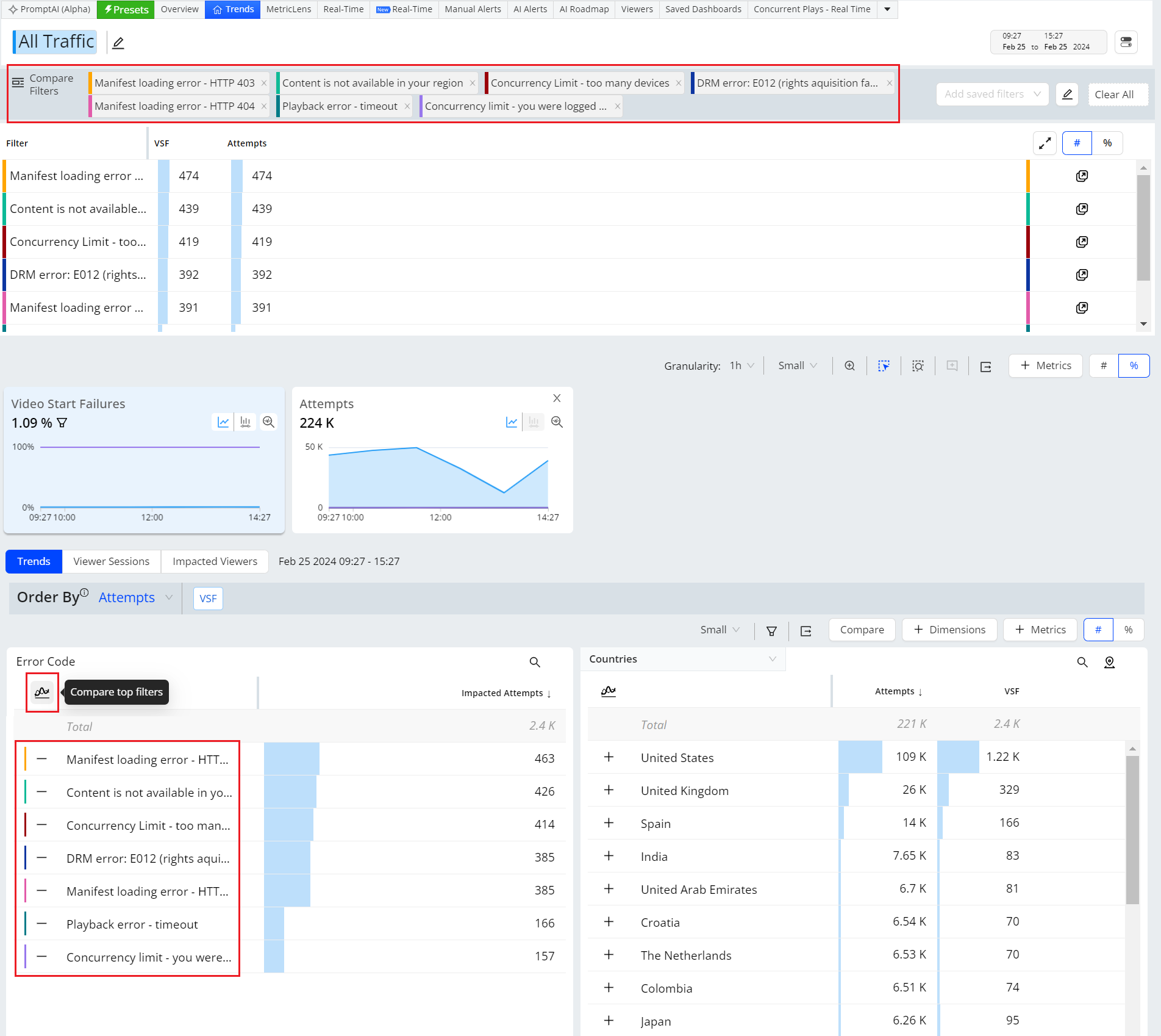
Feature Update:
Adds quick error code comparisons in Trends. This feature displays a new Compare To Filters icon for quick comparison of the top error codes, along with the + symbol next to each error code for individual code selection. Compare Filters appear under the primary filter. Clicking a filtered error code highlights the impacts in the metric widgets.
You can use filtered error codes alongside other dimension drill-downs to analyze advanced error codes. Clicking the Compare button in the dimension tables opens the Compare Filter Builder for advanced filter options, such as equals and not equals.
Use Case:
This feature enables you to easily compare metric deviations of related errors, such as Multiple DRM Errors or multiple Network-related errors.
More Details: Compare.
Real-Time Dashboard (Beta)

|
Feature Update:
Enhances the Real-Time dashboard with,
-
Green / Yellow / Red Bar with threshold data (if any) in the main dashboard. Hover the cell to see the threshold data.
-
Cell turns YELLOW if the value is between 90 – 100% of the threshold, indicating it is approaching the threshold.
-
Cell turns RED once the value crosses the threshold.
-
Small threshold crossing indicator indicating the threshold value relative to the metric value for the YELLOW and RED boxes.
-
The length of the colour bar indicates its relative value in the column.
-
-
Improved threshold page with a single text box for Conviva and Custom threshold.
-
The blue reset button indicates a Custom threshold. Use the reset button to reset the values to Conviva threshold.
-
A quick action tool on the column header to update the same custom value in the entire column.
-
The Real-Time dashboard visually delivers real-time QoE metrics for actionable streaming intelligence. By leveraging selected filters and dimensions, users can actively monitor the performance of their most critical streaming KPIs. Visual threshold crossing indicators enhance this monitoring process, enabling quick identification and correlation of changes in QoE metrics.
Use Case:
This feature allows to actively monitor the performance of their most critical streaming KPIs, with clear green and red bars indication with threshold data to easier data analysis quick identification and correlation of changes in QoE metrics.
More Details: Real-Time.
February 1, 2024
Compare Dashboard Filter Limit

|
Feature Update:
-
Enhances the Compare feature in Trends to twenty filters from ten.
-
Introduces the expand option in Summary Table.
Feature Impact:
This features allows you to add up to 20 dimensions (from any dimension data group) in the compare filter bar. Also, with the new UI option Expand button, you can see all the filters with all the summary details at once.
Use Case:
You can easily compare the details of all the twenty dimensions to provide a deeper data analysis for anomaly detection. You can also perform advanced compare analysis using the compare summary table, quick drill downs to single filter dashboard and toggle individual compare data.
More Details: Compare.
New Setting Panel
|
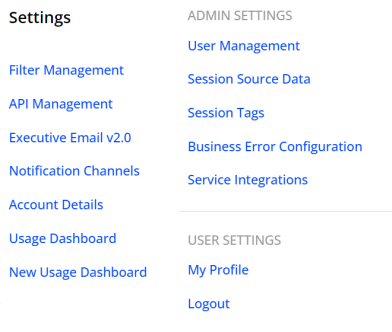
Feature Update:
Introduces New Setting Panel in Pulse now consisting of Filter Management, API Management, Executive Email v2.0, Notification Channels, Account Details, Usage Dashboard, New Usage Dashboard, along with Admin Settings and User Settings.
Feature Impact:
This features displays New Setting Panel in the Right Drawer Navigation Pane of Pulse.
More Details: Navigation and Feature Settings
Filter Management Layout

|
Feature Update:
-
Enhances the Filter Management with a Left Category pane providing different filter categories.
-
Introduces a New Filter option to enhance filter creation.
Feature Impact:
This feature displays the filter categories on the left category pane for easier data analysis. Also, providing a +New Filter button to create new filters.
Use Case:
You can now easily sort the filters based on different categories. You can also create filters by clicking the New Filter button.
More Details: Filter Management and Creating Filters.
Log Scale in Trends
|
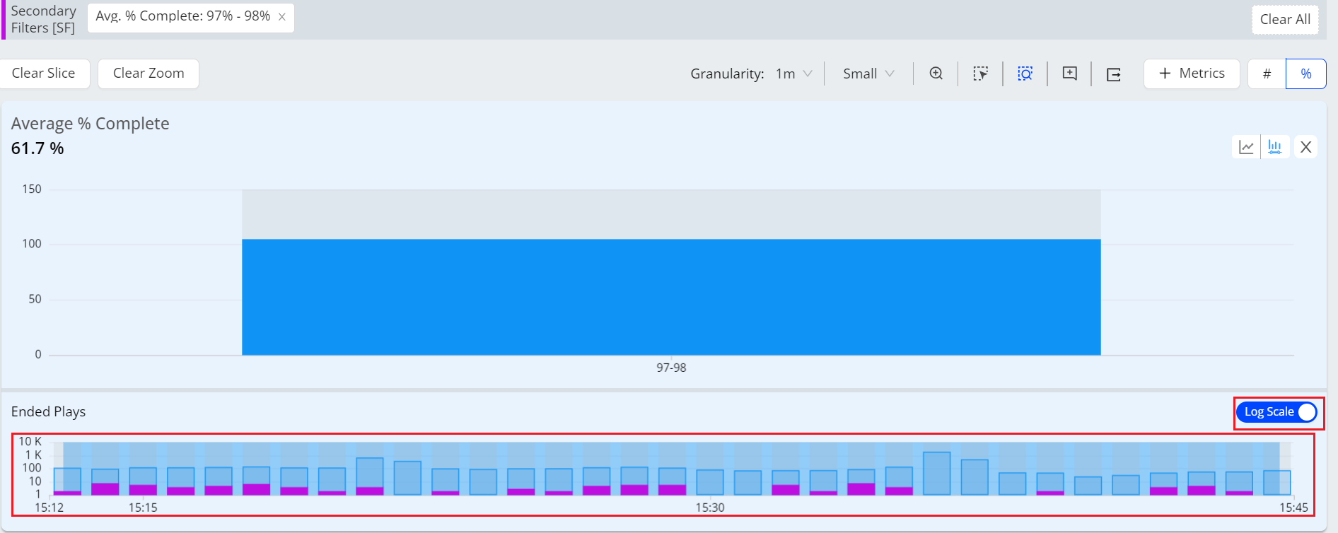
Feature Update:
Introduces the Log Scale option in Focus Mode for a Secondary Metric.
Feature Impact:
This feature provides log scale bar graph with a toggle button.
Use Case:
You can now view the bar graph after applying the secondary filters especially while analyzing larger values.
More Details: Filtering.
Geo Map in Trends (Beta)
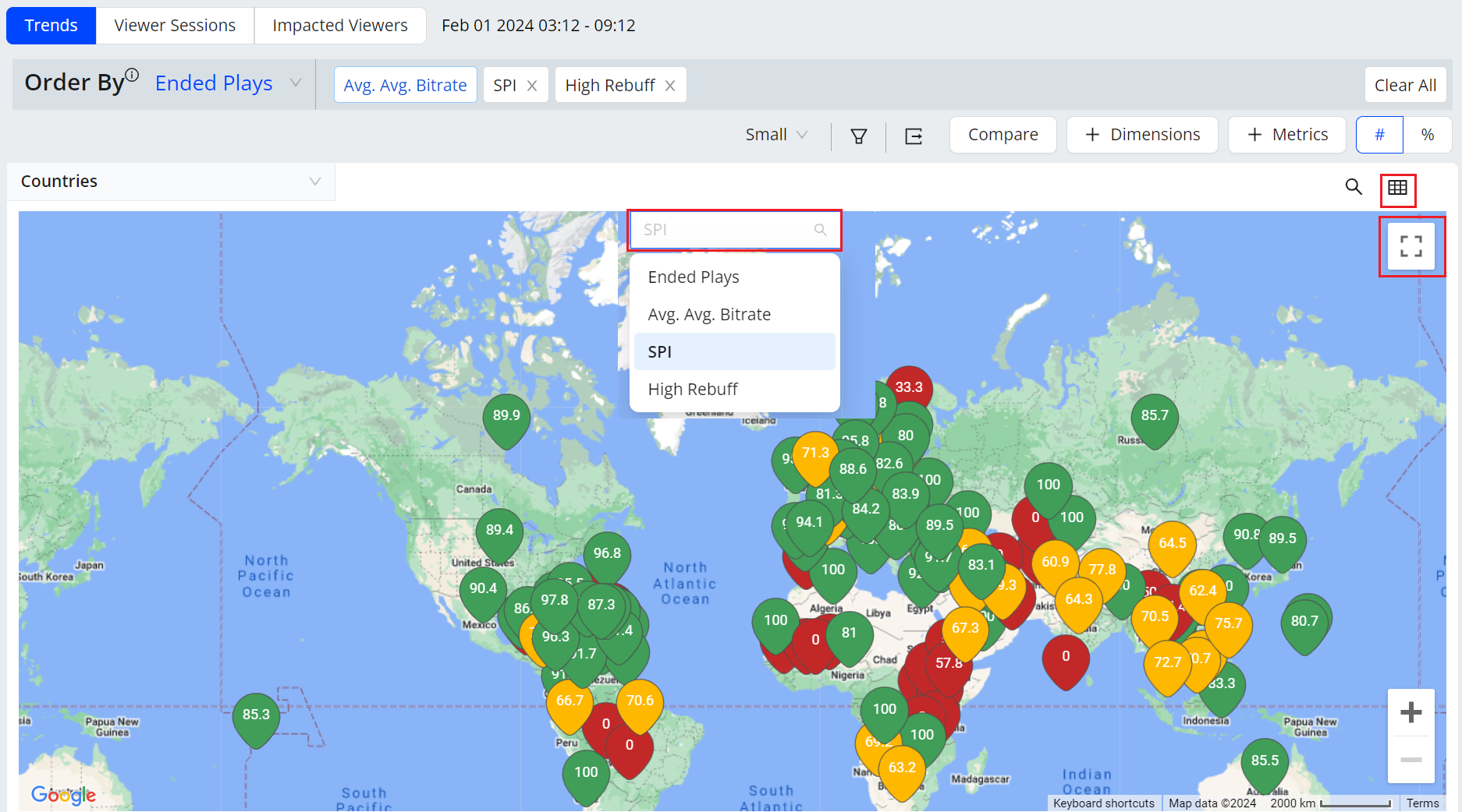
|
Feature Update:
Introduces the GEO Map View within the Dimension table in Trends.
Feature Impact:
This feature provides the geo map view within Dimension table. The UI provides a Map icon to toggle between map view and the dimension table. Also, provides a easy switch between different metrics within the map.
Use Case:
You can now view the geo map with quick search of any location, with a full screen view for great visualization of Geo Dimensions, for different selected metrics.
More Details: Geo Map.
January 18, 2024
New Navigation

|
Feature Update:
Introduces New Navigation in Pulse now consisting of Video (formerly Experience Insights), DPI, Ads, Audience, Integration Tools, and Mini ODP.
Feature Impact:
This features displays New Navigation in the Left Navigation Pane of Pulse.
More Details: Navigation.
AI Alerts Custom Dimensions
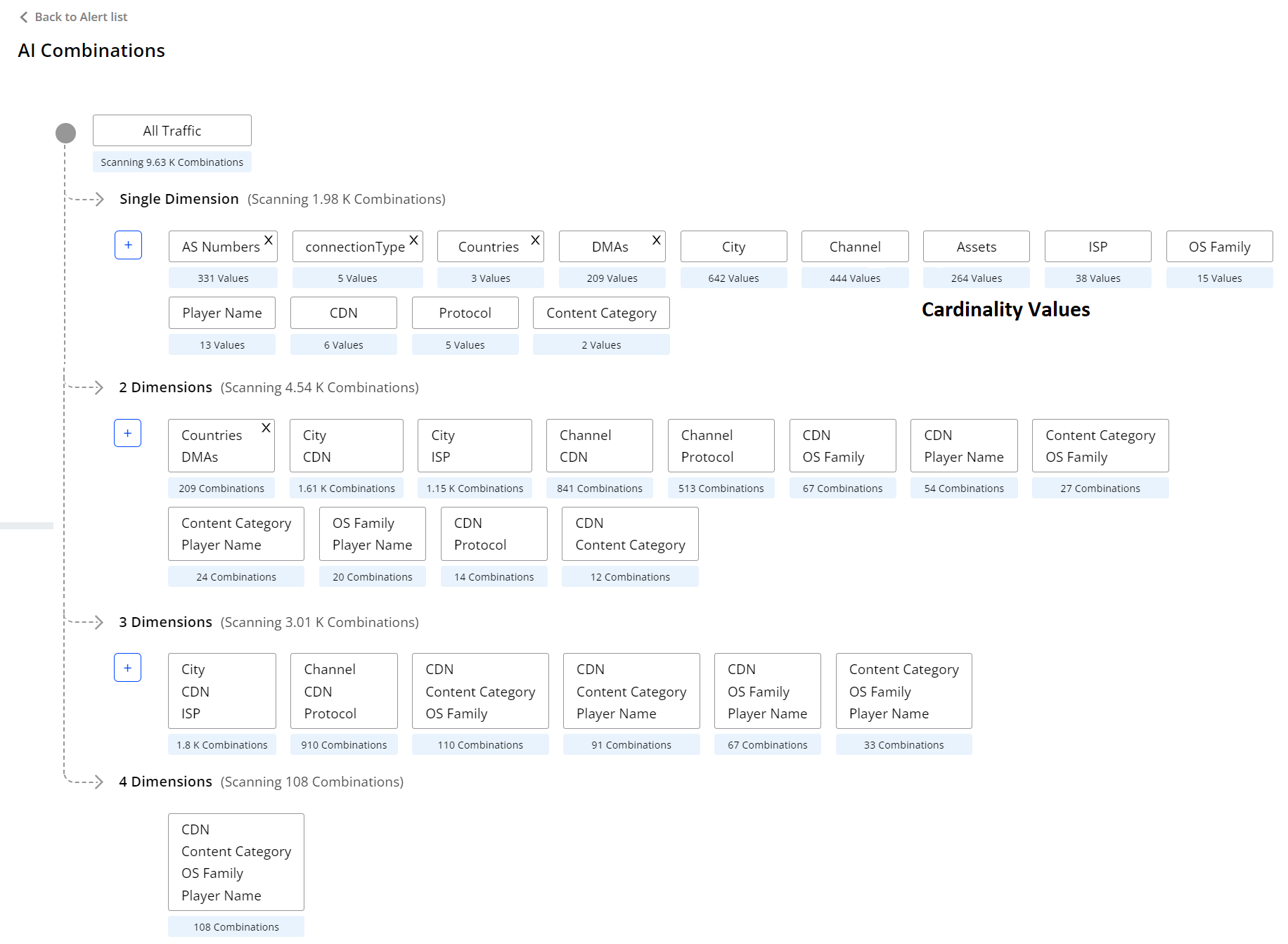
|
Feature Update:
Introduces the AI Alerts Custom Dimension, allowing you to configure custom dimensions as single dimensions or group dimensions.
Feature Impact:
This features displays the AI Combinations page, navigating from the AI alerts dashboard.
Use Case:
You can easily configure custom dimensions as single dimensions or in groups of two or three dimensions to focus AI alerting on specific performance areas, such as an underperforming channel or CDN edge server / OS family combination.
More Details: AI Alert Custom Dimension.
Compare Dashboard
|
|
Feature Update:
Enhances the Compare feature in Trends to ten top filters from five, with addition summary table and drill down to the filter.
Feature Impact:
This features displays top ten dimensions in the compare filter bar with a new addition table and drill down icon. In addition, other new UI options enable advanced compare features such as compare summary table, quick drill down to the single filter dashboard, and toggle compare data.
Use Case:
You can easily compare the details of all the ten dimensions to provide a deeper data analysis for anomaly detection. You can also perform advanced compare analysis using the compare summary table, quick drill downs to single filter dashboard and toggle individual compare data.
More Details: Compare.
2-Hour Date-Picker
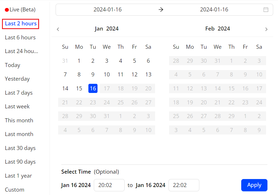
|
Feature Update:
Enhances the Date Picker with a new selection option for Last 2 hours.
Feature Impact:
This features displays the new selection for Last 2 hours in date picker.
Use Case:
You can select the Last 2 hours to get finer data granularity, for better data analysis in anomaly detection.
More Details: Basics.
Rolling Window option for Saved Dashboards
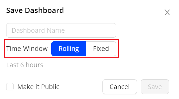
|
Feature Update:
Enhances the Saved Dashboard with the Rolling Time-Window and Fixed time options, based on the current Time Picker setting.
Use Case:
You can save the dashboard with rolling time to see the data on as per the selected timeline.
-
If you save a dashboard with the Last 6 hours option, it will dynamically display data from the past 6 hours to the current time when opened.
-
If you the save the dashboard with the fixed option, the dashboard always shows the data of the selected time.
More Details: Saving Dashboard.
Metrics in Real-Time and MetricLens Dashboards
|
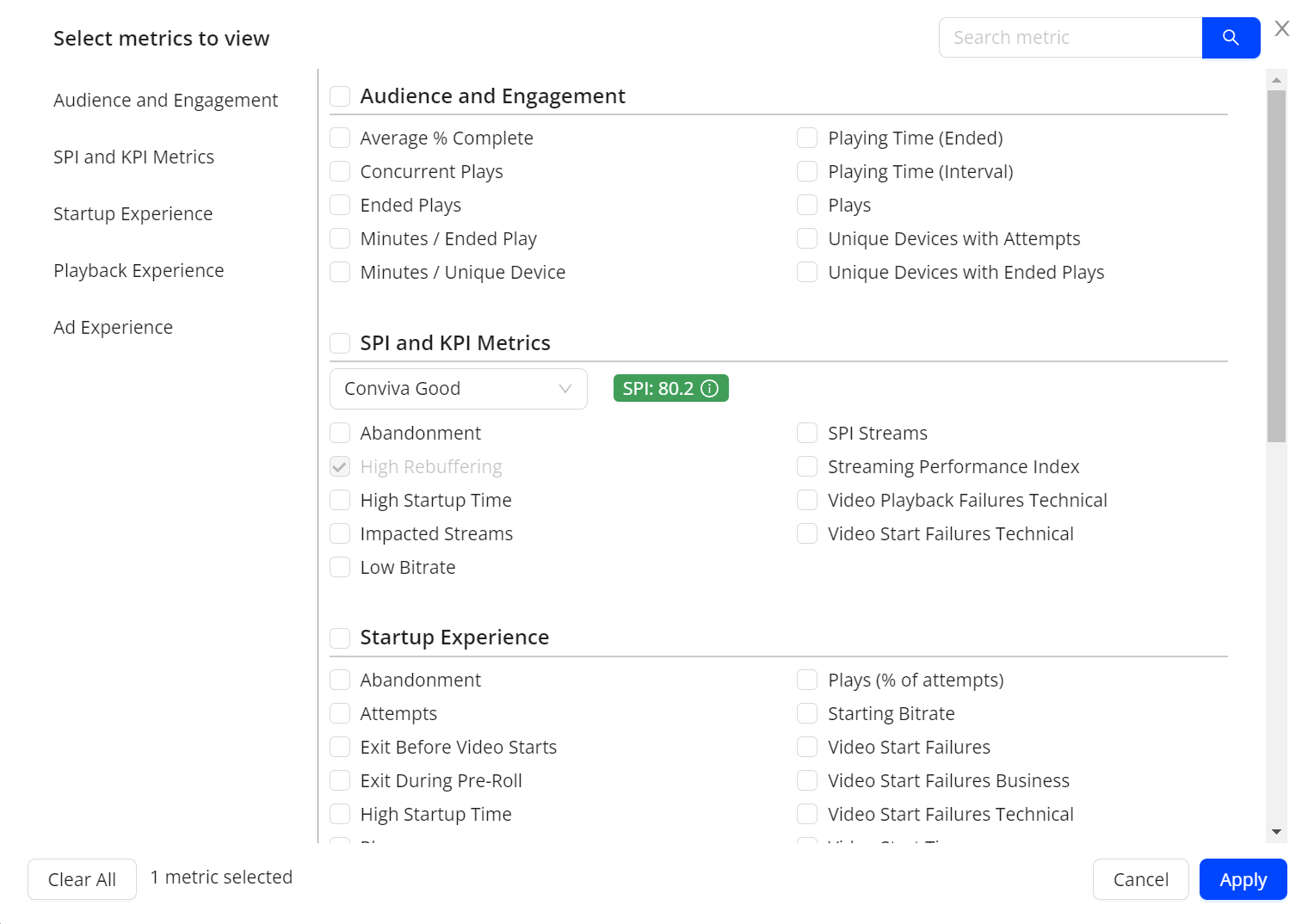
Feature Update:
Enhances the metrics in Real Time and MetricLens dashboard to support all the metrics supported by Trends.
Feature Impact:
This feature lets users choose the complete range of metrics across all categories, enhancing data analysis.
Use Case:
You can now select the metrics like, SPI, Impacted Streams, Low Bitrate Ad Metrics in Real-Time and MetricLens dashboard during the data analysis.
More Details: Real-Time and MetricLens.

