Summary Tab in Trends enables quick overview analysis of your streaming performance data, with several key self-contained UI widgets, such as:
-
SPI score and impacted stream breakout.
-
Ranked improvement opportunities based on SPI threshold settings.
-
Customized metric groups for collective performance evaluation, such as video startup monitoring based on grouping of VST, EBVS, and Attempts metrics.
-
Viewers with the impacted and non-impacted streaming data.
-
Trends dimensions drill-downs based on filters and selected data.
These Summary data allow for easy analysis of audience impacts to determine overall performance baselines, the most critical areas for performance improvements, and metric-based anomaly detection.
Note: Widgets in Trends are self-contained UI elements that display specific data or information, with options for interactive and customizable data display, launching full and customized widget displays, and other data insights, such as filtering the displayed data based on a top improvement opportunity.
Image: Summary

The Summary Tab presets SPI, Streams, Improvement Opportunities, Viewers, while the Metric Groups enables users to group metrics.
Rearrange Widgets
For customized positioning of the Summary widgets, hover over the widget selector and drag the widget to the desired position.
Image: Rearrange Widgets

Add Widgets in Summary Tab
-
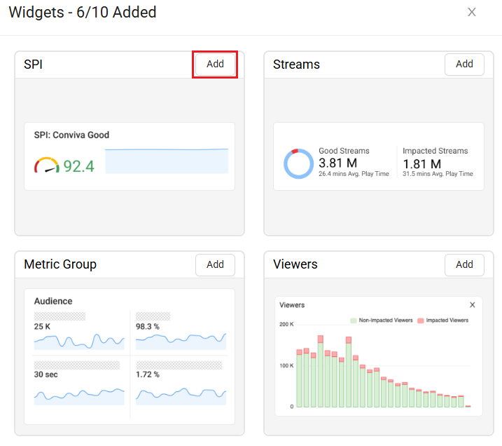
To Add the Widgets in the Summary tab, click +Widgets button from the action bar, to see the Widgets screen.

-
On the Widgets screen, click Add on the widget you wish to add.
-
Click Apply to add the selected Widget.
Note: Add up to ten widgets in the summary tab.

Widgets in the Summary Tab
SPI Widget
The SPI widget provides a visual display of KPI and metric performance over the selected period using SPI streams. It also quickly identifies the number and percentage of impacted streams, which are streams that do not meet one or more of the SPI KPI settings. See the specific KPI performance settings in Improvement Opportunities.
Image: SPI Widget

Note: Clicking the SPI widget on the summary panel displays the SPI metric widget and a new SPI column in the dimensional table.
Improvement Opportunities Widget
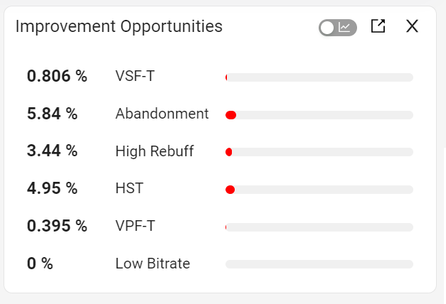
The Improvement Opportunities performance measurements highlight the most common issues that impacted viewer experience in the selected period based on the SPI settings. For example, a high rebuffering ratio may indicate that better alignment of bitrate and buffer control settings could improve viewer experience.
Improvement Opportunities Metrics
-
High Rebuffering (high CIRR or CIRT)
-
Abandonment
-
High Startup Time
-
Video Playback Failure
-
Video Start Failures (VSF-T)
-
Low Bitrate
For information on the Improvement Opportunities Metrics, refer Experience Overview.
|
Image: Improvement Opportunities
|
Image: Improvement Opportunities Time Series
|
Note: Clicking an Improvement Opportunity displays the selected metric widget and sorts the dimensional analysis by that performance indicator, such as HST.
Viewers Widget
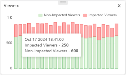
The Viewers widget provides the Impacted and non-impacted streaming times show the average playing times of the related sessions in minutes. For example, impacted streaming time is calculated as the sum of impacted session minutes in the current interval divided by the number of impacted sessions. Hover to see the Impacted and Non-Impacted Viewers details in the bucket.
Image: Viewers
Good and Impacted Streams Widget
Conviva formulates the Conviva Streaming Performance Index, which assesses the percentage of streaming sessions that provide a good or best viewing experience based on the SPI streams. This index takes into account various factors.
This is based on the condition:
GoodSessionAverageLifePlayingTimeMins > BadSessionAverageLifePlayingTimeMins * 1.1
Image: Streams

Note: Clicking the Impacted Streams on the summary panel displays the Impacted streams metric widget and a new Impacted streams column in the dimension table.
For more information on the KPI settings to match your specific performance goals, refer Experience Overview.
Metric Group Widget
Metric Group widget enables the creation of a customized set of up to four metrics, with the option to name the metric group for targeted references, such as Startup Metrics. This widget also provides access to a focused analysis page with expanded time series of the metrics and dimensional drill-downs for easy diagnostics.
For example, create a metric group with startup-related metrics for user engagement, including Attempts, Video Startup Time, High Startup Time, and Abandonment. This metric grouping enables quick access and comparison of key data points within a specific context for data analysis and anomaly detection.
Image: Metric Group
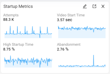
Image: Metric Group drill-down

To drill-down on the Startup metrics,
-
Create a slice across the spike.

-
Sort the dimension data based on the selected dimension.

The Apple devices has high abandonment, so lets compare by creating filters.
-
Click + next to the dimension name to create induvidual filters.
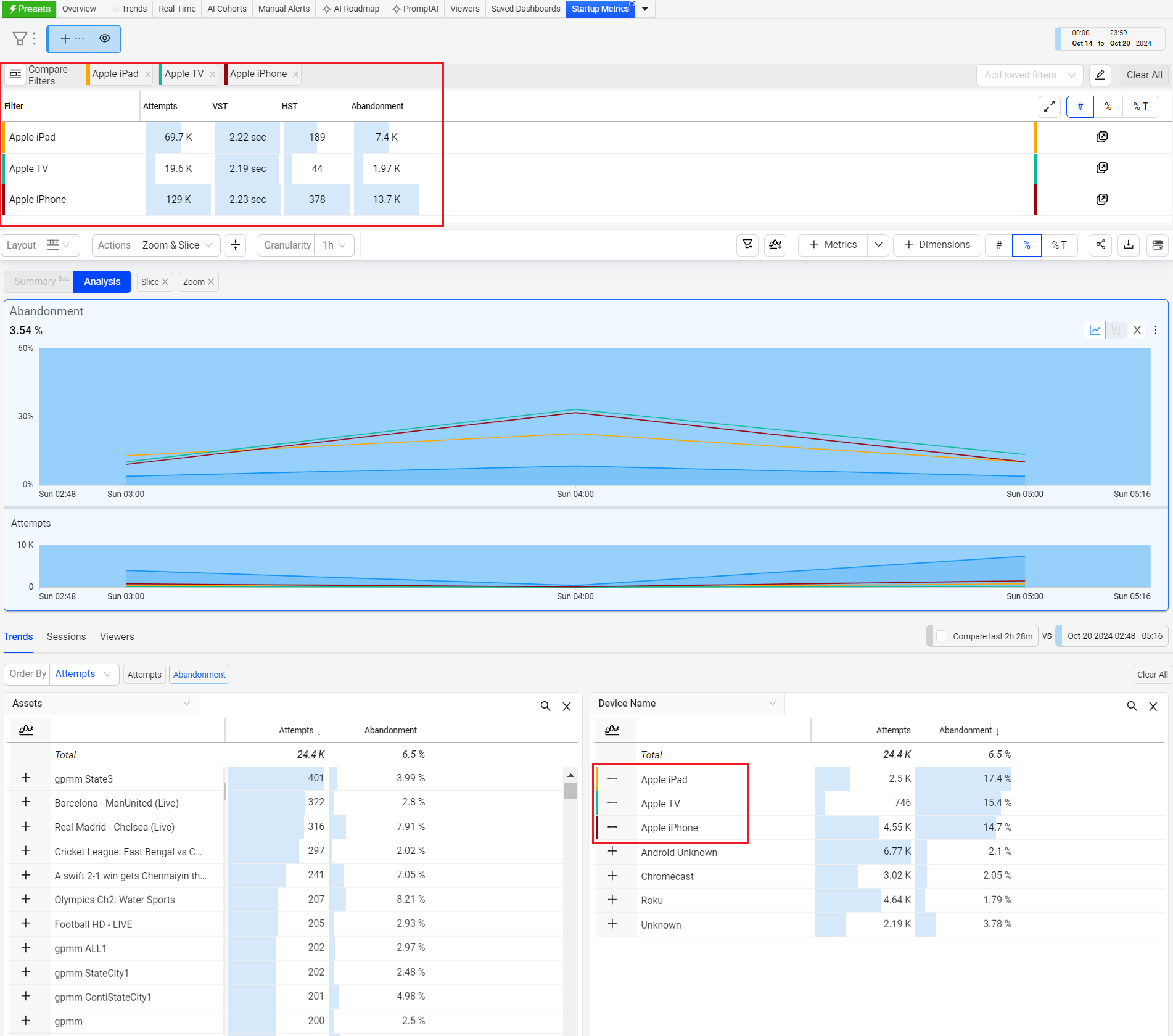
Compare and analyze the data to drill-down to the anamoly.
Widgets Metric Group Summary Widgets Metric Group Widgets Metric Group SPI Improvement Metric GroupSummary Metric Group Oppurtunities Good and Viewers Impacted Streams Summary Metric Group Viewers
