What's New in Video


Video


2024 Releases

September 12, 2024

Filter Builder

Feature Update:

Enhances the Trends dashboard with Inline Filters to create and update filters using saved filters, dimensions, and custom tags without opening the filter builder pop-up screen. The filter icon (with three dots) provides quick access to the filter options to save filter settings, create new filters in the filter builder, and browse saved filters.

Click to expand the image

Use Case:

For example, create an inline filter with the Asset Name as Cricket League and the Device Name as Roku, Android, and Apple TV. This filtered data enhances the data analysis to quickly identify and focus on relevant data points and drill-down to the anomaly.

More Details: Filter Builder.

AI Alert Custom Dimension -- Scanning Combination

Feature Update:

Updates the AI Alert custom dimension scanning combination with,

  • Option to select the dimension combination from the parent level and any dimension supported in the account.

  • Restrict the addition of three dimensions from the first level directly to the third level as it breaks the root-cause chain at the second level.

This feature introduces a dimension combination box at the second and third levels to select combination values from the parent level (the second-level combination serves as the parent for the third level, and the third-level combination serves as the parent for the fourth level).

Click to expand the image

Use Case:

For example, create a second-level dimension combination by selecting the dimensions Device Name and Device Operating System without including the Device Operating System in the single-dimension list. Similarly, create a third-level dimension combination by adding Device Operating System Version to the second-level dimension combination of Device Name and Device Operating System, without adding Device Operating System Version in the single-dimension list.

More Details: AI Alerts Custom Dimensions.

August 22, 2024

Trends -- Layouts, Metric Widgets, Action Bar, and Export

Feature Update:

Enhances the Trends dashboard with,

  • Multiple layout options for positioning metric widgets and dimension tables, enabling you to customize data displays to match your analytic preferences

    The available layout options include:

    • Metric widgets on top, dimension tables below (default layout)

    • Metric widgets on the left and dimension tables on the right

    • Various metric widgets and dimension table sizes, allowing you to expand or contract the displayed metric time series and dimension table values

  • Sticky Action menu bar (always visible) for all actions you can perform

  • Adding metrics to dimension table

    • Append Metric: Click the metric card to append the metric on the dimension table

    • Replace Metric: Click Replace Metric in Dimension Table Icon on the diagnostic metric widget to append the metrics to the existing metrics in the dimension table

  • Right drawer Export Options list, allowing you to select the items you want to export

  • Advance Filter and Advance Compare options are now under the Actions menu

Click to expand the image


Use Case:

Select the layout option which allows you to tailor the dashboard’s appearance and functionality, giving you greater flexibility to interact with data in ways that align with your workflows and preferences.

More Details: Layout in Trends, and Trends.

Dimension Table Compare

Feature Update:

Enhances the dimension tables to display percentages and enables shaded compare periods in diagnostic metric widgets, significantly improving data visualization and analysis.

This feature update also includes a percentage up/down column in the dimension tables to highlight the impact of metric changes. In addition, a shaded (grey) area in the metric widget time series allows quick comparisons between the current and previous periods.

Click to expand the image

Use Case:

This new feature enable users to perform a deeper data analysis by providing them with an enhanced view of date or time slice comparsions.

In this example,

  • Create a slice across VSF-T spike.

  • Select the checkbox next to Compare prev 35m.

Timeseries updates to highlight the previous duration (in grey) and the dimension table refreshes to show VSF-T increased across dimensions.

More Details: Table Compare.

Webhooks

Feature Update:

Updates Webhooks with a new UI, for a better user experience.

Webhooks enables automated notifications to external systems when an AI alert fires within Conviva. These notifications, delivered through HTTP POST requests to a specified URL on your server, allow seamless integration of Conviva alert events into external applications. This includes displaying alerts in aggregation systems or triggering workflows in applications like Pagerduty, JIRA or other support ticket systems.

Use Case:

Expand alert handling with webhooks enabled so that when Conviva Video detects an issue during ad playback failure, it generates an alert in Pulse and also sends the alert to other alerting systems as specified in the webhook server URL. For example, if PagerDuty is the configured integrated aggregation system, the alert triggers a notification in Pulse and PagerDuty, enabling coordinated incident notification and management. This expanded alerting provides more options for identification, especially outside of regular business hours, and resolution of ad playback issues, significantly improving overall alert response times.

More Details: Webhooks.

July 18, 2024

Remove Data Dip for Partial Data in the Last Time Series Data Bucket

Remove Data Dip for Partial Data in the Last Time Series Data Bucket

d

Feature Update:

Removes the last partial data bucket by dropping any partial data in the last time series data bucket if there is a delay in data ingestion, no data availability from the source, or only partial data available in the data bucket, based on the selected granularity and the specified date and time range.

Use Case:

For example, the date picker sets the range from 14 July at 1:30 pm to 14 July at 4:37 pm with a granularity of 5 minutes. The last time series data bucket spans from 4:35 pm to 4:37 pm, resulting in only 2 minutes of data, which would likely cause a dip in the time series due to partial data availability. Therefore, the partial data in that data bucket, which would cause an observable drop or dip in the last data bucket in the time series, is no longer shown.

More Details: Metric Dictionary and Trends.

July 3, 2024

Real-Time (NoC) Dashboard -- Green bar

Real-Time (NoC) Dashboard -- Green Bar

Feature Update:

Enhances the Green bar in the Real-Time dashboard with,

  • A toggle (inside toggle settings) to switch on and off the green bars. When you need to focus on the Red or Yellow bars, you can switch off the green bars using this toggle.

  • The green bar appears only when the audience threshold is met, and the metric threshold (Conviva or custom) is set. Else, the background color remains grey.

Click to expand the image

Use Case:

This feature actively monitors critical streaming KPIs, indicating performance through green and red bars with threshold data for easier analysis and quick identification of changes in QoE metrics. When you need to focus on the red or yellow bars, you can switch off the green bars using the toggle for a better user experience.

More Details: Real-Time.

June 12, 2024

Percentage of Total

Feature Update:

Enhances the dimension data in Trends and MetricLens with Percentage of Total, indicating the percentage of impacted sessions for the displayed dimension values. In this example, the United States value had 54.9% of the total sessions with VSF-T in the country dimension. Similarly, the North America dimension value had 55.4% of the total sessions with VSF-T in the continent dimension.

Click to Expand

Use Case:

This new feature details the impacted percentage contribution of dimension entities, offering better insights during data analysis. For example, you can see the percentage of Ended Plays by geographic location or the percentage of Attempts from each browser.

More Details: Trends and MetricLens.

Viewer Module - Live Mode

Feature Update:

Updates the Viewer Module in Live mode to display the message Summary data is not applicable for Live Mode. The summary metrics compile data from all sessions within the selected time interval. Meanwhile, live mode displays data only from active sessions, potentially causing data point mismatches. Therefore, summary data is not applicable in live mode.

More Details: Viewers.

May 6, 2024

Drill-down from Custom Dashboard to Trends

Feature Update:

Enhances the Custom dashboard by adding a Focus button for detailed data analysis. This enables you to access an enhanced view of the selected dimension tag as a filter in Pulse.

This feature,

  • Provides the enhanced view of the selected metric along with the dimension data updated based on the filter applied.

  • Displays the Focus button next to the dimension tag on hover. Clicking the focus button enables you to view the dashboard with the selected dimension tag as the filter.

Click to Expand

Use Case:

This new feature provides a single-click option to drill-down to the selected dimension tag, providing an enhanced view of the selected dimension tag as a filter in Pulse. This allows you to have an in-depth data analysis.

More Details: Custom Dashboards.

Pulse UI change

Feature Update:

Enhances the Pulse with the new design to make it consistent and space efficient. The changes include the font change, icons to tables and cells, also replace the Metric,and Dimensions pop-up windows with a right-drawer.

More Details: Trends.

Dimension Table Compare (Beta)

Feature Update:

Enhances the dimension tables to display percentages and enables shaded compare periods in diagnostic metric widgets, significantly improving data visualization and analysis.

This feature displays one additional column showing the percentage up or down against each value in the dimension table. Also, displaying the shaded portion (in grey) in the metric widget to compare the details in time series. This helps you to identify at what time the metric deviated.

Use Case:

This new feature enable users to perform a deeper data analysis by providing them with an enhanced view of date or time slice comparsions.

In this example,

  • Create a slice across VSF-T spike.

  • Select the checkbox next to Compare prev 35m.

Timeseries updates to highlight the previous duration (in grey) and the dimension table refreshes to show VSF-T increased across dimensions.

More Details: Table Compare.

April 25, 2024

Real-Time Dashboard (GA)

Real-Time Dashboard (GA)

Feature Update:

Replaces the Real-Time dashboard with a new dashboard. Enhancing the dashboard with,

  • Colour coding indicators (Green / Yellow / Red) representing values below, nearing, or surpassing thresholds. The bar length reflects the metric's relative value within the column and hovering over a cell reveals the threshold data.

  • Improved threshold page with a single text box for Conviva and Custom threshold, with a blue reset button for reverting to Conviva values and a quick action tool on the column header to update the same custom value in the entire column.

  • View Threshold button for easy access to Manage Threshold page.

  • Auto Sort and Threshold toggle buttons on the Manage Threshold page for better user experience.

The Real-Time dashboard provides real-time QoE metrics for streaming intelligence. Users monitor critical streaming KPIs using selected filters and dimensions, with visual threshold indicators to identify metric changes quickly.

Use Case:

This feature actively monitors critical streaming KPIs, indicating performance through green and red bars with threshold data for easier analysis and quick identification of changes in QoE metrics.

More Details: Real-Time.

April 11, 2024

Filter Management Layout

Feature Update:

  • Enhances the Filter Management with a Left Category pane providing different filter categories.

  • Introduces a New Filter option to enhance filter creation and a filter ID column for easier data sorting.

This feature displays the filter categories on the left category pane for easier data analysis. Also, providing a +New Filter button to create new filters and a filter ID column.

Use Case:

You can now easily sort the filters based on different categories. You can also create filters by clicking the New Filter button.

More Details: Filter Management and Creating Filters.

New Metric: Ended Plays/Unique Device

Feature Update:

Introduces the new Ended Plays/Unique Device metric, which helps you understand the number and percent of viewers who watched more videos on the same device and likely experienced higher engagement.

This new metric enhances the Trends, Metric Lens, and Real-Time with a new column for Ended Plays/Unique Device.

Use Cases:

This metric indicates the average number of videos watched on a device, reflecting user engagement. It can also highlight specific issues when there is an unusually high or low number of plays for a particular asset/device type, indicating potential playback/quality issues.

More Details: Ended Plays/Unique Device

AI Alert Diagnostics - Summary

Feature Update:

Enhances the AI Alert Diagnostics Dashboard with Cumulative Total Unique Devices details to the alert summary section to providing more insights to the alert summary. Cumulative Total Unique Devices refers to the total number of distinct devices that accessed or streamed content over a specific period of time. CTUD aggregates all these individual device counts over time, providing a comprehensive view of how many different devices have interacted with the streaming platform.

In this example considering there are 1000 devices, 255 devices attempt to play a video and out of which 137 devices exits before video starts. Hence the Cumulative Total Unique Devices (CTUD) is 255 and Cumulative Impacted Unique Devices (CIUD) is 137, which is 53.72%.

Use Case:

This feature allows to actively monitor Cumulative Total Unique Devices of an alert to track the platform's overall reach among users.

More Details: AI Alerts.

Real-Time Dashboard (Beta)

Feature Update:

Enhances the Real-Time dashboard with,

  • View Threshold button for easy access to Manage Threshold page.

  • Auto Sort toggle button and Threshold toggle button in Manage Threshold page for better user experience.

This feature provides the View Threshold button to easiler access to Manage Threshold page. Also the hamberger icon is introduced instead of a kebab Icon with Auto Sort and Threshold toggles in Real-Time and Manage Threshold page respectively.

The Real-Time dashboard shows real-time QoE metrics for streaming intelligence. Users monitor critical streaming KPIs with filters and visual indicators to identify QoE changes quickly.

Use Case:

This feature allows to actively monitor the performance of their most critical streaming KPIs, with clear green, yellow, and red bars indication with threshold data to easier data analysis quick identification and correlation of changes in QoE metrics.

More Details: Real-Time.

March 13, 2024

Single AI Alert Sensitivity Config Page

Feature Update:

Enhances AI Alerts Sensitivity with a single new right drawer config sensitivity page. This feature displays all the metrics in a single page, allowing you to set the severity values for all metrics simultaneously.

Use Case:

This feature lets you simultaneously set the severity values for all metrics while monitoring the AI Alerts.

More Details: AI Alert Sensitivity.

Deprecate Old Compare and Error Diagnostics

Feature Update:

Deprecates Old Compare and Error Diagnostics in Pulse. With this update, the saved compare and error diagnostics dashboards will now display within Trends. In addition to the Error diagnostics functionality, you can utilize all the benefits of Trends functionalities, such as adding more dimensions and switching between error codes, enabling better analysis.

Use Case:

This feature lets you utilize the functionalities of both Error diagnostics and Trends for deeper data analysis.

More Details: Error Code Diagnostics and Trends dashboard.

Filter Management Layout (Beta)

Feature Update:

  • Enhances the Filter Management with a Left Category pane providing different filter categories.

  • Introduces a New Filter option to enhance filter creation and a filter ID column for easier data sorting.

Feature Impact:

This feature displays the filter categories on the left category pane for easier data analysis. Also, providing a +New Filter button to create new filters and a filter ID column.

Use Case:

You can now easily sort the filters based on different categories. You can also create filters by clicking the New Filter button.

More Details: Filter Management and Creating Filters.

February 29, 2024

Quick Error Code Comparisons

Feature Update:

Adds quick error code comparisons in Trends. This feature displays a new Compare To Filters icon for quick comparison of the top error codes, along with the + symbol next to each error code for individual code selection. Compare Filters appear under the primary filter. Clicking a filtered error code highlights the impacts in the metric widgets.

You can use filtered error codes alongside other dimension drill-downs to analyze advanced error codes. Clicking the Compare button in the dimension tables opens the Compare Filter Builder for advanced filter options, such as equals and not equals.

Use Case:

This feature enables you to easily compare metric deviations of related errors, such as Multiple DRM Errors or multiple Network-related errors.

More Details: Compare.

Real-Time Dashboard (Beta)

Feature Update:

Enhances the Real-Time dashboard with,

  • Green / Yellow / Red Bar with threshold data (if any) in the main dashboard. Hover the cell to see the threshold data.

    • Cell turns YELLOW if the value is between 90 – 100% of the threshold, indicating it is approaching the threshold.

    • Cell turns RED once the value crosses the threshold.

    • Small threshold crossing indicator indicating the threshold value relative to the metric value for the YELLOW and RED boxes.

    • The length of the colour bar indicates its relative value in the column.

  • Improved threshold page with a single text box for Conviva and Custom threshold.

    • The blue reset button indicates a Custom threshold. Use the reset button to reset the values to Conviva threshold.

    • A quick action tool on the column header to update the same custom value in the entire column.

The Real-Time dashboard visually delivers real-time QoE metrics for actionable streaming intelligence. By leveraging selected filters and dimensions, users can actively monitor the performance of their most critical streaming KPIs. Visual threshold crossing indicators enhance this monitoring process, enabling quick identification and correlation of changes in QoE metrics.

Use Case:

This feature allows to actively monitor the performance of their most critical streaming KPIs, with clear green and red bars indication with threshold data to easier data analysis quick identification and correlation of changes in QoE metrics.

More Details: Real-Time.

February 1, 2024

Compare Dashboard Filter Limit

Feature Update:

  • Enhances the Compare feature in Trends to twenty filters from ten.

  • Introduces the expand option in Summary Table.

Feature Impact:

This features allows you to add up to 20 dimensions (from any dimension data group) in the compare filter bar. Also, with the new UI option Expand button, you can see all the filters with all the summary details at once.

Use Case:

You can easily compare the details of all the twenty dimensions to provide a deeper data analysis for anomaly detection. You can also perform advanced compare analysis using the compare summary table, quick drill downs to single filter dashboard and toggle individual compare data.

More Details: Compare.

New Setting Panel

Feature Update:

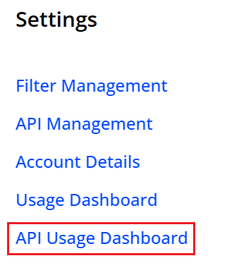
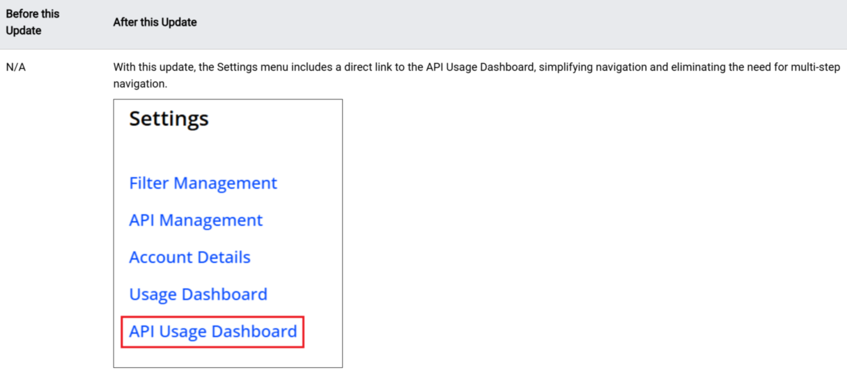
Introduces New Setting Panel in Pulse now consisting of Filter Management, API Management, Executive Email v2.0, Notification Channels, Account Details, Usage Dashboard, New Usage Dashboard, along with Admin Settings and User Settings.

Feature Impact:

This features displays New Setting Panel in the Right Drawer Navigation Pane of Pulse.

More Details: Navigation and Feature Settings

Filter Management Layout

Feature Update:

  • Enhances the Filter Management with a Left Category pane providing different filter categories.

  • Introduces a New Filter option to enhance filter creation.

Feature Impact:

This feature displays the filter categories on the left category pane for easier data analysis. Also, providing a +New Filter button to create new filters.

Use Case:

You can now easily sort the filters based on different categories. You can also create filters by clicking the New Filter button.

More Details: Filter Management and Creating Filters.


Log Scale in Trends

Feature Update:

Introduces the Log Scale option in Focus Mode for a Secondary Metric.

Feature Impact:

This feature provides log scale bar graph with a toggle button.

Use Case:

You can now view the bar graph after applying the secondary filters especially while analyzing larger values.

More Details: Filtering.

Geo Map in Trends (Beta)

Feature Update:

Introduces the GEO Map View within the Dimension table in Trends.

Feature Impact:

This feature provides the geo map view within Dimension table. The UI provides a Map icon to toggle between map view and the dimension table. Also, provides a easy switch between different metrics within the map.

Use Case:

You can now view the geo map with quick search of any location, with a full screen view for great visualization of Geo Dimensions, for different selected metrics.

More Details: Geo Map.

January 18, 2024

New Navigation

Feature Update:

Introduces New Navigation in Pulse now consisting of Video (formerly Experience Insights), Eco, Ads, Audience, Social, Integration Tools, and Mini ODP.

Feature Impact:

This features displays New Navigation in the Left Navigation Pane of Pulse.

More Details: Navigation.

AI Alerts Custom Dimensions

Feature Update:

Introduces the AI Alerts Custom Dimension, allowing you to configure custom dimensions as single dimensions or group dimensions.

Feature Impact:

This features displays the AI Combinations page, navigating from the AI alerts dashboard.

Use Case:

You can easily configure custom dimensions as single dimensions or in groups of two or three dimensions to focus AI alerting on specific performance areas, such as an underperforming channel or CDN edge server / OS family combination.

More Details: AI Alert Custom Dimension.


Compare Dashboard

Feature Update:

Enhances the Compare feature in Trends to ten top filters from five, with addition summary table and drill down to the filter.

Feature Impact:

This features displays top ten dimensions in the compare filter bar with a new addition table and drill down icon. In addition, other new UI options enable advanced compare features such as compare summary table, quick drill down to the single filter dashboard, and toggle compare data.

Use Case:

You can easily compare the details of all the ten dimensions to provide a deeper data analysis for anomaly detection. You can also perform advanced compare analysis using the compare summary table, quick drill downs to single filter dashboard and toggle individual compare data.

More Details: Compare.


2-Hour Date-Picker

Feature Update:

Enhances the Date Picker with a new selection option for Last 2 hours.

Feature Impact:

This features displays the new selection for Last 2 hours in date picker.

Use Case:

You can select the Last 2 hours to get finer data granularity, for better data analysis in anomaly detection.

More Details: Basics.


Rolling Window option for Saved Dashboards

Feature Update:

Enhances the Saved Dashboard with the Rolling Time-Window and Fixed time options, based on the current Time Picker setting.

Use Case:

You can save the dashboard with rolling time to see the data on as per the selected timeline.

  • If you save a dashboard with the Last 6 hours option, it will dynamically display data from the past 6 hours to the current time when opened.

  • If you the save the dashboard with the fixed option, the dashboard always shows the data of the selected time.

More Details: Saving Dashboard.

Metrics in Real-Time and MetricLens Dashboards

Feature Update:

Enhances the metrics in Real Time and MetricLens dashboard to support all the metrics supported by Trends.

Feature Impact:

This feature lets users choose the complete range of metrics across all categories, enhancing data analysis.

Use Case:

You can now select the metrics like, SPI, Impacted Streams, Low Bitrate Ad Metrics in Real-Time and MetricLens dashboard during the data analysis.

More Details: Real-Time and MetricLens.

2023 Releases

December 14,2023

Enhanced Dimensions in AI Alerts Diagnostics

Enhanced Dimensions in AI Alerts Diagnostics

Feature Update:

Enhances the AI Alert Diagnostics with a Dimensions button for custom dimension selection and drill down. The dimension associated with the root cause group is automatically displayed as the first dimension.

Feature Impact:

Adds a new Dimension button in the drill down toolbar of the AI Alert Diagnostics page. For easy drill down in the root cause diagnostics, the dimension associated with the AI alert root cause displays as the first dimension.

Use Case:

Quickly discover dimension entities related to the root cause of an AI alert, such as AKAMAI (CDNs), Vod (Content Category), and Brightcove Web Player (Player Name), with an automatic display of these dimensions.

More Details: AI Alert Diagnostics.

November 2,2023

Compare in Trends

Compare in Trends

Feature Update:

Provides instant compare in Trends with a new compare workflow so you can quickly compare filters for the top five dimension entities or you can compare across the custom list of dimensions filters.

Feature Impact:

Adds a Compare Top Filters icon in the dimension tables to quickly create instant comparisons of top dimension entities in metric widgets.

Adds a Compare button in action bar for custom comparisons based on logical AND/OR dimension combinations and custom entity selection.

Use Case:

You can easily compare the multiple dimension values in metric widgets for analysis in Trends, such as High Startup Time across countries.

More Details: Compare and Trends.

October 19,2023

Custom Dashboards Updates:

Pulse 4 Update:

Custom Dashboards: Support Multiple Data Sources

Feature Update:

Adds support for multiple data sources in Custom dashboards to enhance analysis across your video streams, ads, and application performance.

Note: Page-level filters are not available when using multiple data sources.

Feature Impact:

  • Adds a new pop-up window for creating a new Custom dashboard. The new window includes:

    • Dashboard Name field to enter a dashboard name.

    • Dashboard Type check box to enable the selection of a single data source or multiple data sources.

    • Data Source drop-down list to select a data source type or multiple data sources.

  • Adds a Data Source drop-down list to select a data source type on both the Add New Widget page and the Edit Widget page in the edit mode.

Use Case:

To provide an executive overview of streaming and app performance in a single dashboard, select VIDEO and APP as data sources when creating the Custom dashboard, and add widgets for streaming SPI and app crashes metrics.

More Details: Custom Dashboards

Custom Dashboards: Enhanced Filter Comparison

Feature Update:

Enhances the filter comparison feature by increasing the number of filters from 5 to 10.

Feature Impact:

Increases the number of filters from 5 to 10 when using the filter comparison feature.

Use Case:

To compare data in a widget from different filters, click Edit in the edit mode, enable Filter Comparison, select desired filters, and click OK.

More Details: Custom Dashboards

Custom Dashboards: Enhanced Bar and Map Filter Functions

Feature Update:

Enhances the bar and map filters by providing these functions:

  • Set the number of values that can be displayed in the bar or map.

  • Select static values as advanced filters in the bar or map.

  • Toggle between the visual view and the table view.

Feature Impact:

Adds these new field and icons to support the new feature:

  • Row limits field to set the number of values that can be displayed.

  • Advanced Filter icon to select static values as advanced filters in the bar or map.

  • View Table and View Chart icons to toggle between the visual view and the table view.

Use Case:

To compare attempts from specific countries in a created bar chart, click the Advanced Filter icon at the top right corner of the bar in the Edit mode, select the specific countries, and click OK. The bar chart data updates to reflect your selection.

More Details: Custom Dashboards

Deprecate the Email 1.0, Quality, Audience, Engagement, Real-Time Dashboards from Pulse 4 OR Deprecate Pulse 4

Feature Update:

All the Pulse 4 dashboards expect for device validation and Top Rising Content are no longer available in the Navigation menu.

Feature Impact:

The Pulse 4 Real-Time, Quality, Audience, Engagement, Traffic, Player Insights, Custom Dashboards and Top Rising Content is no longer available.

In new Pulse,

  • Trends dashboard introduces a range of new capabilities designed to enhance streaming performance and metric analysis.

  • Experience Overview highlights your streaming activity and performance. It enables you to assess your streaming level swiftly, compare performance against the Conviva Streaming Performance Index, and analyze improvement opportunities across key performance areas.

  • Real-Time dashboard provides a visual presentation of QoE metrics for actionable streaming intelligence in real time.

  • The MetricLens dashboard is enhanced to enable dimensional analysis of quality and audience metrics in a unified visual presentation of metric comparison bars and time series with 1-hour granularity.

Use Case:

Instead of Legacy Pulse, customer should use the new Pulse with improved and more powerful Pulse Dashboards which provides advanced analytics, performance optimization and enhanced user experience.

More Details: Trends, Experience Overview, and MetricLens

October 5,2023

Remove the Legacy Pulse link from Pulse Navigation Menu

Feature Update:

The Legacy Pulse link in the left menu is now removed.

Feature Impact:

Access to Legacy Pulse is no longer available from the left Navigation menu. Customers still migrating from Legacy Pulse can still access the app through the direct URL.

Use Case:

Instead of Legacy Pulse, customers should use the new Pulse dashboards and features for impacted viewers and session analysis, enhanced dimensional drill-downs, SPI analysis, advance metric filtering, real-time data in Trends, and other enhancements.

More Details: Trends Dashboard.

Deprecate the MetricLens and Viewers Features from Pulse 4

Feature Update:

The Pulse 4 Viewers and MetricLens feature links no longer available from the left menu.

Feature Impact:

The Pulse 4 Viewers and MetricLens features are deprecated and are no longer available.

In new Pulse, Viewers is enhanced to include persistence, pagination, impacted sessions indicator, and an advanced simple mode view for custom tags. The MetricLens dashboard is enhanced to enable dimensional analysis of quality and audience metrics in a unified visual presentation of metric comparison bars and time series with 1-hour granularity.

Use Case:

Instead of Legacy Pulse, customer should use the new Pulse Viewers for enhanced viewer activity and impact analysis, and MetricLens for analyzing the quality and audience metrics.

More Details: Viewer Sessions and MetricLens


September 22,2023

Custom Dashboards: Enhanced Sharing Capability

Feature Update:

Enhances the sharing capabilities to grant edit or view permissions to individual users within the same C3 account and invite collaborators to make changes to custom dashboards.

Feature Impact:

  • Adds a drop-down list for selecting preset options on the pop-up window after clicking Share for assigning edit or view permissions to individual users.

  • Adds the Edit Dashboard button to enter the edit mode.

  • Adds the Edit Mode switch button in the edit mode to indicate your editing status and to exit when needed.

Use Case:

To collaborate with other users on a dashboard you created, open the kebab menu, choose Only specific people can view or edit from the drop-down list of pop-up window, and do these steps:

  • To grant view permissions to some users, select the email addresses, select Can View, and click Apply.

  • To grant edit permissions to some users, select the email addresses, select Can Edit, and click Apply.

More Details: Custom Dashboards

Viewer Sessions: Max Time Range Expanded to 24 Hours

Feature Update:

Enhances the viewer sessions maximum time range from three hours to 24 hours.

Feature Impact:

This features displays the viewer session for a 24 hour time range during the timeline analysis.

Use Case:

You can precisely drill-down to the impacted sessions during an entire day for deeper analysis.

More Details: Viewer Sessions

Expand Error Code Character Limit to 256 Characters

Feature Update:

Expands the error code character limit from 128 characters to 256 characters to display more robust error codes.

Feature Impact:

This features displays the error code (up to 256 characters) in Trends.

Use Case:

You can easily see long error code text during the error code analysis.

More Details: Trends

Ad Unique Devices and Ad Minutes/Unique Device metrics added to EI Metric selector

Feature Update:

Adds the metrics Ad Unique Devices and Ad Minutes/Unique Device to the EI Metric selector.

Feature Impact:

This features displays the metrics Ad Unique Devices and Ad Minutes/Unique Device under the Ad Experience section of the EI Metric selector pop-up screen.

Use Case:

You can gain better insights into the ad experience by monitoring the total number of minutes and devices that had Ad Ended Plays during the selected interval.

More Details: Trends

AI Alerts Custom Dimensions (Beta)

Feature Update:

Introduces the AI Alerts Custom Dimension, allowing you to configure custom dimensions as single dimensions or group dimensions.

Feature Impact:

This features displays the AI Combinations page, navigating from the AI alerts dashboard.

Use Case:

You can easily configure custom dimensions as single dimensions or in groups of two or three dimensions to focus AI alerting on specific performance areas, such as an underperforming channel or CDN edge server / OS family combination.

More Details: AI Alert Custom Dimension

September 7,2023

Custom Dashboards: Map Visual Type

Feature Update:

Adds support for the Map visual type when setting up a new widget. This feature enables an intuitive way to check metrics from geographical perspectives, such as country, state, and city.

Feature Impact:

Adds Map to the Visual Type drop-down list when setting up a new widget to enable an intuitive way to check metrics from geographical perspectives.

Use Case:

To monitor the Concurrent Plays metric in different countries from an intuitive way, create a dashboard using VIDEO as a data source, and then create a widget by selecting these options:

  • Visual Type: Map

  • Metric: Concurrent Plays

  • Dimension: Countries

More Details: Custom Dashboards

Secondary Filter Data for Viewer Sessions

Feature Update:

Applies the secondary filter settings to the displayed viewer sessions, enabling a deeper analysis of impacted sessions based on additional metric performance.

Feature Impact:

This features displays the viewer sessions based on the applied secondary filter.

Use Case:

You can precisely drill-down to the impacted sessions for deeper analysis.

More Details: Viewer Sessions

Presets - Alerts

Feature Update:

Adds (AI+Manual) Alert use case to the Presets dashboard, showing the key metric widgets with callouts for any alerts that fired during the current period.

Feature Impact:

This features provides a dashboard for the (AI+Manual) Alerts, displaying the key metric widgets and dimensions for alert analysis.

Use Case:

You can easily analyze and correlate the last seven days alert annotations (AI+Manual) with multiple diagnostic widgets during the data analysis.

More Details: Basics

Secondary Filter on Multiple Error Codes

Feature Update:

Enhances the secondary filters to allow you to filter on multiple error codes at once.

Feature Impact:

This features enables you to select multiple error codes at once.

Use Case:

You can easily filter on related error codes together to see the aggregated impact.

More Details: Filtering

August 10,2023


Support APP (Beta) as a Data Source in Custom Dashboards

Feature Update:

Adds support for APP as a data source when creating custom dashboards. This feature enables you to create custom dashboards for tracking app performance based on different app metrics and related dimensions, such as App Sessions.

Note: When creating a dashboard, you can only select one data source type. The available data source types depend on your account access.

Feature Impact:

  • Adds APP in the Data Source drop-down list after clicking New Dashboard on the Custom Dashboards page to enable you to create a dashboard using APP as a data source.

  • Adds APP in the drop-down list located at the right corner of the Custom Dashboards page to enable you to filter the created dashboards with the APP data source type.

Use Case:

To track app performance, create a dashboard that uses APP as a data source and then create a widget with required APP metrics and dimensions.

More Details: Custom Dashboards

Enhanced Visual Type in Custom Dashboards

Feature Update:

Adds support for the Bar visual type when setting up a new widget. This feature enables efficient comparison of discrete data sets.

Feature Impact:

Adds Bar in the Visual Type drop-down list when setting up a new widget to enable efficient comparison of discrete data sets.

Use Case:

To monitor a live event that airs across countries and compare attempts of selected countries against each other in a bar chart, create a dashboard using VIDEO as a data source, and then create a widget by selecting these options:

  • Visual Type: Bar

  • Metric: Attempts

  • Dimension: Country

  • Filter: Live

More Details: Custom Dashboards

New Metric: Exit During Pre-Roll (EDPR)

Feature Update:

Introduces new Exit During Pre-Roll metric, which aggregates the exits during pre-roll ads in the selected time period.

Feature Impact:

This new metric enhances the Trends analysis with this new metric widget time series and distribution, along with a dimensional table column for EDPR.

Use Case:

You can use the EDPR metric to refine ad strategies, highlighting changes in ad engagement and improving the overall pre-roll ad user experience. For example, high exit rates during pre-roll ads on specific assets could indicate that the ads are not capturing viewers' attention or poor ad performance is negatively impacting the video startup experience.

More Details: Exit During Pre-Roll


New Trends and AI Alert Diagnostic Workflows

Feature Update:

New Trends enhances performance analysis and issue resolution with the following features:

  • Customizable Summary Panel: Personalized snapshot of key metrics: SPI, Impacted Streams, and other metrics.

  • Secondary Filter [SF] on Metrics: Bringing impacted sessions and impacted devices to the forefront.

  • Secondary Filter [SF] on Error Message: Apply filter on VSF/VPF error message.

  • Secondary Filter [SF] on all Errors: One-click shortcut to apply Secondary Filter [SF] on all errors.

  • Filter on Unknown: Drill-down on the cause of missing values and discover more data wherever needed.

  • Improved Diagnostics workflows: Display all AI alerts and/or manual alerts events as annotations directly in Trends metric widget time series. The Diagnostics icon is now the Focus icon, which expands the time series view for that metric.

  • Top Impacted Viewers: Enable proactive customer care and go straight to outlier users.

  • Annotations: Keep track of important changes/events impacting QoE and/or engagement metrics.

  • Flexible and Powerful UX: Create personalized views for various use-cases with save/share capability.

  • Presets based on Trends: Off-the-shelf views which can be customized for easy save and share.

Feature Impact:

The old Trends is deprecated with the introduction to New Trends. You will no longer be able to view the old trends.

More Details: Trends Dashboard

MetricLens Time series

Feature Update:

Enhances the MetricLens to support up to 10 timeseries and also mark the Y axis in the timeseries with out mouse hover.

Feature Impact:

This features provides quick and clear metric value identification, with optimized space not hiding the adjacent chart.

Use Case:

You can easily compare the multiple dimension values during the data analysis.

More Details: MetricLens

Ad Metadata as Dimensions in Trends

Feature Update:

Adds a new Dimension button above the dimension drill down tables for quick access to adding and removing dimensions. Also, adds the Ads dimension selector to the list of available dimensions.

Feature Impact:

Enhances dimension analysis with the addition of ad dimensions such as Ad Position, Ad Id, Ad Technology.

Use Case:

You can easily compare the multiple dimension values across video and ad performance.

More Details: Dimension Selection

Old Viewer Module Deprecation

Feature Update:

The Viewers link in the left menu is now removed.

Feature Impact:

The old Viewers link in the left menu is no longer available and the old Viewers Module is deprecated. The new Viewers is enhanced to include persistence, pagination, impacted sessions indicator, and an advanced simple mode view for custom tags.

Use Case:

Use the new Viewers module for enhanced viewer activity and impact analysis.

More Details: Viewers

July 20,2023

Support Scheduling Custom Dashboard as PDF

Feature Update:

Adds support to allow you to schedule the delivery of custom dashboards as PDF files.

Feature Impact:

Provides the “PDF” option in the “Delivery Format” drop-down list on the “Schedule” dialog.

Use Case:

To schedule delivery of custom dashboards as PDF files, custom dashboards users, can select the “PDF” option from the “Delivery Format” drop-down list in the “Schedule” dialog.

More Details: Custom Dashboards

Support AD as a Data Source in Custom Dashboards

Feature Update:

Adds support to allow you to select AD as a data source when creating dashboards. This feature enables you to create dashboards for tracking ad performance based on different ad types, such as client side ad and server side ad.

Note: Dashboards support only one type of data source, either VIDEO or AD.

Feature Impact:

  • Adds a new drop down list “Data Source” to enable you to select one type of data source when creating a new dashboard.

  • Adds a new column “Data Source” on the Custom Dashboard page to indicate the data source type for each created dashboard.

  • Adds “AD” and “VIDEO” in the drop down list located at the right corner of the Custom Dashboard page to enable you to filter the created dashboards based on the data source type.

Use Case:

To track ad performance, create a dashboard that uses AD as a data source and then create a widget with a specific ad type and required ad metrics and dimensions.

More Details: Custom Dashboards

Trends Viewer Session

Feature Update:

Enhances the Viewer Session in Trends with the additional dimension - IP Address, used for effective troubleshooting and root cause analysis.

Feature Impact:

This addition enhanced the Viewer Session in Trends with a new column for IP address with both IP v4 and IP v6 address support.

More Details: Viewer Sessions


Advance Tags in Viewer Module

Feature Update:

Enhances the Viewer Module with the Advance Tag Toggle feature to switch between the basic and advance tag view.

Feature Impact:

This feature enhances the viewer module with a toggle button to view the advance tags.

More Details: Viewer Module

Trends Focus Mode

Feature Update:

Enhances the Focus mode in Trends with the addition of the respective secondary metrics in the time series.

Feature Impact:

This feature enhances the Trends with secondary metric details in the focus mode.

More Details: Trends Dashboard

July 6,2023

Rename Metric: Playing Time (Interval)

Feature Update:

Renames the Interval minutes metric to Playing Time (Interval) for easy accessibility, and simplified playing time analysis within intervals.

Note: There is no change to this metric calculation.

Feature Impact:

This metric displays as Playing Time (Interval) instead of Interval minutes in Trends and MetricLens.

More Details: Playing Time (Interval)

Rename Metric: Playing Time (Ended)

Feature Update:

Renames the Ended Play Duration metric to Playing Time (Ended) for easy accessibility, and simplified playing time analysis across ended plays.

Note: There is no change to this metric calculation.

Feature Impact:

This metric displays as Playing Time (Ended) instead of Ended Play Duration in Trends and MetricLens.

More Details: Playing Time (Ended)


June 29,2023

Support to Export and Schedule Data in CSV

New Feature:

Adds support to allow you to export the custom dashboard data in CSV format and schedule the delivery of custom dashboards with CSV files.

Feature Impact:

  • Adds “Export” in the kebab menu for each dashboard.

  • Provides the “CSV” option from the “Delivery Format” drop-down list on the “Schedule” dialog.

Use Case:

  • To download custom dashboards data, click “Export” from the kebab menu of the dashboard.

  • To get scheduled reports with CSV files, set up scheduled email delivery for a custom dashboard with “CSV” selection from the “Delivery Format” drop-down list in the “Schedule” dialog.

More Details: Custom Dashboards

Enhanced Schedule Management

New Feature:

Enables the “Schedule Management” tab as a fixed tab on the Custom Dashboards page to allow you have a convenient access to manage eligible schedules. The admin users can view and edit all schedules while non-admin users can view schedules that they have access to and edit the schedules that they created.

Feature Impact:

  • Makes “Schedule Management” as a fixed tab on the Custom Dashboards page.

  • Grants Pulse admin role with full view and edit permission for schedule management.

Use Case:

To manage schedules, select the “Schedule Management” tab on the Custom Dashboards page, and perform the management action for the schedule you want to edit.

More Details: Custom Dashboards

New Metric: Unique Devices with Attempts

Feature Update:

Introduces the new Unique Device with Attempts metric, which counts the devices with attempts in the current interval, including startup failures and early exits (such as VSF and EBVS).

Feature Impact:

This new metric enhances the Trends and MetricLens with the new column Unique Device with Attempts.

Use Case:

This metric helps clarify the set of impact devices by including devices for sessions with startup issues and early failures.

More Details: Unique Device with Attempts

Rename Metric: Unique Devices with Ended Plays

Feature Update:

Renames the Unique Devices metric to Unique Devices with Ended Plays to clarify the analysis of the devices and session impacts across ended plays, excluding start failures and early exits.

Note: There is no change to this metric calculation.

Feature Impact:

This metric displays as Unique Devices with Ended plays instead of Unique Devices in Trends and MetricLens.

More Details: Unique Devices with Ended Plays

June 8,2023


New Trends Diagnostics Workflow (Beta)

Feature Update:

Enhances the New Trends (Beta) diagnostics with a easier workflow for a smooth user experience.

Feature Impact:

This new feature enhances the New Trends with a new Alerts Dashboards page providing the alert summary, all alerts list with the same root cause, heat map details along with the metric widgets and dimension data.

Use Case:

You can get a comprehensive view of the alerts for easier drill-down of the data.

More Details: Trends Dashboard


Customize Summary Panel (Beta)

Feature Update:

Enhances the New Trends (Beta) Summary Panel customization with edit option.

Feature Impact:

This new feature enhances the New Trends Summary Panel allowing you to display only the required metrics in the summary panel.

Use Case:

You can select the metrics to be displayed based on your requirement using the edit option in the Summary panel.

More Details: Trends Dashboard

Custom Dashboard Templates

New Feature:

Provide pre-defined dashboards for out-of-the-box use cases and customized starting points. Clone to make your own edits based on a template dashboard. For example, to view the number of concurrent plays during the live events, clone the Concurrency Tracking for Live Events template and add new dimensions accordingly.

Feature Impact:

  • Adds the pre-defined custom dashboards marked with a template icon in the Custom Dashboards list.

  • Provides the Template filter in the filter kebab, so you can quickly find the template dashboards.

Use Case:

Before creating a custom dashboard from scratch, consider starting with a template dashboard to leverage the most common predefined settings. For example, use a template for concurrency tracking for live events to quickly create a Custom dashboard to visualize the number of concurrent plays during these events.

More Details: Custom Dashboards

Error Code Table Support

Feature Update:

Adds support for error code tables to improve error analysis. To enable an error code table:

  • Click the metric name, such as VSF, to add the error code table with error breakdowns rather than aggregate totals.

  • Click the ‘New Widget’ button, select Error Code Table from the drop-down list and select the required fields, including Error Type.

Feature Impact:

  • Adds the Create Error Code Table button for error-type metrics within a widget.

  • Provides the Error Code Table option in the Visual Type drop-down list on the Add New Widget page, along with a new Error Type drop-down list.

Use Case:

To do further analysis on the specific error-type metrics, such as VSF, simply click the metric to create an error code table. Error code tables provide additional details to help you identify which errors are most impactful and accelerate error troubleshooting.

More Details: Custom Dashboards

Support to Filter Summary Metric Widget Data

Feature Update:

Adds support to include a single filter in each Summary Metric widget. You can select a filter from the newly added filter drop-down list. When checking a summary metric widget, the filter icon in blue indicates a filter working on this widget. Hover over the filter icon to see which filter is applied.

Feature Impact:

Adds a filter list in each Summary Metric widget so you can apply a single filter to each Summary Metric widget.

Use Case:

To compare the number of plays across all traffic and specifically plays in the live category, create two summary metric widgets with the plays metric and then apply a live filter to one of the summary metric widgets.

More Details: Custom Dashboards

Dark Mode Support

New Feature:

Adds dark mode so you can toggle the display appearance. In most cases, dark mode provides a better monitoring experience on a big screen. Toggling the dark or bright mode in other Conviva Video dashboards also affects the Custom Dashboard, and vice versa.

Feature Impact:

Adds the Dark Mode toggle in the menu bar, located in the upper right corner of the Custom Dashboard page.

Use Case:

To optimize your monitoring experience on a big screen, simply toggle the dark mode option in the menu bar.

More Details: Custom Dashboards

May 18,2023

Public Saved Dashboard (Beta)

Feature Update:

Enhances the New Trends (Beta) and Real-Time dashboards with the option to publicly save a dashboard.

Feature Impact:

This new feature enhances the Saved Dashboards page with a new Public Dashboards tab listing all the publicly-saved dashboards. You can share the saved dashboard with other users to view the content. Only the owner can edit the data after the dashboard has been saved.

Use Case:

You can customize the dashboard and save it to reuse and collaborate the with other users.

More Details: Public Saved Dashboard, Trends Dashboard, and Real-Time Dashboard.


Display Custom Percent Values in Custom Dashboards

Feature Update:

Adds support to display metric values as percentages within widgets. With this new feature, you can select metrics as a numeric and percentage, such as VPF and VPF%.

Feature Impact:

  • For some metrics, such as VPF, adds a dedicated metric, such as VPF(%), in the Metrics drop-down list when creating or editing a widget.

  • Adds the Show % check box on the Add New Widget and Edit Widget pages.

Use Case:

To view metrics percentages in a widget, such as the Attempts metric, select the Show % check box while creating the widget. After creating the widget, you can check the Attempts metric values as percentages.

More Details: Custom Dashboards (Beta)

April 27, 2023

New Trends (Default option - Beta)

Feature Update:

Enhances the New Trends (BETA) as the default option with a range of new features.

Feature Impact:

The New Trends now is the default option where the system displays the New Trends page as the default view whenever a page refreshes or a session expires. The New Trends introduces a range of new features that are only available in New Trends. These features include:

  • Metric Filtering with pre-added unique devices and secondary metrics

  • Enhanced Live mode experience

  • Summary Panel with improvement opportunities and filtering on Impacted Streams

  • Annotations, zoom to select and other tools for the chart section

  • Ability to change dimension table height (Auto, Medium, Large)

  • Up to eight dimensions supported in the new trends table and search on dimension columns

  • Filtering the Unknowns

  • Top Impacted Viewers

  • Advanced filter mode and new filter panel

More Details: Trends

Advance Benchmarks (Beta)

Feature Update:

Enhances the Benchmark feature support to 13 dimensions starting at the required country level and any combination of the remaining dimensions.

Feature Impact:

This new feature enhances the Overview dashboards with a new column for the additional Benchmarks by dimension.

Use Cases:

This feature provides a easy way to identify the under-performing dimensions based on the Industry benchmarks, such as a specific country and device operating system combination.

More Details: Overview Dashboard

April 6, 2023

Legacy AI Alerts (Deprecated)

Feature Update:

Deprecates the Legacy AI alerts for Ad and Content. Under Other Dashboards, the AI alerts (legacy) is no longer available. The AI Alerts page now shows a unified view of content and ad AI alerts.

Feature Impact:

The Video and Ad Experience AI Alerts pages continues to show the unified view of content and ad AI alerts. It is recommended you to use the enhanced AI Alerts. This means that the legacy AI alerts will no longer be supported going forward.

More Details: AI Alerts

Concurrent Plays (Limited availability)

Feature Update:

Enhances the AI alerts with a new alert based on concurrent plays.

Feature Impact:

This enhanced AI alert based on concurrent plays displays the impacted root cause group along with the impacted unique devices for anomalies in the expected level of concurrent plays, such as sudden drop in VoD viewer concurrency due to a CDN performance issue.

The availability of AI alerts for concurrent plays is limited. To enable this feature, please contact your Conviva representative.

Use Cases:

This AI Alert helps you respond to abnormalities in expected concurrency, helping you to analyze unexpected concurrency changes across VoD, VoD+CDN, VoD+OS Family, root cause groups.

More Details: AI Alerts


February 23, 2023

New Metric: CIR Related Exits

Feature Update:

Introduces the new CIR Related Exits metric, which helps you understand the number and percent of plays that likely ended due to CIR.

This metric considers an ended play as related to CIR if the viewer exits:

  • During CIR.

  • Within 5 seconds after the end of CIR.

  • With a gap of less than 30 seconds of non-CIR time between CIR events and the session end.

Feature Impact:

This new metric enhances the Trends, Viewer Sessions, Timeline, and Viewers dashboards with a new column for CIR Related Exits.

This metric appears as a distribution verses Ended Plays in Trends Diagnostics.

Use Cases:

This metric helps you determine the impact of rebuffering on viewer experience which led to viewers exiting the video. The metric distribution helps identify the groups of sessions with the highest levels of non-seek rebuffering and with exits most likely related to CIR.

More Details: CIR Related Exits


Renamed Metric : Unique Devices with Ended Play is renamed to Unique devices

Feature Update:

Renames the metric Unique Devices with Ended plays back to Unique Devices to align the name for the upcoming changes in metric filtering.

Note: There is no change in the underlined calculation.

Feature Impact:

This metric displays Unique Devices instead of Unique Devices with Ended plays in Trends and Metric lens.

More Details: Unique Devices


CIRR AI Alerts

Feature Update:

Supports the AI alert CIRR metric in place of the Rebuffering Ratio, which enables customers to eliminate seek-related alerts that cause unnecessary disruption, such as sudden spikes in seek-buffering after a live event.

Feature Impact:

The CIRR AI alert replaces the existing AI alert based on Rebuffering Ratio (RR). Any existing RR AI alerts are automatically converted to CIRR AI alerts with the same notification settings and sensitivity settings. Any previously generated RR AI alerts will continue to be displayed in the AI Alerts dashboard. RR to CIRR is seen in the AI Alert Forwarding and Email Notification.

Use Cases:

This feature helps you to reduce noise caused due to seek related alerts.

More Details: AI Alerts


2022 Releases

December 19, 2022

New Metrics: Avg. Average Bitrate

Feature Update:

Introduces the new metric called Avg. Average Bitrate which helps you to understand the average bandwidth field of the manifest and represents the time-weighted average bitrates played by the players.

Feature Impact:

This new metric enhances the Viewer Sessions, Timeline, and Viewers with a new column for the new metric Avg. Average Bitrate.

Use Cases:

This metric helps measure the video stream quality. Typically, the higher the bitrate, the better the image quality and viewer experience. You can also compare Avg. Average Bitrate with Average Peak Bitrate to help optimize bitrate encoding.

More Details: Avg. Average Bitrate


December 5, 2022

Metrics Rename: Average Peak Bitrate

Feature Update:

Renames the metric Average Bitrate to Average Peak Bitrate. The Average Peak Bitrate is derived from the bandwidth field of the manifest and represents the time-weighted peak bitrate played by the player.

Feature Impact:

This metric has the label change in Trends, MetricLens, Timeline, Manual Alerts, Real-time, and Viewer Sessions.

Use Cases:

This metric helps measure the video stream quality. Typically, the higher the bitrate, the better the image quality and viewer experience. You can also compare Average Peak Bitrate with Avg. Average Bitrate to help optimize bitrate encoding.

More Details: Average Peak Bitrate


Nov 16, 2022

New Metircs: Last Playhead Time , Starting Bitrate, and Bitrate Switches

New Feature: Annotations

New Metric: Last Playhead Time

New Features:

This metric helps you understand the last play time, after which a pause event occurred in an expired session that did not resume playing. This can help you understand the viewer experience during expired sessions.

Feature Impact:

This new metric enhances the Viewer Sessions, Timeline, and Viewers with a new column for the new metric Last Playhead Time.

This metric is also available in the Viewer API.

Use Cases:

  • The last playhead time helps you understand from where the video must resume after an interruption, such as a long pause.

  • This metric helps you resolve differences between when the viewer stopped watching video, and pause and seek times.

More Details: Last Playhead Time


New Metric: Starting Bitrate

New Features:

This metric shows the average starting bitrates received from the profile of the player during the lifetime of the sessions.

Feature Impact:

This new metric is available in the Trends metric selection, time series, and diagnostics. It is also available in Timeline, Viewer Session, MetricLens, Viewer Module with a new column to show the metric value for the ended sessions.

Use Cases:

It is essential to have a higher starting bitrate for a better user experience and engagement based on video quality. This metric helps you measure the video quality and impact on user engagement or completion rates based on the starting bitrate.

More Details: Starting Bitrate


New Metric: Bitrate Switches

New Features:

This metric displays the average of the bitrate switches that occurred during video sessions.

Feature Impact:

This new metric is available in the Trends metric selection, time series, and diagnostics. It is also available in Timeline, Viewer Session, MetricLens, Viewer Module with a new column to show the metric value for the ended sessions.

Use Cases:

Bitrate switches enable a better understanding of user experience and engagement based on the delivered video quality and the frequency of bitrate changes. With this metric, you can compare the impact of bitrate changes with user engagement and video completion rates.

More Details: Bitrate Switches


Annotations

New Features:

Annotations allow you to mark the anomalies in the timeseries within the selected time interval. Also, it enables you to add comments making it a collaboration tool.

Feature Impact:

This feature is available in Trends dashboard and Compare, for the selected time range with a new option to annotate.

Use Cases:

Annotations help you mark the anomalies, comment on the annotation for further analysis.

More Details: Annotations

October 20, 2022

New Metrics: Paused Ratio

New Features:

Introduces the new metric called Paused Ratio which is the sum of the pause time with in the selected interval divided by the number end of plays. This metric complements the Paused Time, which measures the paused minutes in viewer sessions.

Feature Impact:

This new metric is available in Trends metric summary and as a selected metric in Trends and Compare.

Use Cases:

Paused Ratio lets you know the frequency of the gaps in continuous viewing, which can help publishers compare advertising opportunities across different cohorts, such as assets (movies vs. episodes), devices (big screen vs. small screen), and browsers, for a given filter like geo/ISP.

More Details: Paused Ratio


October 11, 2022

New Metrics: Paused Time and Ended Status

The new Paused Time metric is available from the metric selections in the Trends page for display as a summary metric time series and as a dimensional metric.

The new Ended Status metric is available in the Viewer Sessions display in Diagnostics.

New Features:

Enhances the metric summary and selection in the Trends dashboard with new metric Paused Time. Enhances the viewer session with Ended Status.

Feature Impact:

  • Enables the detailed analysis of the viewer pause time as paused minutes in the viewer session during ended plays.

  • Provides the status of the ended session, if the session was gracefully ended or by expiration.

Use Cases:

  • Analyzing the Paused Time can help the publishers understand the frequency of the viewer pause to make a better decision on the type and length of the advertisements played during the content playback.

  • Ended Status helps to analyze how the session ended—for example, sorting sessions that ended gracefully.

More Details:

Paused Time, and Ended Status in the Metric Dictionary

Enhanced Time Granularity in Trends

New Features:

Enhances the Trends dashboard and Compare page with a Granularity drop-down list to select the granularity level for the current display.

Feature Impact:

Enhances the selection of different time granularities for the time period to get a comprehensive view of the timeline.

Use Cases:

  • You can now analyze data with more granularity options, such as yesterday’s data with hourly granularity instead of 1-minute granularity, or three months data with a 30-day granularity instead of 1-day.

  • You can reduce the granularity to avoid spikiness in timings or cohorts of low volume, perform DoD comparisons across 30 days, and perform MoM comparisons across 1 year.

More Details: Time Granularity


August 17, 2022

  • Renames the following metrics to clarify the use of the metrics.

    • Unique Devices is renamed to Unique Devices with Ended Plays

    • Total Minutes is renamed to Ended Plays Duration


July 28, 2022

  • Enhances the Compare page with the Open in Trends option to open to a new Trends page for further analysis of the compare dimensions based on the selected metrics.

    For more details, see Trends Dashboard.

July 7, 2022

  • Enhances the metric selection in Trends and other dashboards with easy category selection, such as Startup Experience, Streaming Performance, and Audience and Engagement. The metrics selections now include the streaming performance measurements, such as SPI Streams and Streaming Performance Index.

    For more details, see Trends Dashboard.

  • Introduces the New App Version in Automatic Insights to compare the performance between new and past releases based on impacted devices and traffic. These insights can help you quickly detect issues with the new app releases.

    For more details, see Automatic Insights.

  • Enhances the Viewer Module dashboard with a Customize drop-down list , so you can customize the displayed metadata. Additional metadata is available for configured dimensions.

    For more details, see Viewer Module Dashboard.

June 16, 2022

  • Adds on hover display of the release date to the New App Version entries.

  • Enhances the Broken Assets result list to display the Impacted Unique Devices number.

  • Enhances the Broken Assets setting, with "Ignore Assets containing" field to filter out assets with known issues.

  • Adds the ability to toggle the display data between numbers and percentages in the Compare dashboard when analyzing the new app versions from automatic insights.

For more details, see Automatic Insights.


June 7, 2022

  • Enables re-positioning of metric tiles in the Trends metric list and Comparisons. Hover over the tile move icon to drag the metric tile to a new location. Metric tiles can be re-positioned to highlight comparisons and improve cross-metric analysis. For more details, see Trends Dashboard.

  • Resolves the Viewer Timeline issue of viewing multiple revived sessions that share the same session ID. For more details, see Viewer Timelines.


May 19, 2022

  • Enhances Automatic Insights with the Broken Assets to trigger insights based on behavior, such as the number of impacted unique devices, play attempts, rebuffering, and failures. Also, adds support for App Version (Beta) to trigger insights based on new version anomalies, such as the number of impacted unique devices and traffic on new apps. For more details, see Automatic Insights.

May 6, 2022

  • Adds benchmarks for Conviva Best performance to the Overview dashboard.

    For more details, see Overview dashboard.

  • Adds Abandonment > 10secs as a Startup Experience measure for dimensional analysis in the Trends page.

    For more details, see Trends dashboard.


April 21, 2022

  • Enhances the Videocharting libraries to improve charting performance and enhance visualizations, such as shorter display times, enhanced animations, and better interactivity.


April 7, 2022

  • Introduces a new Viewer Module so customer care teams can more quickly display viewer streaming experiences across the sessions watched, with summary, session-level data and metrics. Users can easily determine a viewer's overall stream experience using the number of plays, total minutes watched, session SPI, startup/play failures, rebuffering and average bitrates, while also drilling into the specific timeline performance and diagnostics of each session. For more details, see Viewer Module.


March 10, 2022

  • Enhances the Executive Email feature to include daily and monthly distribution and improved data. For more details, see Executive Emails.


February 24, 2022

  • Enhances the Comparison display in Trends to include a summary table of the average metric values for the selected time period. For more details, see Comparisons.

  • Completes support for displaying pages in dark mode with a lighter color palette for UI elements, labels, and values.

    Use the Dark Mode toggle in the menu bar to change the display mode.


January 27, 2022

This release introduces an updated application menu for improved navigation to Video features and between Conviva applications. For more details, see Navigation.

This release also provides support for AI Alerts Summary in Auto-Insights for Conviva Video AI Alert customers.

Note: Beta support for displaying pages in dark mode is also available.


January 13, 2022

This release introduces a new AI Alerts dashboard that integrates content and ad AI alerts and provides a quick link to enhanced alert diagnostics.


what's new release updates release notes what's new release updates release notes what's new release updates release notes