Conviva DPI
 2026 Releases: Events and Metrics, Custom Dashboards, and Trends Enhancements
|
Automatic Insights |
Events and Metrics
|
Trends Updates |
Activation Metric Builder: Adds an Option for Additional Dimensions in Flows and Custom Metrics Settings
|
Other Dashboards |
May 14, 2026
Update:
ASN Dimension: Refreshes ASN Dimension Names
Feature Update:
Refreshes the ASN display names for approximately 40,000 ASNs to align with the latest authoritative source data. Changes include major ownership renames and minor normalizations such as country code corrections. This update affects only the ASN dimension — the ISP dimension remains unchanged and accurate. A recurring refresh process is now in place to ensure ASN names remain up to date going forward.
May 7, 2026
New:
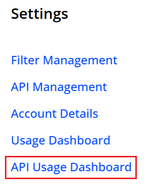
Settings: New API Usage Dashboard Menu Item
Settings: New API Usage Dashboard Menu Item
|
|
Feature Update:
Simplifies API Usage Dashboard access with a direct link in the Settings menu, eliminating multi-step navigation.
Click to expand the image

Use Case:
Quickly access API usage and determine the API traffic distribution across MCP-originated and direct Pulse data calls. Monitor MCP traffic usage to build efficient agentic data models for VSI and DPI data access.
More Details: Settings and Usage Dashboard.
April 9, 2026
New:
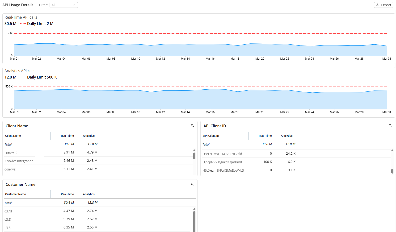
Usage Dashboard: Improved API Usage Visibility in the Usage Dashboard
Usage Dashboard: Improved API Usage Visibility in the Usage Dashboard
|
|
Feature Update:
Introduces call origin filtering in the Usage Dashboard to distinguish between MCP-originated and Pulse API calls. This enhancement enables targeted analysis of traffic distribution, supports measurement of MCP adoption, and improves troubleshooting by isolating issues specific to each access path. The Call Origin filter provides options to view MCP-only, direct-only, or combined traffic, with dashboard metrics updating dynamically based on the selected configuration.
Click to expand the image

Use Case:
Check your overall API usage and determine the API traffic distribution across MCP-originated and direct Pulse data calls. Monitor MCP traffic usage to build efficient agentic data models for VSI and DPI data access.
More Details: Usage Dashboard.
February 26, 2026
Update:
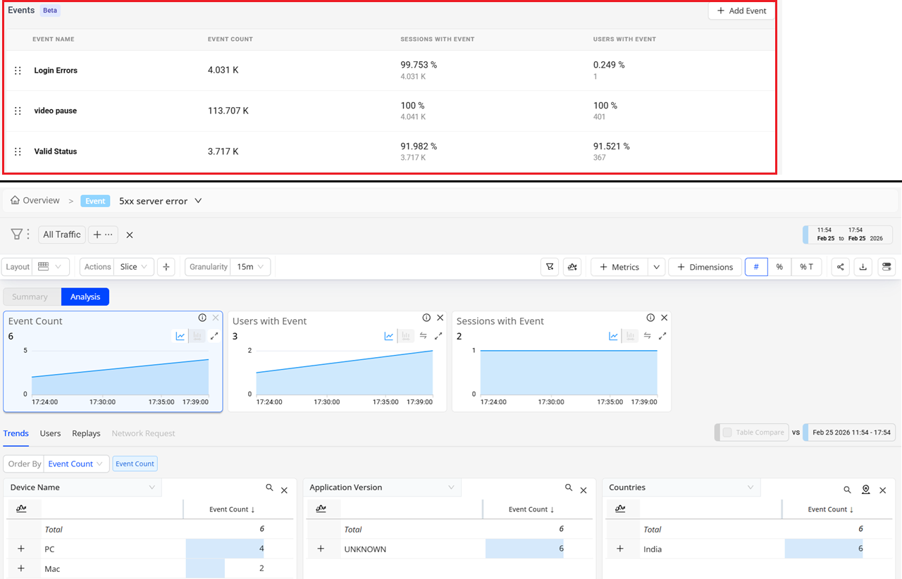
Overview: New Events Section with Preset (Beta)
Overview: New Events Section with Preset (Beta)
|
|
Feature Update:
Introduces a new Events section in the Overview Dashboard to analyze the occurrence of various events. Additionally, click on the specific event to view the preset for the selected event, which accelerates event-based data analysis and anomaly detection. Each preset includes a predefined set of key metrics and corresponding dimension data, offering a structured starting point for investigating trends and identifying issues across critical user experience areas. These presets reduce setup time and promote consistent data analysis across teams.
Click to expand the image

Use Case:
Select the event preset to gain quick insights into user experiences on that platform. From the Events drop-down, select the event preset to gain quick insights, such as which app versions and devices were most impacted by 5xx server errors and app crashes. This preset supports efficient issue detection, performance optimization, and root cause analysis, enabling faster resolution of user-impacting issues across web and mobile platforms.
More Details: Overview Dashboard and Presets.
February 23, 2026
New:
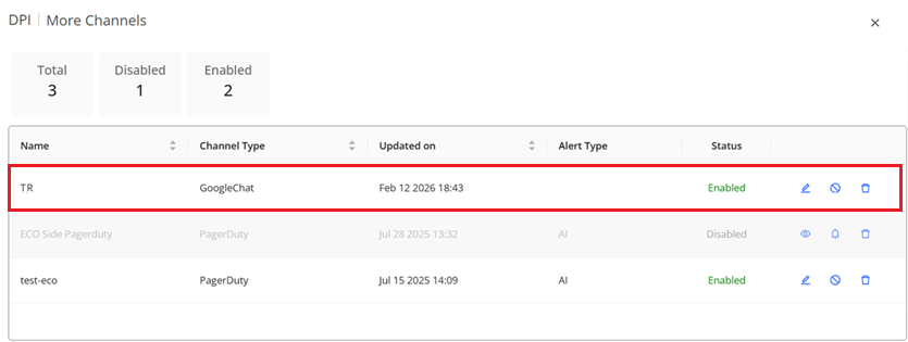
AI Alert Notification: Google Chat Notifications for AI Alerts (Beta)
AI Alert Notification: Google Chat Notifications for AI Alerts (Beta)
|
|
Feature Update:
Enhances the Conviva Notification Channel with support for AI Alerts in Google Chat Spaces as data-rich, structured notification cards. With this release, Google Chat appears as a notification channel within Conviva’s existing notification service settings. The integration enables the delivery of AI-generated alerts directly to a selected Google Chat Space using Incoming Webhooks. These notifications render as data-rich Google Chat cards, ensuring structured, readable, and actionable alert messages with links to Conviva diagnostics features.
Click to expand the image

Use Case:
Set up Conviva Google Chat settings to reduce incident response times. For example, automatically route alerts about minutes with 4xx network response codes to the web services team's Google Chat channel, enabling engineers to proactively identify and resolve client-side errors before they impact users.
More Details: Google Chat Notification.
January 22, 2026
New:
Trends: Percentile Aggregation for Flow-Duration and Custom Metrics (Beta)
Updates:
Metric Builder: Adds an Option for Additional Dimensions in Flows and Custom Metrics Settings
Trends: Percentile Aggregation for Flow-Duration and Custom Metrics (Beta)
|
|
Feature Update:
Adds support for percentile values with a dynamic Aggregation Selector that toggles between percentiles and averages in the Trends dashboard. Percentile-based aggregation (P50, P75, P90, P95, P99) enables the Flow-Duration and Custom metrics to provide a more precise view of Flow-Duration and Custom performances.
Click to expand the image

Use Case:
Using the P95 metric value for the average duration of the Payment Complete Flow helps identify slow client-side navigations that affected a small (5%) but meaningful subset of users. While the average duration for completing the Payment Complete Flow may appear acceptable, the P95 reveals routes, devices, or browsers where the payment completion steps took significantly longer than most other app transitions, thereby impacting perceived responsiveness. Going beyond the average value, percentile values enable teams to isolate and optimize the most impacted performance issues that degrade the user experience.
More Details: Trends.
Metric Builder: Adds an Option for Additional Dimensions in Flows and Custom Metrics Settings
|
|
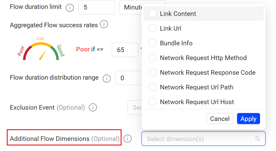
Feature Update:
Adds support for additional event-based dimensions, beyond the out-of-box dimensions, for Flows and custom metrics. Specify whether the dimension value is based on the first-observed event value or the last observed event value, enabling more control of the dimensional values for richer analysis of the configured Flows and custom metrics.
Click to expand the image

Use Case:
Enhance Checkout Flow analysis with the payment_method dimension.
Use the last observed event as the dimension value as payment_method is reported on intermediate events within the checkout flow from Checkout Start to Receipt Page Viewed, rather than only at the Flow start or complete events.
This enhanced flow-level analysis by payment method enables identification of conversion drop-offs, error patterns, and performance differences based on payment types, supporting more targeted optimization and troubleshooting of the payment processes related to the Flow.
More Details: Flows and Custom Metrics.
January 13, 2026
Updates:
Custom Dimension: Promotion of Event Tags to Global Tags
|
|
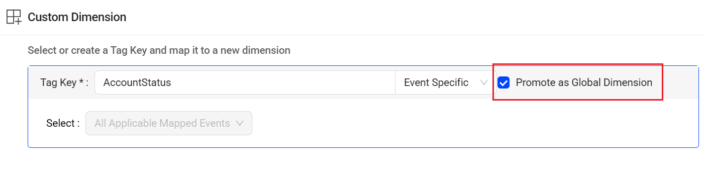
Feature Update:
Adds support for promoting event tags as a global dimension across all relevant events, enabling an existing event-level tag to function as a global tag across all relevant events. This update makes it easy to update an event tag to persist across dimensions when a tag represents global context.
Note: Global tags are commonly for user levels or environment data that apply to the current event and all future occurrences of the event until cleared by session or Flow instance.
Click to expand the image

Use Case:
When adding a custom dimension, promote the AccountStatus tag key as a global dimension to perform dimensional analysis of account-related activity, such as page views, clicks, and purchases, across different account status values, including upsell, silverPlan, and goldPlan.
This enhanced analysis by account status helps identify how user behavior, engagement, and conversion patterns vary across subscription tiers, enabling more targeted optimization and troubleshooting.
More Details: Semantic Mapper.
January 8, 2026
New:
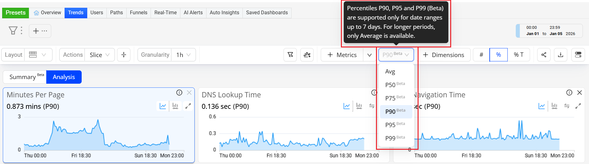
Trends: Percentile Aggregation for Duration Metrics (Beta)
Trends: Percentile Aggregation for Duration Metrics (Beta)
|
|
Feature Update:
Adds a dynamic Aggregation Selector to toggle between percentiles and averages in the Trends dashboard, enabling percentile-based aggregation (P50, P75, P90, P95, P99) for Duration metrics to gain a more precise view of duration performances.
Click to expand the image

Use Case:
Using the P95 metric value for Soft Navigation Time helps identify slow client-side navigations that affected a small (5%) but meaningful subset of users. While average soft navigation time may appear acceptable, P95 reveals routes, devices, or browsers where in-app transitions took significantly longer than most other app transitions, impacting perceived responsiveness. Going beyond the average value, percentile values enable teams to isolate and optimize client-side rendering or script execution issues that degrade the user experience.
More Details: Trends.
2025 Releases
For Conviva DPI 2025 releases, see DPI 2025 Releases.
2024 Releases
For Conviva ECO 2024 releases, see ECO 2024 Releases.
2023 Releases
For Conviva ECO 2023 releases, see ECO 2023 Releases.