Summary Tab in Trends enables quick overview analysis of your app performance data, with several key self-contained UI widgets, such as:
-
Flow widgets that reflect user journeys, helping identify crucial moments to optimize applications and improve the user experience.
-
Customized metric groups for collective performance evaluation, such as service performance monitoring based on grouping of Network Request Failure and Avg Network Request Duration metrics.
-
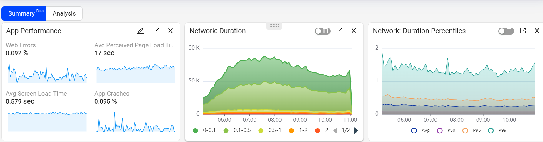
Widgets related to service performance, including Network Duration, Network Percentile, and Network Response, for monitoring server-side performance through related metrics and dimensions.
-
Quality of Experience (QoE) widget, displaying overall app performance based on KPI settings.
These Summary data allow for easy analysis of audience impacts to determine overall performance baselines, the most critical areas for performance improvements, and metric-based anomaly detection.
Note: Widgets in Trends are self-contained UI elements that display specific data or information, with options for interactive and customizable data display, launching full and customized widget displays.
Image: Summary
The Summary Tab presets Flow Widget, and Widgets Related to Service Performance, while the Metric Groups enables users to group metrics.
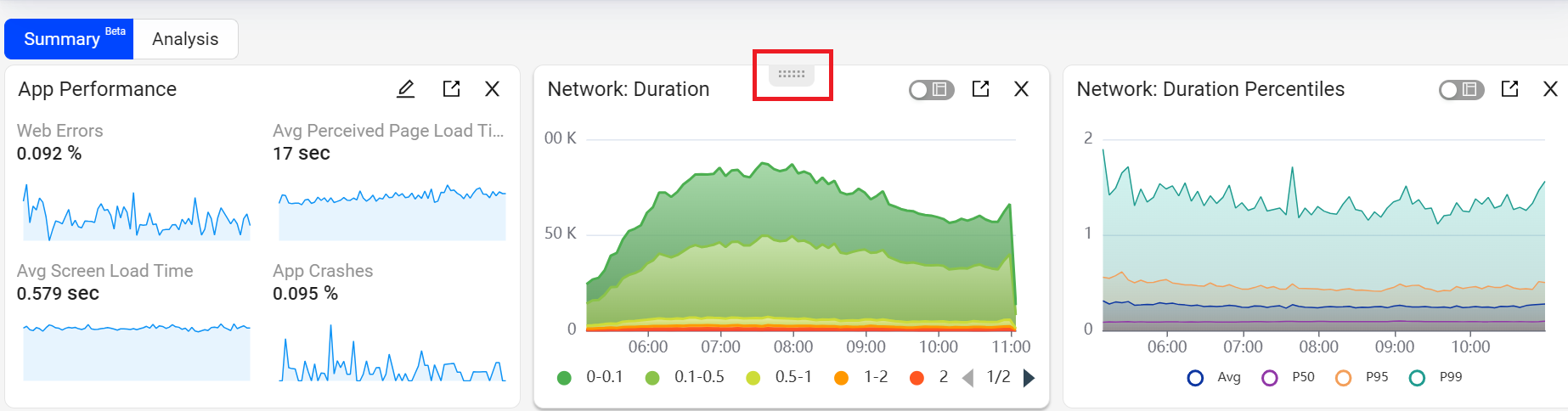
Rearrange Widgets
For customized positioning of the Summary widgets, hover over the widget selector and drag the widget to the desired position.
Image: Rearrange Widgets
Add Widgets in Summary Tab
-
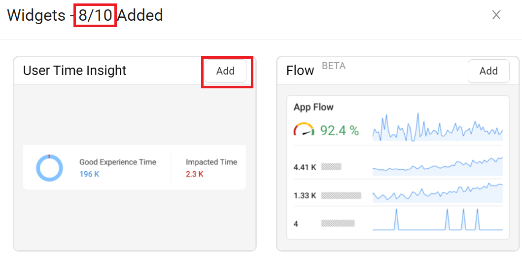
To Add the Widgets in the Summary tab, click +Widgets button from the action bar, to see the Widgets screen.

-
On the Widgets screen, click Add on the widget you wish to add.
-
Click Apply to add the selected Widget.
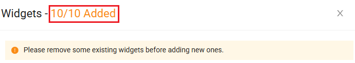
Note: Add up to ten widgets in the summary tab.
Widgets in the Summary Tab
Flow Widget
The Flow widget enables you to select the most critical flow and displays its success rate in a gauge, along with key flow metrics and a link for detailed analysis. The widget helps you monitor the performance of the selected flow and drill down to a Flow Specific Dashboard for deeper insights.
The gauge provides a quick view of the flow’s performance based on the success rate defined in Activation. For example, if the gauge shows 71.2%, it indicates that 71.2% of flows meet the success time boundary defined in Activation among all initiated flows.
With the Flow widget and other widgets under the Summary tab, you can efficiently track all business KPIs in a single view, optimize application performance, and enhance the user experience.
To quickly check the event composition, click the information icon in the Flow Widget. For further flow details, click the flow name link to display the Activation flow detail page.
Use Metric Builder to create up to three Flow widgets. For how to create a flow, check Metric Builder.
Image: Flow Widget
Drill Down to Flow Specific Dashboard
To perform detailed analysis of the flow, click the Drill Down icon to access the details view of the selected flow. The details view, by default, loads all metrics belonging to the flow. Switch to focus view to expand each metric card, similar to how the Trends dashboard works.
Dimension analysis defaults to loading global dimensions, such as platform and app name. Add other dimensions from the Dimension panel to perform drill-down analysis and identify improvement opportunities.
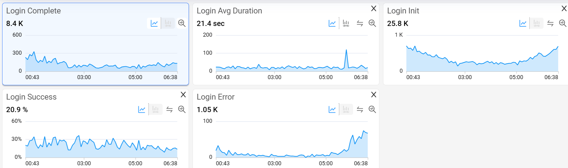
Flow metrics can break down by all global dimensions, such as GEO, ISP, and Device, and global tags configured in Activation. Flow metrics are also linked to event tag dimensions when the tag is reported by flow events.
Errors that happen during flows include 5xx errors and app crashes by default. Conviva allows you to add other errors from Activation. The default error msg dimension captures errors from app crash.
Flow errors can break down into configured flow error events and custom error dimension. On the Flow Specific Dashboard, toggle to % to view the percentage of total errors divided by the total number of initial events, showing the percentage of flows with this issue. Toggle to %T to see the error distribution percentage across different error types.
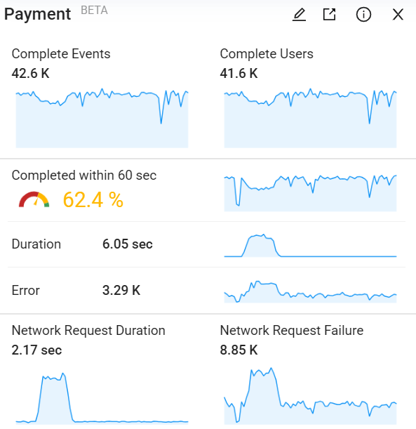
Metric Group Widget
Metric Group widget enables the creation of a customized set of up to four metrics, with the option to name the metric group for targeted references, such as Service Performance Monitoring. This widget also provides access to a focused analysis page with expanded time series of the metrics and dimensional drill-downs for easy diagnostics.
For example, create a metric group with service performance-related metrics for service engagement, including Network Request Failure and Avg Network Request Duration. This metric grouping enables quick access and comparison of key data points within a specific context for data analysis and anomaly detection.
Image: Metric Group
Widgets Related to Service Performance
Widgets such as Network Duration, Network Percentile, and Network Response enable monitoring of server-side performance through related metrics and dimensions.
Image: Widgets Related to Service Performance
![]()
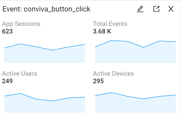
Event Widget
Event widget allows the creation of a customized set of up to four event-related metrics for monitoring the trend of any business-critical mapped events right from the summary section.
For example, create a group with the Active Devices, Active Users, App Sessions, and Total Events metrics to evaluate the login, payments, or subscription events over a given timeframe. This metric grouping makes it easy to compare and summarize the key data points within a specific context for event analysis and anomaly detection.
Image: Event Widget
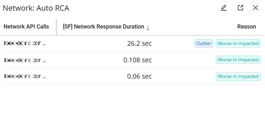
Network Auto RCA
(![]() To be deprecated on March 26, 2026)
To be deprecated on March 26, 2026)
Network Auto RCA automatically identifies network API requests that contribute to degraded user experience metrics. By analyzing network request data from problematic sessions, it replaces manual troubleshooting and detects outliers or abnormal patterns. To maximize efficiency, the system analyzes a representative sample of problematic traces rather than scanning all sessions. It then generates a list of suspected APIs along with supporting metrics such as request count, impacted users, and average response time, enabling faster identification of potential root causes.
Image: Network Auto RCA
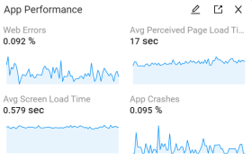
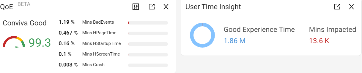
QoE and User Time Insight Widgets
Conviva QoE widget consists of QoE KPI and critical performance analytics. QoE KPI provides a summary of your user experience and app performance so you can quickly view your current app performance across critical performance analytics (high page/screen load times, high startup times, app crashes, and impacting (bad) events) and compare performance with the Conviva QoE performance Index. Based on industry-leading performance analytics intelligence, Conviva QoE widget highlights specific opportunities for improvement, enabling quick-click dimensional analysis across the impacted performance areas.
As a companion to the specific QoE widget, the User Time Insight widget highlights the user time durations during good (‘happy’) and impacted (‘unhappy’) app experiences so you can quickly gauge the overall severity of impacts.
Image: QoE and User Time Insight Widgets
In addition, Conviva DPI allows you to set custom KPI values to tailor the QoE KPI impacts based on specific app performance levels, such as zero app crashes for mission critical apps, very low startup times for apps with low latency tolerance, and customized event impacts.
Note: The QoE KPI is a unified, aggregate KPI that represents the percentage of minutes without issues across multiple performance areas, where an issue is defined as an app performance and/or user experience impact. High (green) Conviva Good performance levels indicate high levels of overall app performance with minimal performance and user experience impacts.
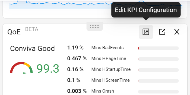
Edit KPI Configuration
To set custom KPI metrics:
-
Click the Edit KPI Configuration icon, then click Add New.

-
Configure the KPI:
-
Enter a KPI name, such as Low Latency App Performance.
-
Define the threshold value for each metric.

Note: The supported threshold for ANR (Application Not Responding) for Good Minutes is zero.
-
(Optional) Enable Bad Events and configure the event rules based on new raw events or previously mapped events, such as the conviva_network_request event with a 404 status code marked as a bad event.
-
Toggle on Bad Events and click Set.
-
For rules based on new raw events, select a raw event name and set the corresponding attributes and values.
-
For rules based on an existing mapped event, click Import Rules…, select a mapped event from the drop-down list, and click Confirm. The raw event name, attributes, and values are automatically populated. Adjust them as needed.
-
To add a new raw event, click Add Raw Event and follow the same process to set the attributes and values. The logical operator for all raw events is OR.


-
-
Click Save & Apply.
-
-
Select the custom KPI in the QoE widget to see the updated metrics.

QoE KPI Performance Analysis
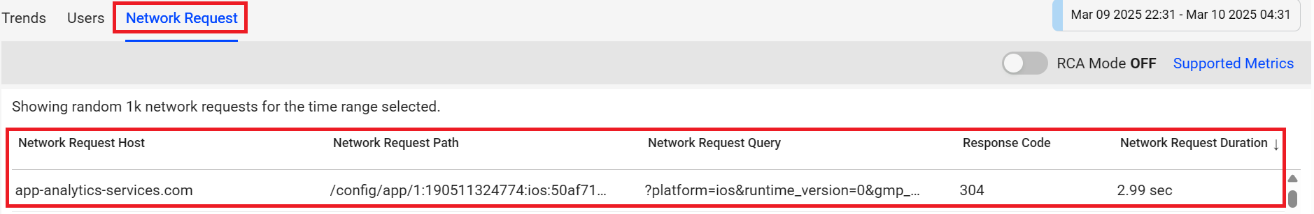
For guided app performance analysis, click an impacted QoE KPI metric to focus the Trends dimensional analysis on the KPI impacted sessions in the example bad event analysis.
Image: QoE Widget
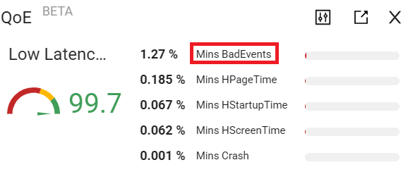
Image: Trends
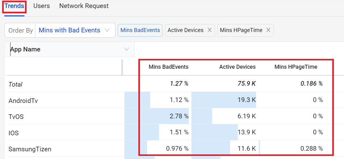
Image: Users
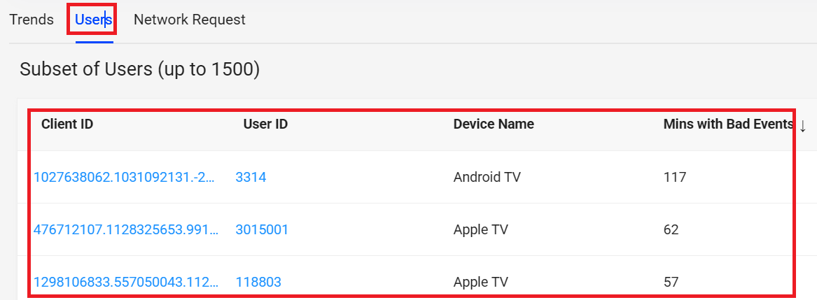
Image: Network Request
Widgets Metric Group Summary Widgets Metric Group Widgets Metric Group Improvement Summary Oppurtunities Good and Impacted Streams Summary event widget event widget QoE and User Time Insight Widgets QoE and User Time Insight Widgets QoE Widget QoE Widget User Time Insight Widget User Time Insight Widget