Explore DPI Features
DPI provides a robust set of metrics to enable advanced application performance monitoring and user behavior analysis across your web and native applications. Metric values appear as time series and distributions in metric widgets, and alongside dimensional values in the dimension drill-down tables.
For more details about DPI capabilities and experience monitoring, see DPI Feature Overview.
-
Explore Presets links for established use cases and pre-configured dashboards.
-
Start with Trends to view the out-of-box metric time series widgets and dimension tables.
-
Drill-down on network requests for automated root case analysis.
-
Display Real-Time metrics for quick issue discovery and resolution.
-
Access User Timelines for details about user experiences.
-
Use LiveLens for event discovery.
-
Build custom metrics with Metric Builder.
-
Use Custom Dashboards for advanced analysis of scenarios.
-
Monitor AI alerts for automated root cause diagnostics.
Note: It's best to complete your initial feature adoption and metric discovery before using more advanced features, such as setting AI alerts, notification channels, and building advanced metrics.
This example shows the App Overview Preset for quick drill-downs into app performance issues, such as login process time.
-
Access the Preset for App Overview
-
Slice Login Process Time metric time series
-
Drill-down to impacted device dimension
Preset: App Overview Example
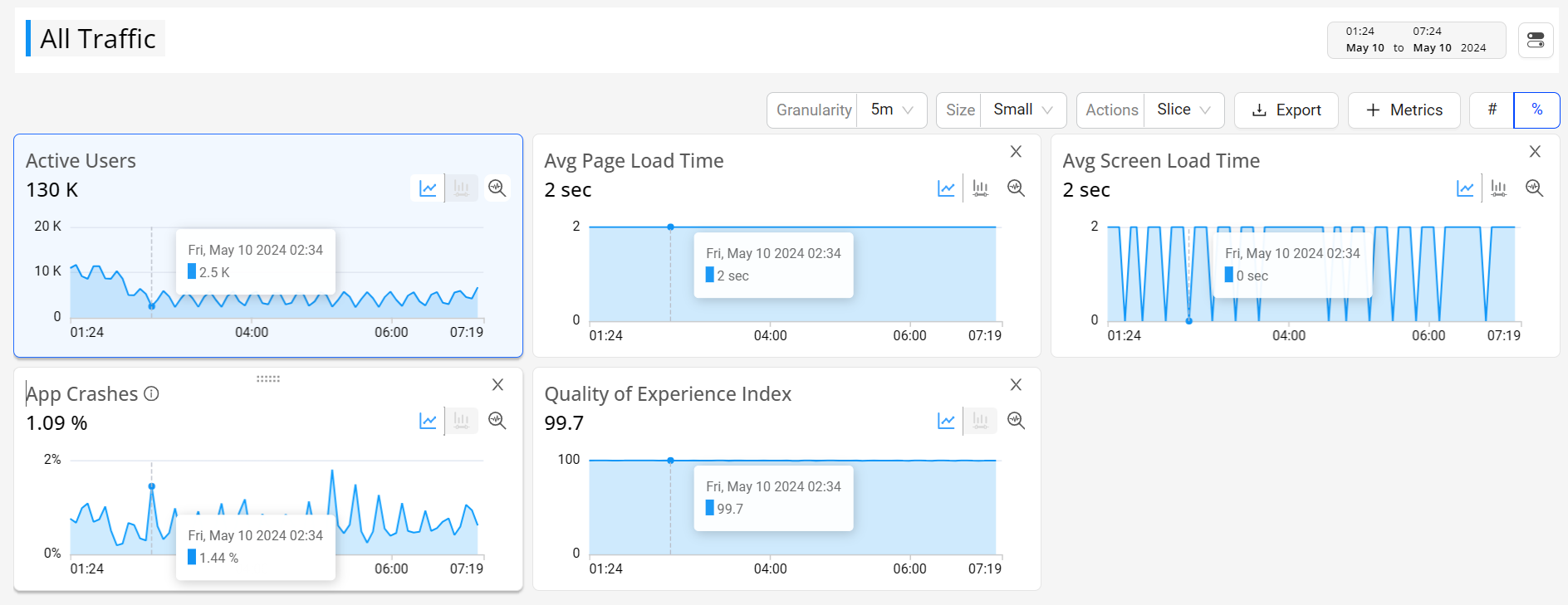
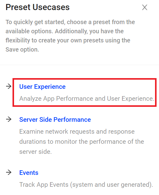
Use Presets to display access customized Trends dashboards, pre-configured with metrics and metadata for the most common use cases.
Click the Presets tab in the main menu to get started with the DPI Presets items with pre-configured Trends dashboards.
DPI Presets
 Trends Drill-Downs
Selecting time slices and anomalies in the Trends metric widgets, enables cross-dimensional analysis for root cause discovery and issue resolution.
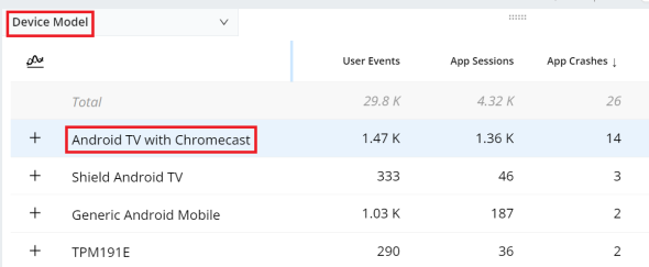
For example, after selecting a time series anomaly, drill-down across-dimensions by selecting Device Model and clicking a specific device model, like Android TV with Chromecast.
Trends Drill-Down Example
For more details, see Performing Drill-Down Analysis.
 Trends Secondary Filters
The secondary filter supplements the primary filter in Trends by adding an additional layer of data refinement. It enables a deeper analysis by allowing you to explore the distribution of selected data within specific buckets, complementing the primary filtering process.
Note: Only one secondary filter can be applied at a time.
For example, apply an Avg Page Load Time secondary filter to focus on app page loads between 3 seconds and 20 seconds.

Secondary Filter Example
For more details, see Secondary Filters.
 Trends Compare
Trends offers comparison features in addition to the Compare dashboard. For example, use instant compare to quickly compare filters for the top five dimension entities or across a custom dimension filters.

Compare in Trends Example
For more details, see Compare.
 Custom Dashboards
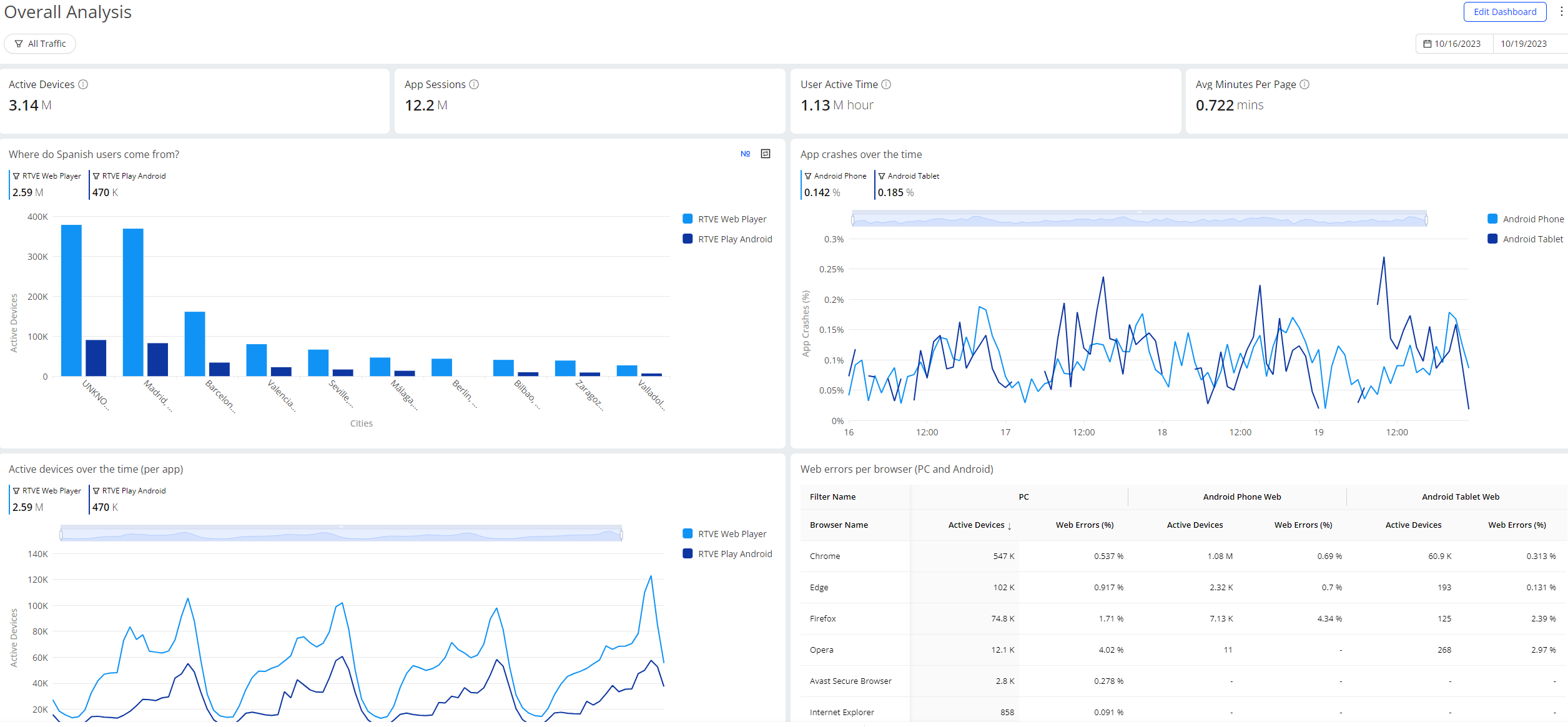
Custom dashboards enable the combination of widgets and display options to highlight the insights that are most meaningful to your users and business. Customized widgets display metrics and dimensions in table, summary metric, distribution, time series, and bar.
By selecting DPI as the data source when creating a custom dashboard, you can have the custom dashboard used for DPI, such as tracking the app crashes on different hardware to analyze the app performance.
Custom Dashboard Example
For more details, see Custom Dashboards.
 AI Alerts
AI alerts is an advanced feature that eliminates the need to determine the thresholds, identify the relevant dimensions that you need to monitor, and set alerts to notify related individuals and groups.
The Conviva AI Alerting system continuously checks for anomalies and computes a baseline along with a range of variation for the metric(s) based on the mean and standard deviation derived from historical data. This range of variation is then used to evaluate the traffic in the past few minutes. If the upper boundary range or threshold is exceeded, an anomaly is detected, which then triggers the diagnosis process to determine if an alert should be fired based on the sensitivity control settings and the root cause of the event.
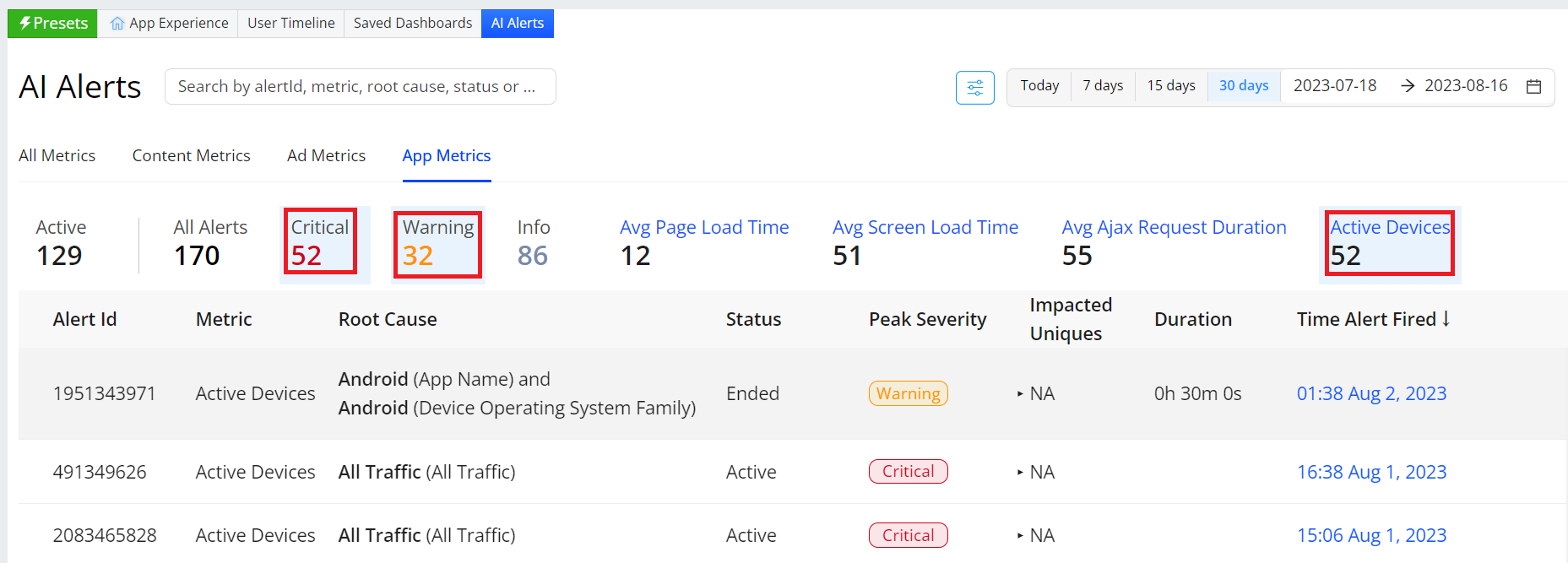
AI Alerts Example
For more details, see AI Alerts.
 Sankey Event Analysis
The Sankey dashboard enables you to create a Sankey chart that shows the journey of events visually.
For example, create a Sankey chart that uses conviva_page_view, conviva_button_click, conviva_application_error, and conviva_link_click as nodes. The created Sankey chart allows you to understand the sequence of events and the composition of events, helping you gain insights for metric creation and potential issue identification.
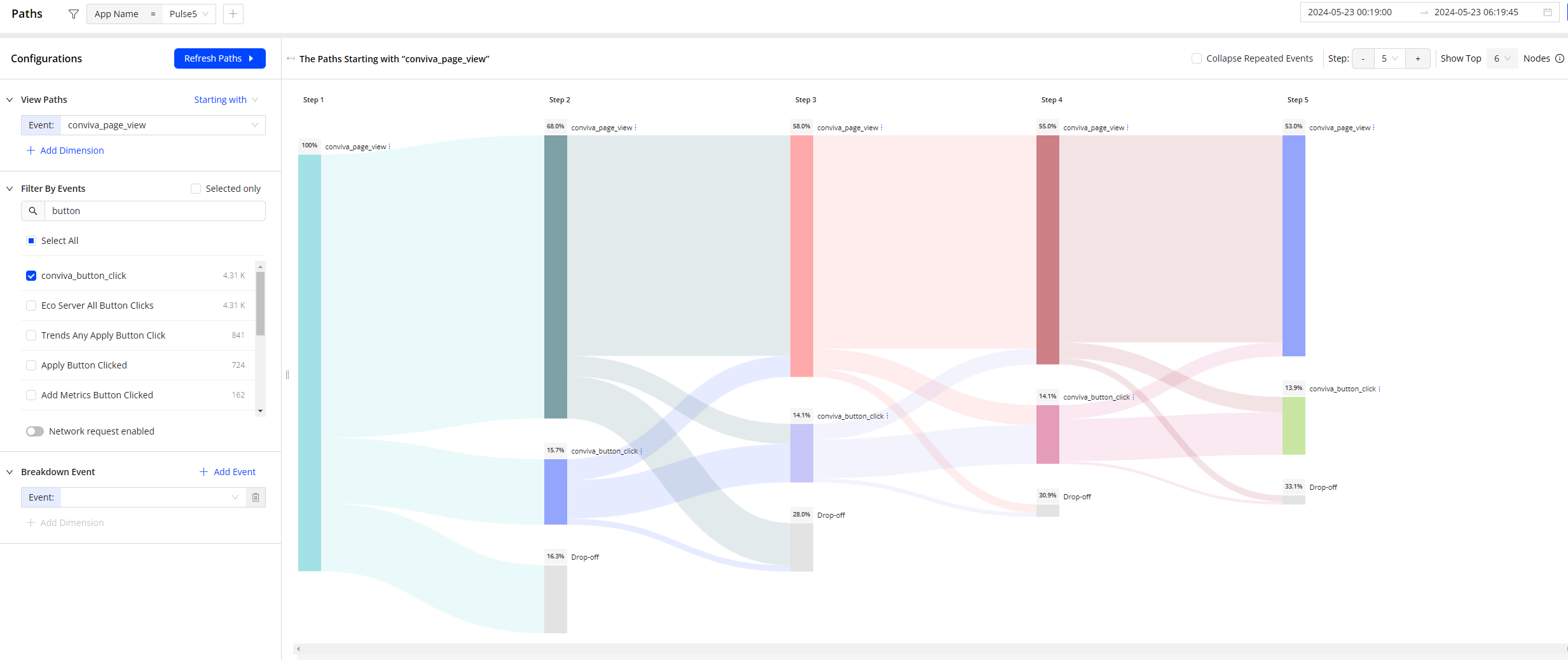
Sankey Example
For more details, see Paths.
 Real-Time Analysis
Conviva's Real-Time dashboard visually presents metrics for actionable streaming intelligence in real-time. Enhanced by selected filters and dimensions, you can monitor the performance of your most critical streaming KPIs with visual threshold crossing indicators to quickly identify and correlate changes in metrics.
With up to 20 filters and 200 monitored dimension values per Real-Time dashboard, you can customize the dashboard settings to focus on the most critical performance, such as Live traffic across channels for tent pole events or All Traffic across assets for ongoing operations. The Real-Time has two modes - Trends mode supports monitoring app performance based on selected filters across dimensions. In contrast, the Real-Time Filters mode supports monitoring app performance based on selected filters. Save dashboards for quick access to recurring diagnostics and monitoring.
The metric along with the value displays the threshold value, when you mouse hover on the metric display.
When a threshold is crossed, the impacted metric turns red. Click the metric value to open the Diagnostics page with data for the impacted dimension and filter settings.

Real-Time Example
For more details, see Real-Time Dashboard.
 User Timelines
User Timeline enables you to drill down into session timelines for comprehensive and granular analysis of a session:
-
Client ID: Get all data in the selected period, including the data occurring before users log into the application successfully.
-
User ID: Get the data occurring from the time when users log into the application successfully to a session end.
User Timeline consists of two parts:
-
session summary, such as the related user information and session events count
-
session events, ordered sequentially by a user
To support the app behaviors analysis, the Summary and Events sessions display all custom events from a session start to a session end. For example to identify the causes behind app crashes, analyze session details in Event section including application_error events.
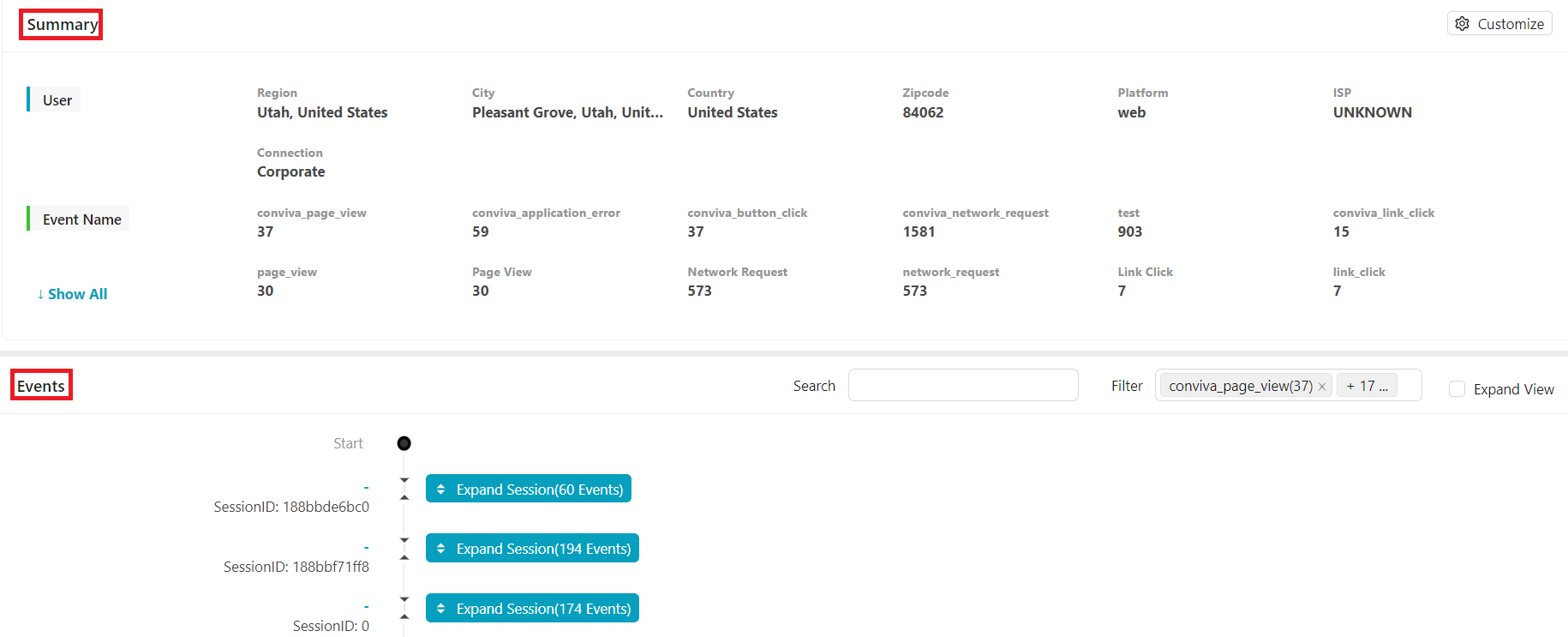
User Timeline Example
For more details, see User Timelines.
Next Step: Explore More DPI Features