Conviva's enhanced Ads interface and feature set provide improved diagnostic workflow for ad creative QoE and ad engagement analysis. This workflow is powered by Conviva's high-scale, real-time, on-demand platform that provides fast data accessibility with more detailed data granularity, one-click, and combinatorial instant filtering, and enhanced analysis workflows.
Ads Dashboards
The Ads dashboards enable real-time and historical metrics and diagnostics for monitoring and improving ad delivery, ad viewer experience, and ad performance, With these dashboards you can monitor key ad delivery, quality, and performance metrics, and then proactively segment metric data by dimensions, view 1-minute diagnostic time series of the events, and receive alerts related to any defined issues and errors.
Ads provides the following set of pre-defined dashboards that function as a collection of widgets, displaying ad quality metrics and performance.
-
Ads
Historical ad metric data which can be used to analyze and identify changes in key ad delivery, quality, and performance. You can view summary metrics and time series, as well as drill-down into dimension performance using one-click and combinatorial filters. You can also view time series charts of metric progress within the selected period and quickly jump to diagnostics.
-
Real-Time
A visual presentation of ad metrics for actionable streaming intelligence in real time. Enhanced by selected filters and dimensions, you can monitor the performance of your most critical streaming KPIs with visual threshold crossing indicators to quickly identify and correlate changes in ad metrics.
-
AI Alerts
Instant alerts to help shorten time to resolution for ad issues involving lost ad impressions (Ad Start Failures), creative quality (Ad Average Bitrate and Ad Rebuffering Ratio), and slate durations (% Slate Durations).
-
Alerts
List of all the Ads alert notifications for your account, and enables you to set up and manage ad alerts.
-
Custom
Combinations of ad metrics. Use the Saved Dashboards tab to access custom dashboards.
For more information, see Ads Dashboards.
Structure and Navigation
The Ads interface components consolidate ad creative QoE and ad engagement data into an Ads page, so you can easily gain high-level insights cross your attempted ads and also quickly deep dive into the most impactful QoE trends and anomalies, with easy navigation to advanced features such as multi-dimensional comparisons and error code analysis.
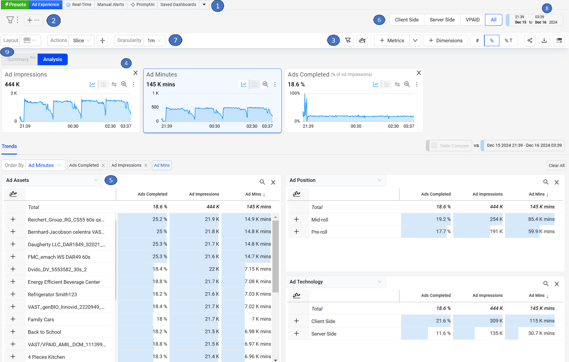
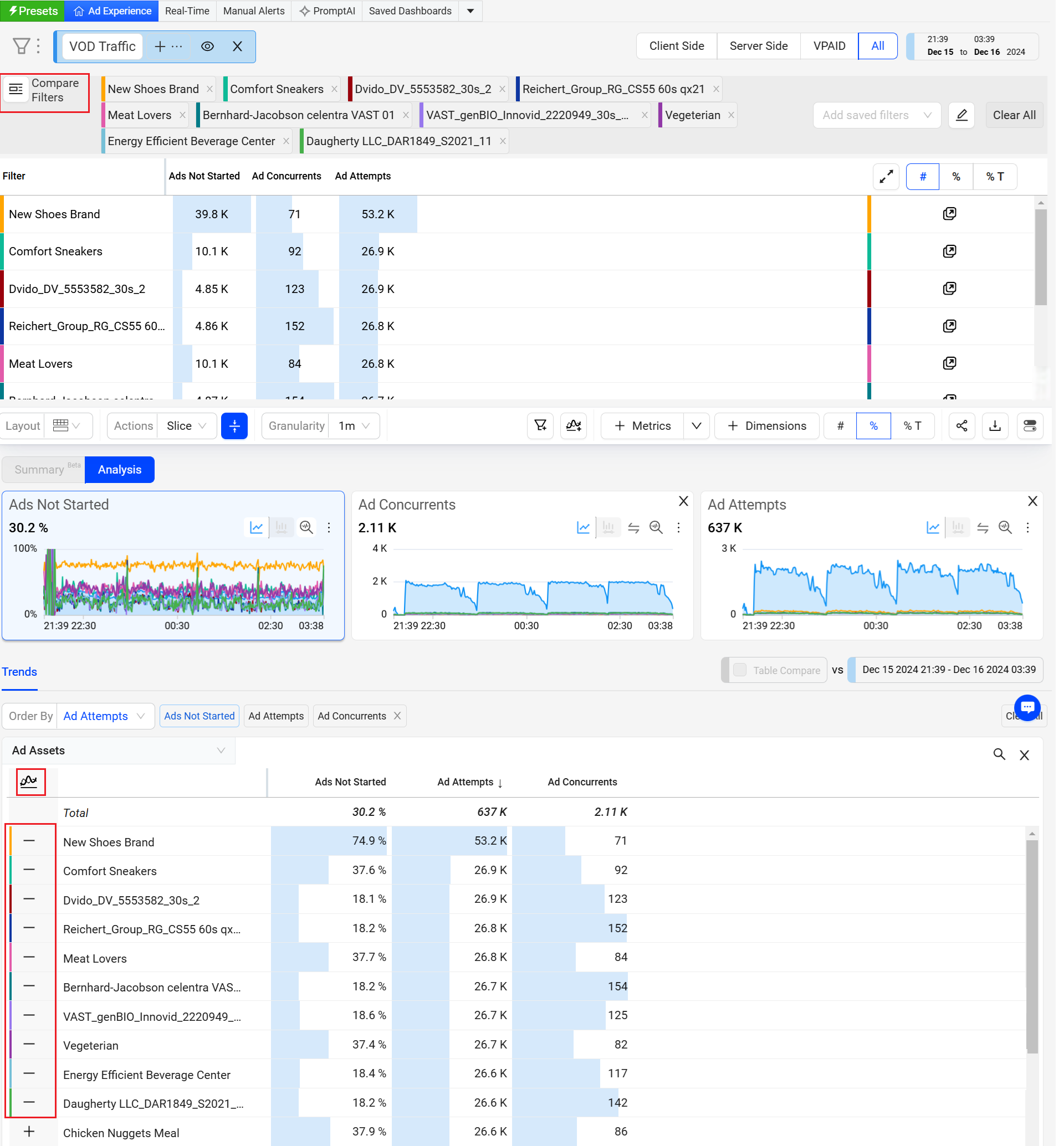
Ads tabs pane for quick page access to the default pages other saved pages. See Navigation for details.
Filter Bar to display current filter settings (All Traffic by default). Click to edit and save filters.
Action Bar for various Trends actions.
All Metric Time Series with comparative percentages and links to Diagnostics (in the future ordered by threshold impact). By default, these time series show data for the Last 6 Hour current day with 1-minute granularity.
Top Dimensions by the selected metric (in the future sorted by threshold deviation) and Order By options for advanced sorting, along with the dimension values for dynamic filtering and analysis.
Pre-defined toggles that focus on the Client Side, Server Side, and VPAID ads.
Granularity dropdown list allows you to select the time interval for detailed data analysis within a selected time interval.
Date/Time picker for customized time selection and comparison percentage setting. Save, share, export Kebab icon.
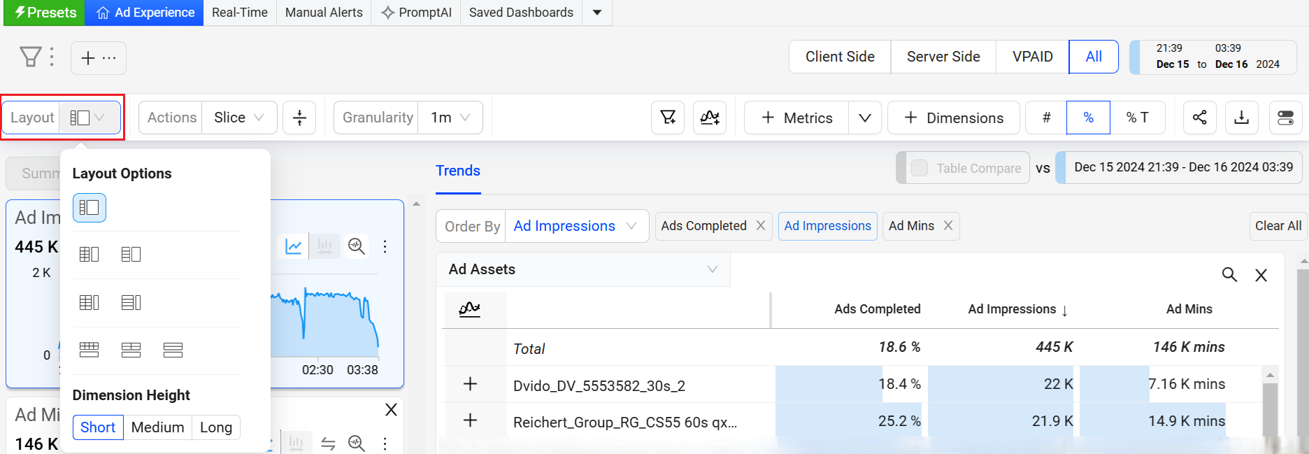
Layout to select a layout from a wide range of available layouts.
Navigation Menu
The Ads navigation menu enables quick selection of the main Ads dashboards, saved dashboards, and access to other Conviva applications.
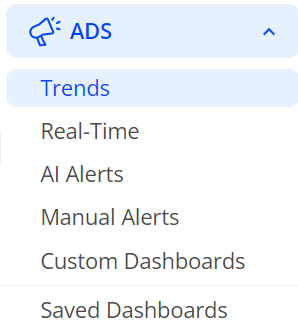
The navigation hamburger menu enables quick selection of the main Ads Trends, Real-Time, AI Alerts, Custom Dashboards saved dashboards, and access to other Conviva applications to which you have access.
To access the navigation menu, click the hamburger icon next to the Conviva logo.
For more information about Default and Saved pages, Ads page settings, Navigation icons, Profile and Account Settings, see Ads Navigation.
Changing the Default Page
To change the default landing page, in the kebab icon, select Set a landing page (for Trends) Make Default (for other dashboards). The Home icon appears in the page tab of your default page.

Date and Time Intervals
Ads provides pre-defined time intervals along with a calendar based time-picker for custom intervals. The time-picker also supports a specific hour, and 5-minute ranges from 00:00 hour to 23:59 hour.

Click Time Frame settings and select a predefined range or use the time selector to choose the start and end dates/times for the desired time interval.
Filters
Filters use the configured Ads metadata dimensions to limit the displayed data for more focused analysis. Clicking in a filter option text box displays a drop-down list of the available filters. The applied filters appear in the filter bar at the top of each page.
On each dashboard, you can use the filter options to quickly add and remove additional filter criteria, and create new filters based on customized combinations of filter attributes.
For more information on filters, see Ads Filter Management, One-Click Filters, Combinatorial Filters.
Ad Webhooks
Ad Webhooks enable automated notifications to external systems when a manual or AI alert fires within Conviva. These Webhooks push alert information through HTTP POST requests to a destination webhook URL that is a destination endpoint on your server.
You can use these webhooks to integrate Conviva alert events into external applications, such as displaying Conviva alerts in an alert aggregation system or triggering workflows in other applications, such as JIRA or other support ticket applications.
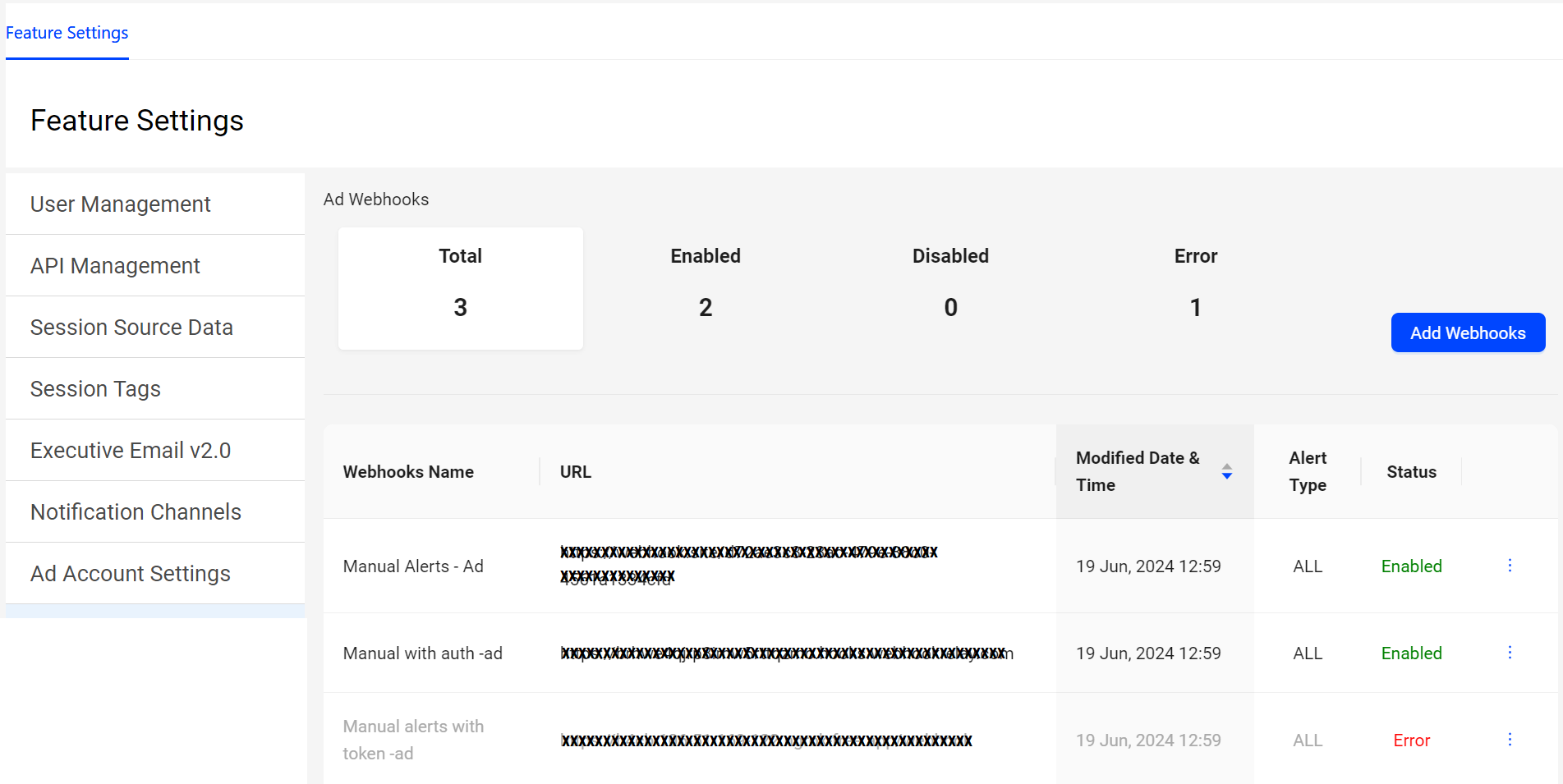
For more information on configuring webhooks, see Ad Webhooks.
Data Export
Depending on you analysis needs, you might want to export the data from a dashboard or another page for use elsewhere in .csv format. It's easy to do: just click the options or settings icon at the top of the data area and select the Export option.
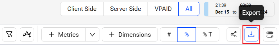
For more details, see Exporting and Sharing Data.
Sharing
You can share snapshots of dashboards with other Ads users by clicking Share in the Action bar.
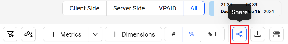
Clicking the Share icon saves a 30-day snapshot of the item and generates a link for collaboration, shared by copying and pasting the link.
When a user opens the link, they see an exact copy of the dashboard you shared. They can change how Conviva Ads presents the data in the snapshot, but cannot change data that are part of the snapshot. For example, they can deselect metrics to hide them, but they cannot change the dimension or time series.
Note: Special character and emojis are not supported in the shared links.
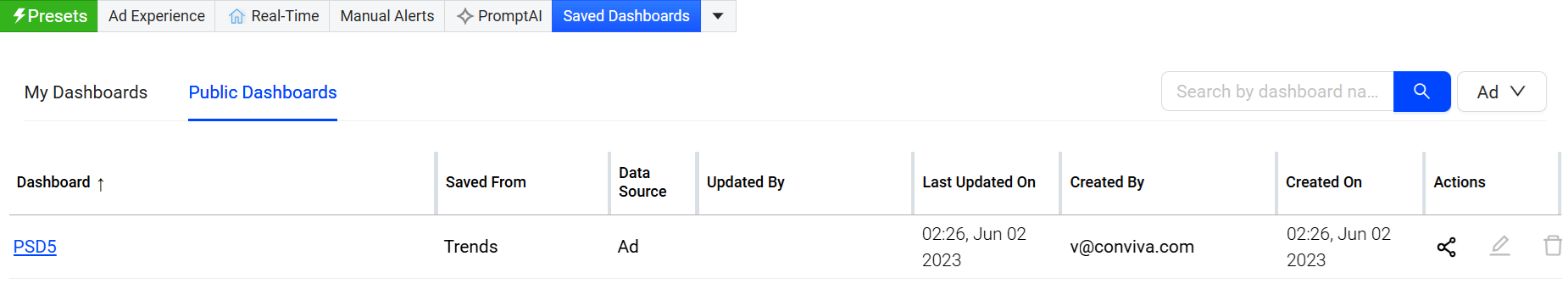
Saving
In a shared dashboard, click the kebab icon to Save the dashboard for re-use and further collaboration.
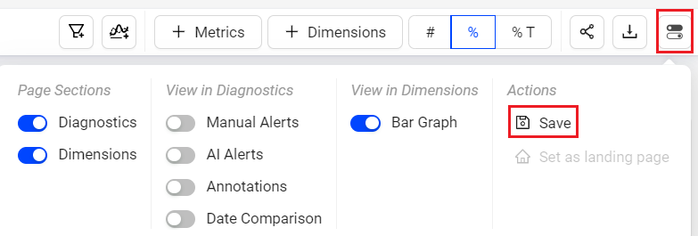
Saved Dashboards appears in the Saved Dashboard tab, similar to Trends.
In the Saved Dashboards tab,
My Dashboards displays the private saved boards.

Edit the data based on the requirement after the dashboard has been saved.
Public Dashboards displays the public saved boards.
Cloning
Cloning a saved dashboard creates a copy of the dashboard, enabling customization based on the original dashboard settings, for example, expanding the date range. This feature simplifies collaboration and updates while preserving the original saved dashboard.
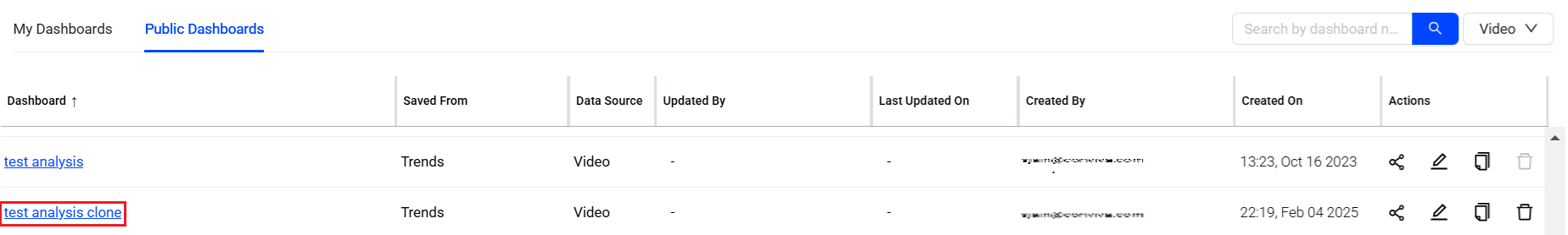
For more information on cloning the public saved dashboards, see Public Saved Dashboard and clone private saved dashboard, see My Dashboard.
Layouts
You can select from multiple layout options to enhance your experience and customize the interface to fit your needs. These new layouts allow you to tailor the dashboard’s appearance, giving you greater flexibility to interact with data in a way that aligns with your workflow and preferences.
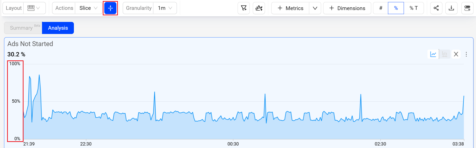
Dynamic Y-Axis
Dynamic Y-Axis narrows the granularity of the y-axis range to focus more precisely on the displayed data points. Pulse calculates the maximum and minimum values, adds appropriate buffers, and determines whether to include the zero position in the y-axis. Excluding the zero position often improves the clarity and interpretation of scatter charts. For example, the y-axis range changes from 0 – 100 to 50 – 100 when data points fall only between 60 and 100.
For more information on Dynamic Y-Axis, see Dynamic Y-Axis.
Metrics and Dimension Metrics
Metrics
To add the metrics to the Metric widgets and the dimension table,
Click the Metrics button in the action bar, to see the metrics slider.
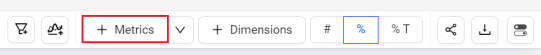
Select the metrics from the metric slider and click Apply.
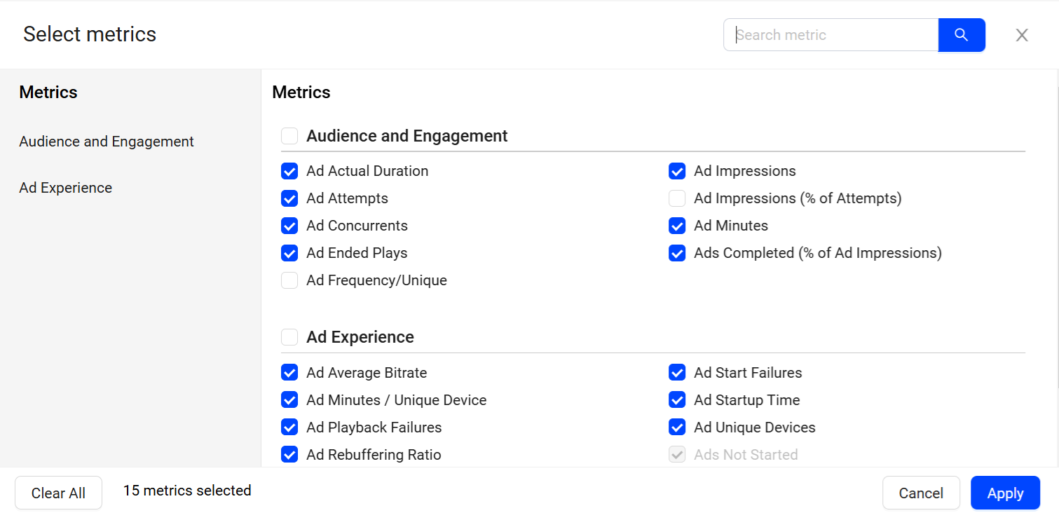
The selected metrics appears in the metric cards and the dimension table.
Dimension Metrics
To add the metrics to only the dimension table,
Click the drop-down next to Metrics button and click Dimension Metrics, to see the metrics slider.
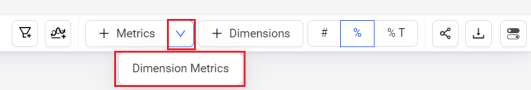
Select the metrics from the metric slider and click Apply.
The selected metrics appears as a new column in the dimension table.
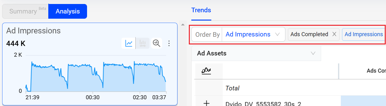
Comparisons
Time Series comparisons enable you to select metrics and dimension values for comparative analysis in a separate dashboard. Because the metric and dimension values are determined by the current filter settings, make sure the current filter settings, such as All Traffic, Live, or VOD, represent the data set that intended for time series comparisons.
Click the Compare button above the dimension names to enter Compare mode.
In Compare mode, the metric list shows the Top Trends By metric selected as the compare default metric. In addition, radio buttons appear next to the dimension names and values so they can be easily selected for the comparison. Other metrics can be added in the Compare view.

Click the dimension values to apply filters to the data.
Compare Integrated in Trends
Trends offers instant comparison in addition to the Compare dashboard. Quickly compare filters for the top ten dimension entities or across a custom dimension filters. You can add up to 20 dimensions.
Dimension Table Compare
Dimension Table Compare displays comparitive percentage values in the dimension tables so you can directly identify which dimension values contributed most to the spike or drop (in percentage) within the table. This feature also displays the shaded comparitive area in the metric widget time series, to help clarify the scope of the impacts. Hovering over the percentage value displays the absolute value of the shaded area. With this feature, you can efficiently analyze the data, and detect any anomalies to provide a better user experience.
You can also save, share, and export the table-compare data.
This feature offers two distinct modes, Date-on-Date (DoD) Compare Mode and Slice Mode, each designed to cater to different user needs and scenarios.
Note: Turning the Date Comparison feature toggles off any secondary feature settings. The Dimension Table Compare feature is not supported for Live mode.

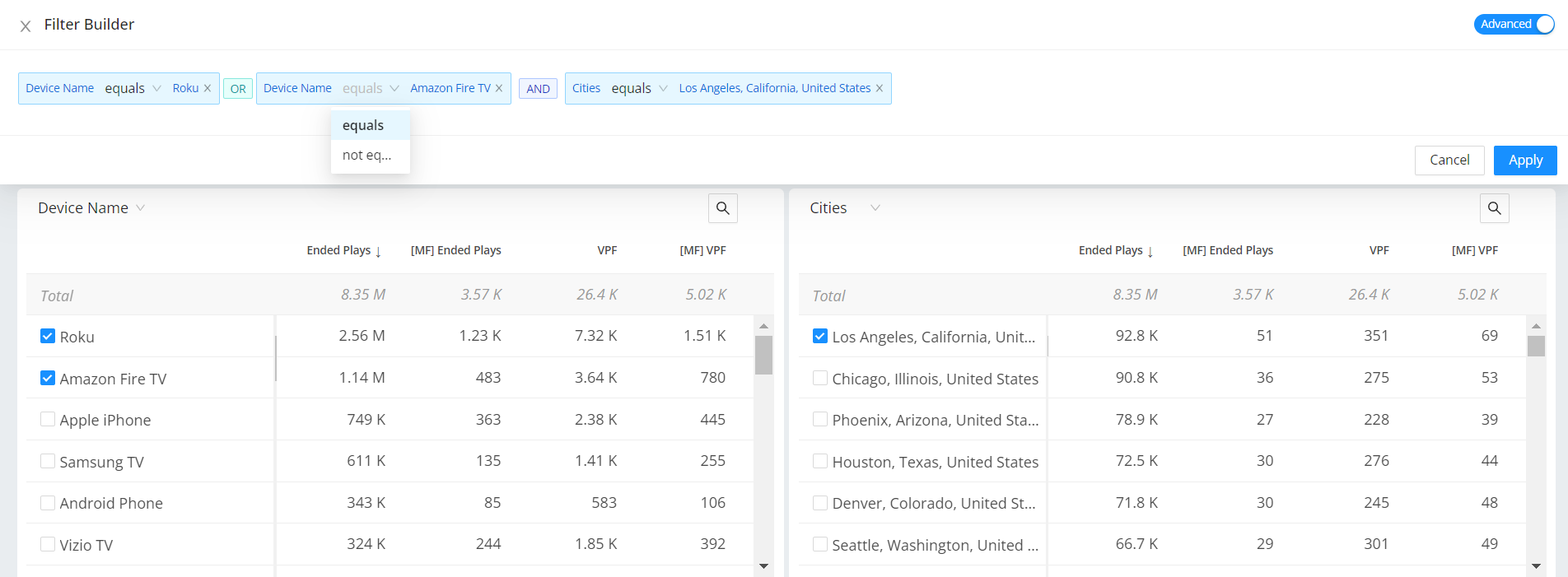
Filter Builder
Easily visualize side-by-side comparisons based on advanced filter settings, in the dimension tables with links to Trends.
After zoom, select and dimension filters, you can create the filters to see the specific data. Along with the single click filters you can create dimension filters based on equals and contains filter options.
For example, create a dimension filter for asset analysis that does not contain video trailers.
Trends allows you to create a complex filter with conditions easily. Also, you can filter the unknowns and compare the between Basic and Advance modes using the toggle.
The Advanced option allows you to easily see the conditions applied and modify the filters. This advance mode allows you to change the condition equals and not equals on the fly.
|
Inline Filters
Using the filter builder in Trends enables focused data analysis along with inline filter creation and updates.
Inline filter rule addition, modify operators, and directly apply the filter rule.
Save inline settings to create new filters.
Open filter builder for a full view of filter creation and management.
Open Filter Management to browse saved filters, and directly apply to Ads.
Time Granularity
The Trends page, including Diagnostics and Compare, supports enhanced granularity levels, such as:
1 min, 5 min, 15 min, 30 mins and 1 day (24 hours) for 1-hour intervals
1 hour, 6 hours, 12 hours, 1 day, and 7 days for 30-day intervals
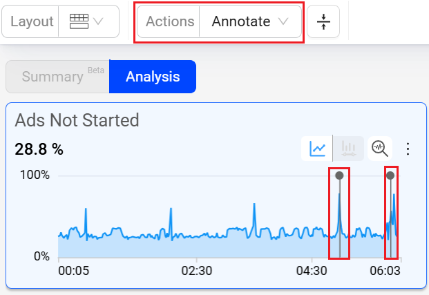
Annotations
Annotations allow you to mark the anomalies in the timeseries during the data analysis within the selected time interval in Trends dashboard and Compare. Also, it enables you to add comments making it a collaboration tool.
You can add and save the annotations in the following two levels:
Metric: Annotation is visible for selected metric across all dashboards.
Dashboard: Annotation is visible for all metrics across all dashboards.
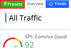
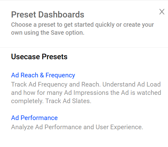
Presets
Trends offers pre-defined feature options as quick starting points to provide access to commonly used metrics and metadata use cases. Users can customize these pre-defined selections as needed and save them as public or private dashboards.
To access the preset use cases,
Click Presets on the Pulse
Present Usecases dashboard is displayed.
Dark Mode
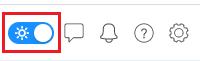
Conviva Ads supports dark mode to switch to a black background with a lighter color palette for UI elements, labels, and values.
Use the Dark Mode toggle in the menu bar to change the display mode.