The Ads navigation menu enables quick selection of the main Ads dashboards, saved dashboards, and access to other Conviva applications.
Top Level Navigation
The navigation menu provides quick access to the main Ads dashboards, saved dashboards, and other Conviva applications with granted access.
To access the navigation menu, click the hamburger icon next to the Conviva logo.
Note: The Home icon indicates the current default page.
Path: Navigation icon >> Ads >> Trends/Real-time/AI Alerts/Manual Alerts/Custom Dashboard/ Saved Dashboard

Default and Saved Page
By default, Ads displays tabs for the Ad Experience, Real-Time, Manual Alerts, and any Saved Dashboards. The Saved Dashboards tab also show the Custom dashboards.
For most dashboards, select Make Default in Toggle icon to set that page as your default landing page.
The default landing page is the page that appears when the Ads application starts. A 'home' icon appears next to page name of the currently selected default page.
![]()
The blue highlight indicates the current page. Any unsaved pages appear with a blue dot, indicating that any changes will be lost if not saved.

Any saved pages appear in the Saved Dashboards drop-down for easy access.
The Saved Dashboards tab shows:
Private Saved dashboard (My Dashboard) visible only to the owner

You can edit or delete the dashboard.
For more information on save, share and delete the public saved dashboards, see My Dashboard.
Public saved dashboards visible to all users

The blue highlight indicates the current page. Any unsaved pages appear with a blue dot, indicating that any changes will be lost if not saved.
For more information on save, share and delete the public saved dashboards, see Public Saved Dashboard.
Toggle Comparison Metrics
From the toggle icon, switch on the toggle next to Date Comparison to the display of comparison metrics based on the selected compare time period.
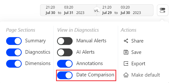
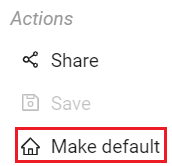
Changing the Default Page
To change the default landing page, in the Toggle icon, select Make Default. The Home icon appears in the page tab of your default page.

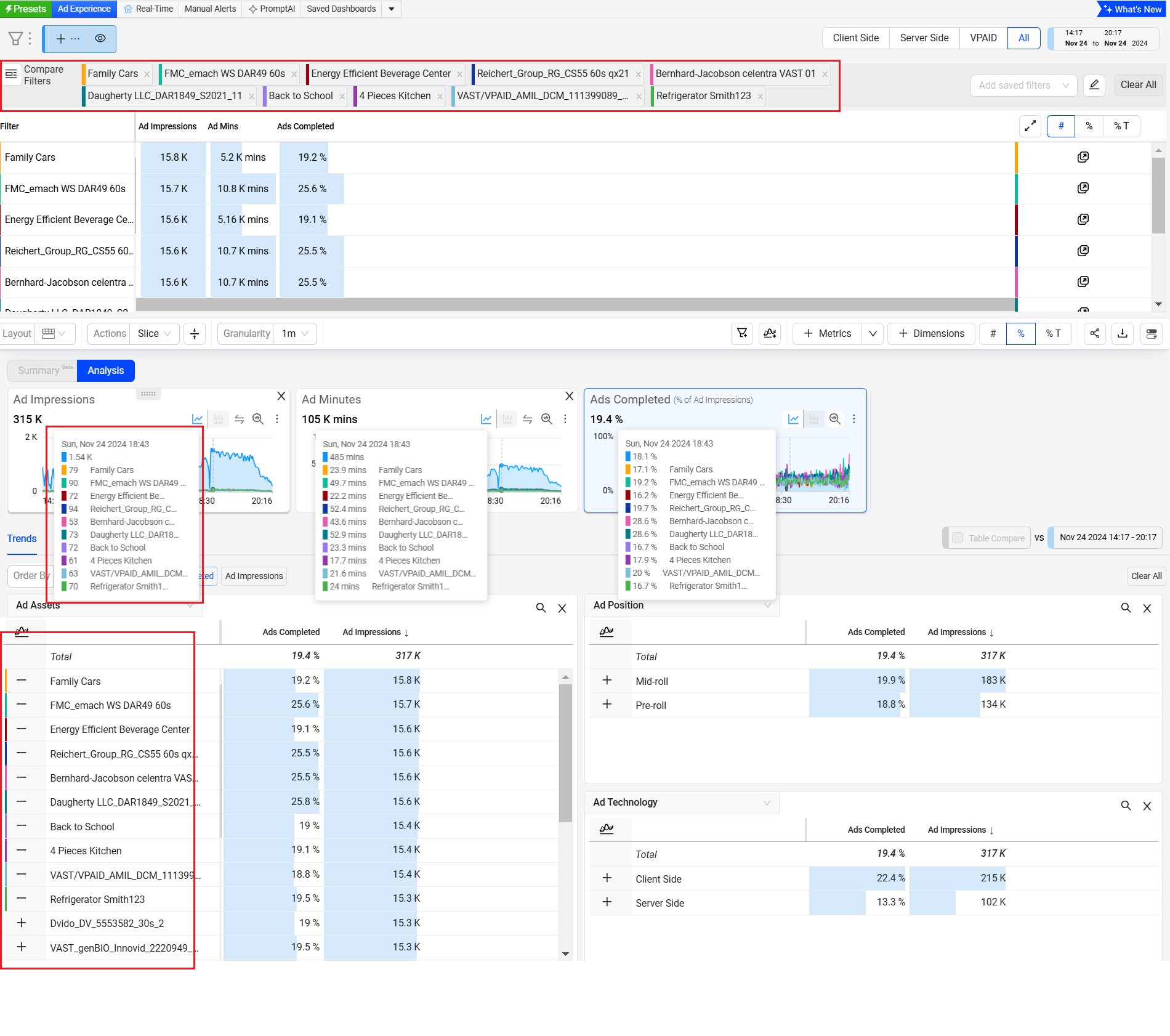
Dimension Table Compare
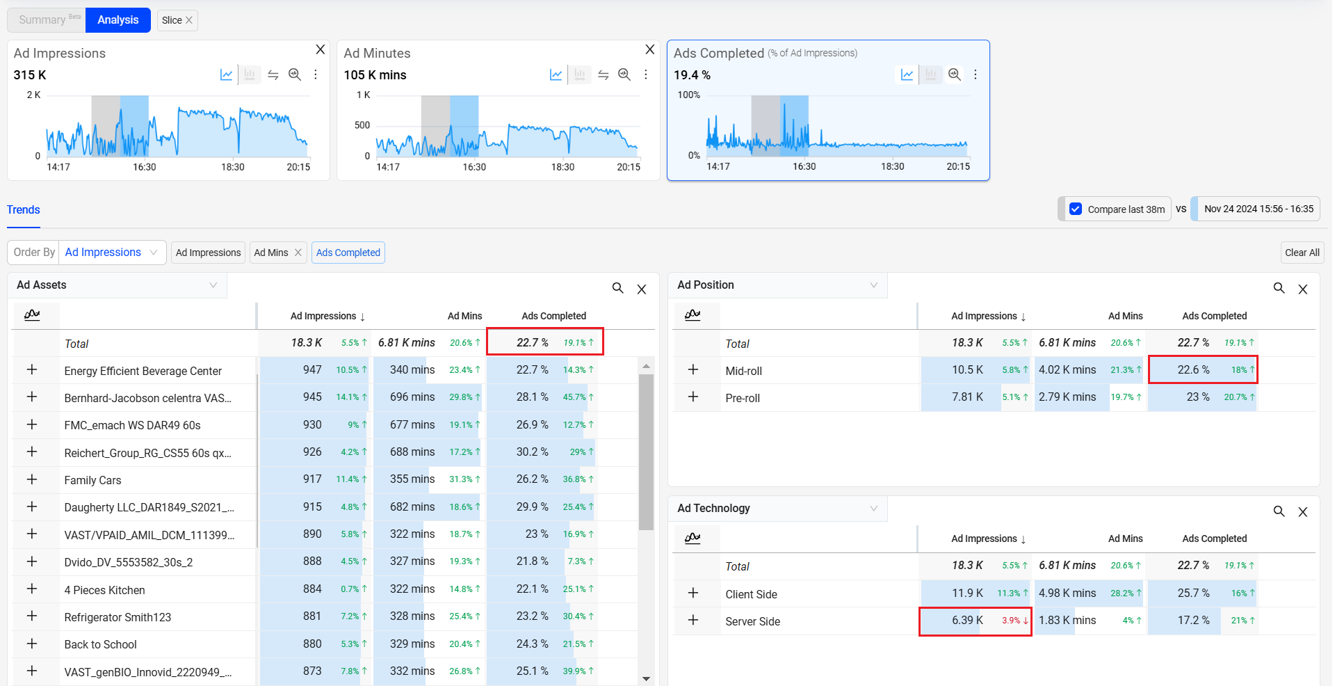
Dimension Table Compare displays comparative percentage values in the dimension tables to directly identify which dimension values contributed most to the spike or drop (in percentage) within the table. This feature also displays the shaded comparative area in the metric widget time series to help clarify the scope of the impacts. Hovering over the percentage value displays the absolute value of the shaded area. With this feature, you can efficiently analyze the data and detect any anomalies to provide a better user experience.
Ads provides an option to save, share, and export the table-compare data.
This feature offers two distinct modes, Date-on-Date (DoD) Compare Mode and Slice Mode, each designed to cater to different user needs and scenarios.
Note: Turning the Date Comparison feature toggles off any secondary feature settings. The Dimension Table Compare feature is not supported for Live mode.
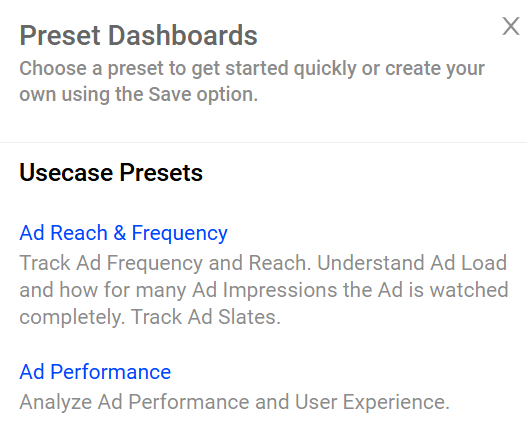
Presets
Ads offer templates or presets for common use cases to determine the best metrics and metadata required to address specific use cases. This empowers new and current customers to operationalize and serve as quick starting points. Users can customize these Templates and save them as public or private dashboards.
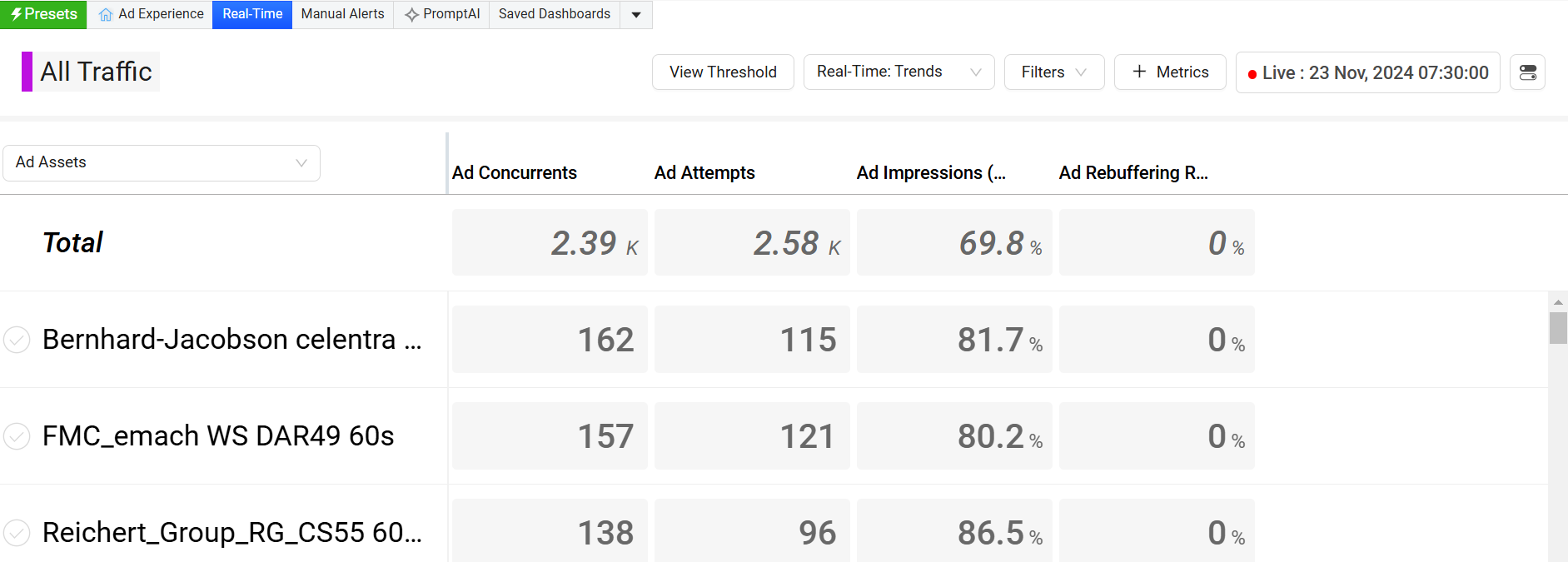
Real Time (NOC)
Real-time dashboard provides a visual presentation of QoE metrics for actionable streaming intelligence in real time. Enhanced by selected filters and dimensions, it provides an option to monitor the performance of your most critical streaming KPIs with visual threshold-crossing indicators to quickly identify and correlate changes in QoE metrics.
For monitoring video streaming performance based on selected filters across dimensions, and support monitoring video streams based on selected filters, see Real Time Dashboard.
Manual Alerts
Manual alerts define alert conditions and trigger email notifications when the specified criteria are met.
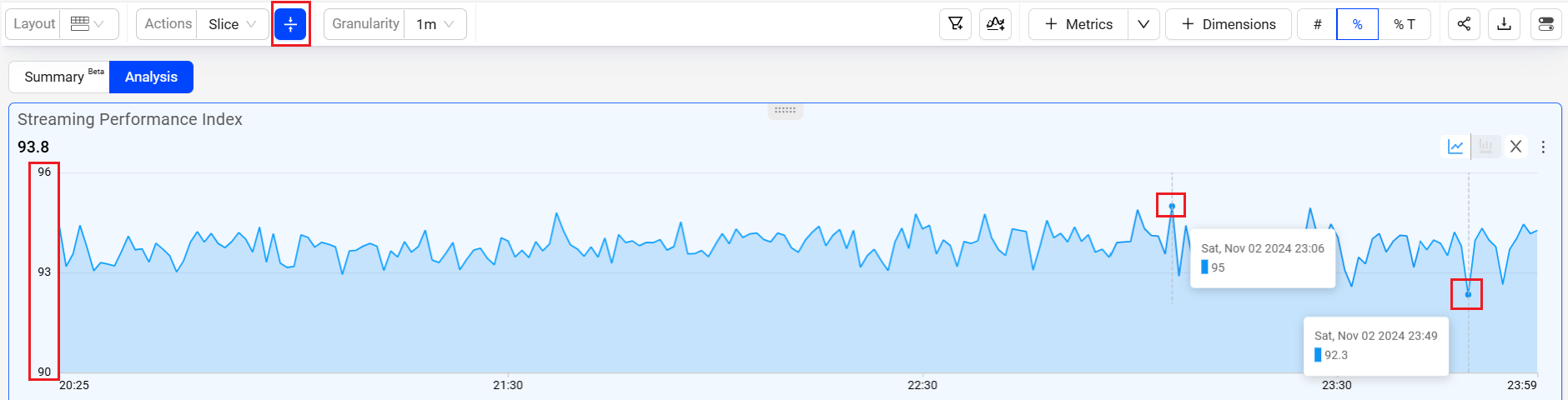
Dynamic Y-Axis
Dynamic Y-Axis narrows the granularity of the y-axis range to focus more precisely on the displayed data points. Pulse calculates the maximum and minimum values, adds appropriate buffers, and determines whether to include the zero position in the y-axis. Excluding the zero position often improves the clarity and interpretation of scatter charts. For example, the y-axis range changes from 0 – 100 to 50 – 100 when data points fall only between 60 and 100.
Image: Dynamic Y-axis displays more focused axis points
Layouts
You can select from multiple layout options to enhance your experience and customize the interface to fit your needs. These new layouts allow you to tailor the dashboard’s appearance, giving you greater flexibility to interact with data in a way that aligns with your workflow and preferences.
![]()
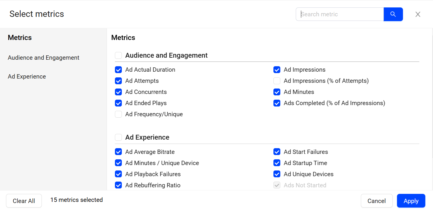
Custom Metric Display
Customize the metrics on Trends, use the metric button above the horizontal metric widget to select the summary metrics. Use the metric button in the right dimension table to select the dimension metrics.
Easy Access to Compare
Use the Compare feature to build comparative analysis across multiple metric and dimensions.
Clicking Compare displays the Compare bar at the top of the screen with All Traffic as the default compare group. Click the + sign to add additional compare groups.
Custom Dimension Selection
Click Dimension drop-downs to quickly toggle dimensional analysis across dimensions, such as asset, browser, channel, city, device OS, and ISP.
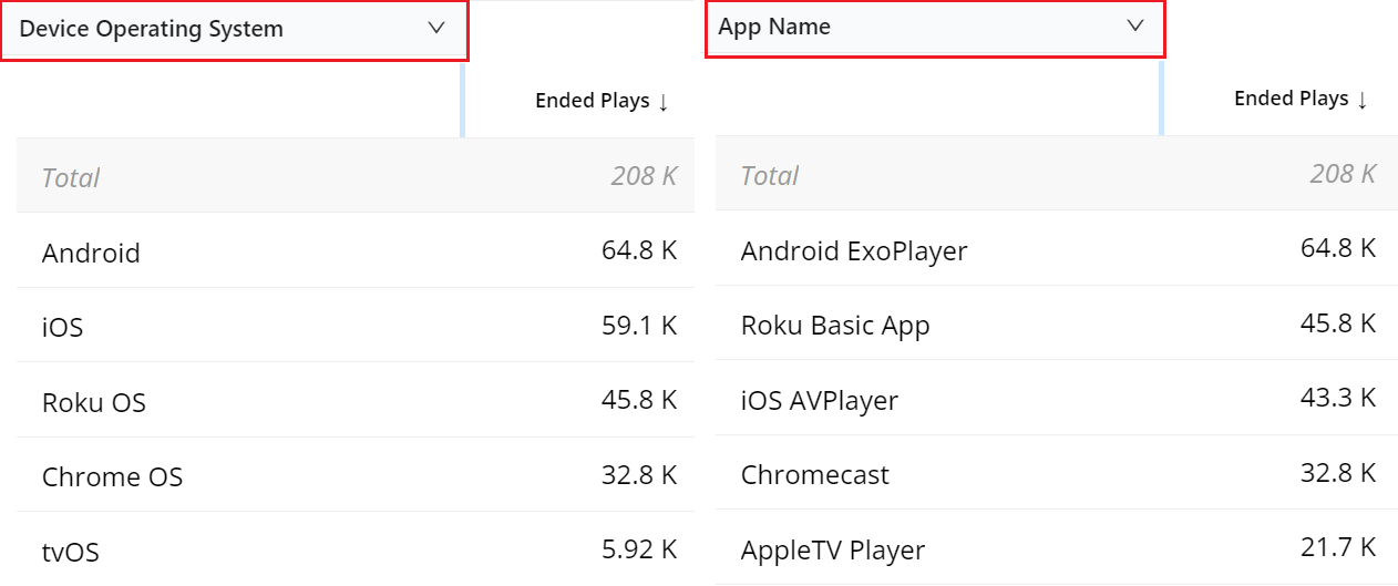
Compare In Trends
Trends offer instant comparison in addition to the Compare dashboard. Quickly compare filters for the top five dimension entities or across custom dimension filters.
Inline Filters
Using the filter builder in Trends enables focused data analysis along with inline filter creation and updates.
Inline filter rule addition, modify operators, and directly apply the filter rule.
Save inline settings to create new filters.
Open filter builder for a full view of filter creation and management.
Open Filter Management to browse saved filters, and directly apply to Trends.
Ads Page Settings
The Ads page provides UI options to navigate advanced features and customize displayed data.
Custom metric displays
Summary metric selection
Easy access to Compare
Custom dimension selection
Toggle comparison metrics
The Ads page supports user-level persistence for filters, metrics, dimensions, and top trends/orders by settings, enabling seamless navigation while retaining current preferences.
Custom Metric Display Metrics drop-down list to select only the metrics most important to you. Limit is 10 metrics. |
Summary Metric Selection Select a summary metric to move that metric to the top of the Metrics list for quick timeseries analysis, and set the Top Trends and Order By metric for dimension-based drill downs. |
Easy Access to Compare Use the Compare feature to build comparative analysis across multiple metric and dimensions. Clicking Compare displays the Compare bar at the bottom of the screen with All Traffic as the default compare group. Click the + sign to add additional compare groups. |
Custom Dimension Selection Click Dimension drop-downs to quickly toggle dimensional analysis across dimensions, such as asset, browser, channel, city, device OS, and ISP. |
Toggle Comparison Metrics From the kebab icon, select Enable/Disable Date Comparison to toggle the display of comparison metrics based on the selected compare time period. |
Navigation Icons
Ads navigation icons appear in the upper right corner and provide easy access to additional features.
 | Account selector for customers with access to multiple c.3 accounts. Also, a toggle icon to show/hide the current account. |
 | Feedback icon to provide your inputs about the current features, navigation, and recommendations. |
 | Alert icon for quick access to recent AI and manual alerts. |
 | Help icon for easy access to page-level, quick guides, and other related topics. |
 | Settings icon for access to your profile settings along with Account and Feature settings. |
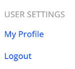
Profile and Account Settings
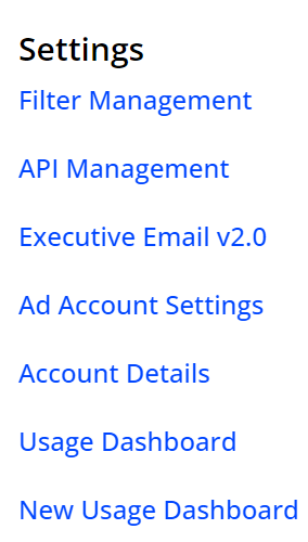
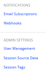
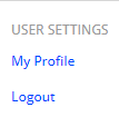
The Settings icon provides access to your feature settings, Notifications, Admin and User settings.
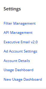
Use for personal information settings and other settings, such as account assignment and devices.
Use the settings to display the enabled features along with the Usage dashboard.
Admins use for user management, executive email settings, and alert notification channels.
| My Profile Settings | Access to your profile information as well as notification subscriptions and access records. |
| Account Overview | Access to your account details, such as feature and filter use, and usage data. |
| Feature Settings | Access to feature controls such as user management, API set up, session tags, executive and alert emails, and business logic metric configuration. |