The Trends dashboard provides an easy-to-use interface with an advanced feature set that enables application performance monitoring and user behavior analysis within your applications. The Trends dashboard enables:
-
Metric widget time series and distributions for customizable displays of app performance metrics
-
Filtering and slicing data in time series and distributions for focused analysis, for example only app sessions related to a spike in app crashes.
-
Deep drill-down cross-dimensional analysis for easy analysis across dimensions, such as device model, application version, and error messages.
-
Impacted user analysis with access to detailed user event timelines.
-
Network request analysis with access to detailed service performance and root cause analysis.
-
Use a wide time range for performance monitoring and user behavior analysis, from the last year to the last 2 hours or real-time. For data analysis within the last 24 hours, narrow the time range to minutes.
-
Share, save, and export the Trends dashboard for reusing and collaboration with other users.
Trends Dashboard Setting
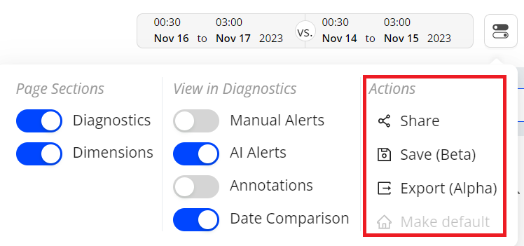
The toggle button at the top right corner enables you to select pages to be displayed on the dashboard, enable or disable view functions in diagnostics, and perform actions for the dashboards, such as sharing the dashboard. You can minimize these sections on the page using the quick toggle on the top right.
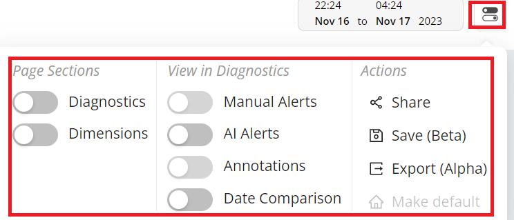
 Page Sections
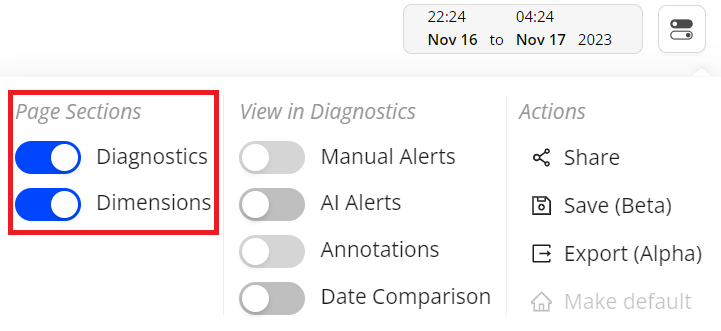
The Trends features a two-layout structure consisting of a diagnostics, and dimensions.
-
Diagnostics: displays detailed metric time series widgets. These diagnostics widgets mainly provide these functions:
- Dimensions: select it to show dimensional data including the trends data and user data. The data helps you analyze the app performance and user behaviors. For more details, see Dimensional Data (Trends and Users).
 View in Diagnostics
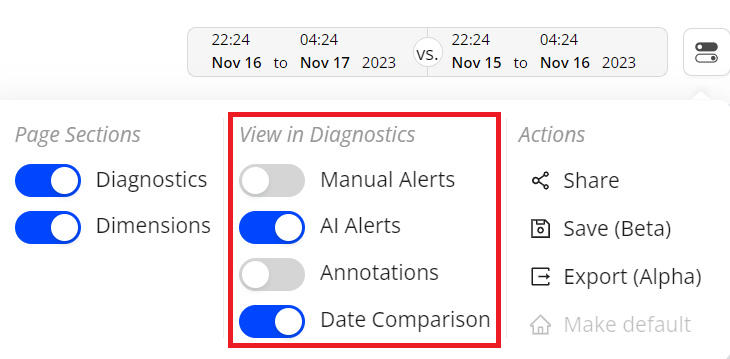
The Trends enables AI alerts and date comparison to present detailed information in metric widgets.
-
AI Alerts
-
Date Comparison
AI Alerts
This option displays AI alert markers in the time series to indicate error conditions and link to alert diagnostics.
Annotation
Annotations allow you to mark the anomalies in the timeseries during the data analysis within the selected time interval in Trends dashboard and Compare. Also, it enables you to add comments making it a collaboration tool.
You can add and save the annotations in the following two levels:
Metric: Annotation is visible for selected metric across all dashboards.
Dashboard: Annotation is visible for all metrics across all dashboards.
Date Comparison
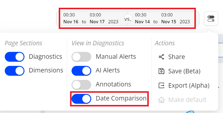
Date comparison shows comparative performance data for quick analysis across periods. Ensure that your current filter settings, such as All Traffic, match the data set you intend to use for time series comparisons, as they dictate the metric and dimension values.
 Actions
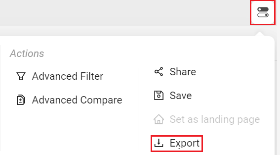
Trends from the Toggle menu allows you to share, save and export the dashboard. Also you can set Trends as the default page.
Sharing Trends Dashboard
Click the Share icon in the action toolbar to share snapshots of dashboards with other Conviva DPIusers. Clicking the Share icon saves a 30-day snapshot of the item and generates a link for collaboration, shared by copying and pasting the link.

Note: Special characters and emojis are not supported in the shared links.
Saving Trends Dashboards
You can save the Trends dashboard for reuse and collaboration with other users.
There are two options to save the dashboards:
-
My Dashboards (Private Dashboard): visible only to the owner
-
Public Dashboards: visible to all users
The new publicly-saved dashboard appears in the Public Dashboards list. From this list, you can also share the dashboard with other users, with view-only permissions. Only the owner can edit the data after the dashboard has been saved.
To save the Trends dashboard,
-
Click the Kebab icon on Trends page and select Save.
-
On the Save Dashboard screen, give a name to the dashboard. To save this as public dashboard, select the Make it Public checkbox and click Save.
The saved dashboard appears in the Public Dashboards list.
Export
You can also export the data in .csv format using the Export option in the action menu or the action bar.
Clone
Cloning a saved dashboard creates a copy of the dashboard, enabling customization based on the original dashboard settings, such as expanding the date range. This feature simplifies collaboration and updates while preserving the original saved dashboard.

For more information on cloning public saved dashboards, see Public Saved Dashboard; for cloning private saved dashboards, see My Dashboard.
 Layouts in Trends
The Trends dashboard offers multiple layout options for metric widget and dimension table positions, allowing customized data display to align data with your analytic preferences.
These layout options include:
-
Metric widgets on top, dimension tables below (default layout)
-
Metric widgets on left, dimension tables right
-
Various metric widget and dimension table sizes, to expand and contract the displayed metric time series and dimension table values
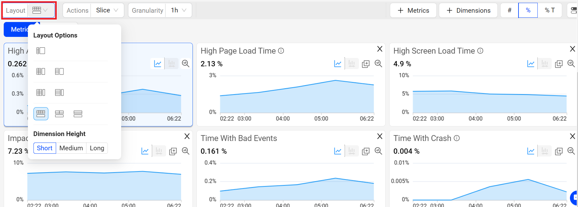
For more information, see Layouts in Trends.
Metric and Dimension Metric Selection
Click Metrics or Dimension Metrics to open the metric selector. The selector displays all metrics categorized under User Login, Subscription, DPI and Engagement, and User Defined Metrics.
To analyze specific metrics, select required metrics and click Apply.
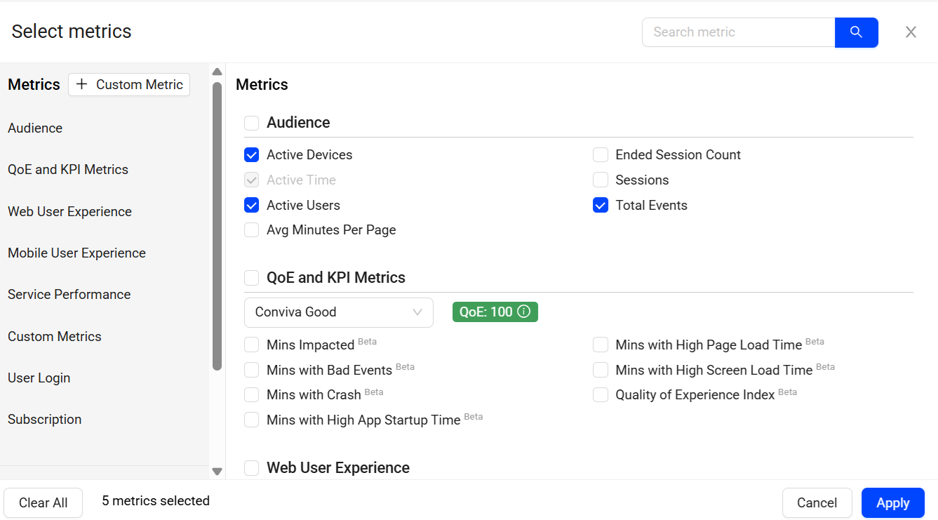
For the metrics of User Login and Subscription, you can either add new events or edit the mapped events metrics to update and activate the metrics. For more information, see Activating Metrics.
For the user defined metrics, you can create the metrics directly in the DPI dashboard. For more information, see Creating User Defined Metrics.
Diagnostic Metric Widget
The Diagnostic Metric Widget provides multiple options:
-
Re-position and resize widgets for efficient cross-metric analysis.
-
Adjust widget sizes and remove metrics without relying on the metric panel.
-
Switch to Focus mode to enhance the metric view of a selected metric.
-
Use Trends distribution mode to discover how streaming sessions affect the overall metric value. This helps in discerning whether the metric value reflects consistent session behavior or if session outliers cause variance.
-
Include both Manual and AI alert specifics in the metric display, offering a comprehensive perspective on both types of alerts.
-
Annotate anomalies in time series to highlight data analysis points in time series.
-
Use the Slice option in Trends dashboard to select a portion of the time line, which then replicates the same time line portioning across other displayed metric widgets.
-
Zoom in on the time slice of data in one metric widget, which then selects the same time slice in the other widgets.
Note: For easy access you can zoom and select in one step using Zoom to Select.
Trends provides you the option to select the metrics from the metric pop-up page. Alternatively, you can utilize the search bar to locate the desired metric and select the metrics based on a search query.
Advanced Metric Filtering
Trends streamlines focused data analysis by employing filters. These filters, categorized as Main and Secondary, offer versatile ways to filter through the data.
Main Filters:
-
Instant Single-click Filtering: Easily apply a filter by clicking on a dimension data entry.
-
Filter Builder: Build the filters using the Trends Filter Builder feature, available in basic and advanced modes.
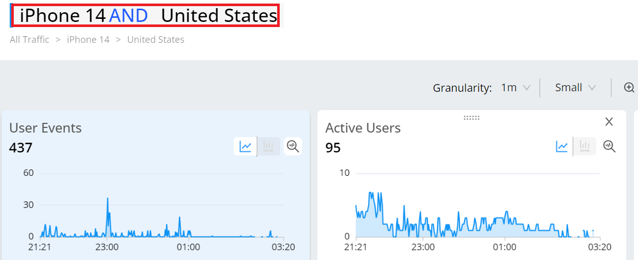
Advanced Data Selection
Drag and drop metric widgets to improve visual comparison. Within a metric widget, drag to select a portion of a time series or distribution to focus the analysis on only the related app sessions. This zooms the displayed data across all the widgets, dimension areas, sessions, and users to only the focused session data.
Within a distribution, drag to select distribution bars to add an advanced secondary filter based on the selected app sessions. Secondary filtering enables analysis based on specific metric performance, such as only app sessions with average minutes per page greater than 30 seconds.
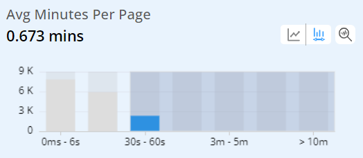
The distribution selection also displays the related metric in the dimension tables for easy impact analysis. In this case, Avg Minutes Per Page is highlighted and enables a quick determination of top page URL use.

After you slice and dice the data , clicking a dimension value focuses the data on that dimension value. In this example, clicking the most used page URL limits the displayed data for analysis of that dimension value cross other dimensions, dimensional drill-downs.
Focus
Click the Focus icon in a metric time series to display an expanded view of the time series above the trend data.
![]()
The focused view of the metric provides the enhanced view of the selected metric along with the secondary metric details. Clicking the distribution icon to see the distributed view of the time series.
With distributions, you can easily uncover a deeper understanding of the significance of each metric per session. The distributions illustrate the impact of streaming sessions on the overall metric value, helping you determine whether the metric reflects consistent session behavior or if outliers cause session variance.

Dynamic Y-Axis
Dynamic Y-axis narrows the granularity of the y-axis range to focus more precisely on the displayed data points. Pulse calculates the maximum and minimum values, adds appropriate buffers, and determines whether to include the zero position in the y-axis. Excluding the zero position can be especially helpful in interpretting scatter charts.
Note: Y-axis adjustments are not available when the data range is too large or contains zero values.
For example, the y-axis range changes from 0 – 100 to 50 – 100 when data points fall only between 60 and 100.
To add Dynamic Y-Axis to time series,
-
Select the desired metrics and click Dynamic Y-Axis icon.
Image: Dynamic Y-axis icon

Dynamic Y-axis displays more focused axis points
Image: Dynamic Y-axis displays more focused axis points

In this example, the y-axis points start at 0.2 and end at 0.4, based on the minimum data value in the time series of 0.223, and the maximum value of 0.315 with added buffer. This adjusted display offers more precise insights into the timeline data points, enhancing the data analysis.
Dimensional Data Table
The trends dimension data table displays the readings as per the applied primary and secondary filters. This helps you to analyze the data and check the anomalies if any.
Note: The NA metric value appears when a metric value cannot be calculated by the application, for example, screen load time for a web page dimension or impacted time for a trace id dimension. The Unknown dimension value appears when the dimension value cannot be determined, such as an unnamed browser.

Search the required dimension data using the search box.
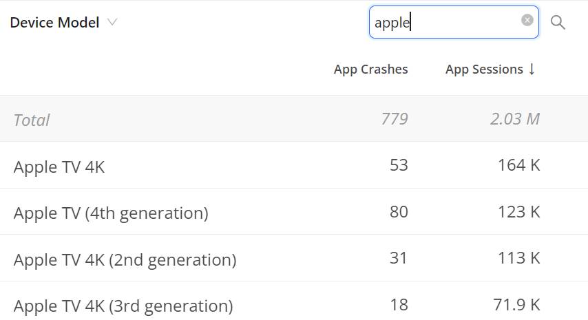
Note: The State and Cities Geo dimensions include more than one entry for the same geolocation. An DPI label differentiates the entry valid for DPI, while the other entry applies to Video.

Dimension Data in Numbers
The # toggle option displays the metric value in number format for each dimension value.
Dimension Data in Numbers

Dimension Data in Percentage
The % toggle option displays the metric value in percentage format for each dimension value.
Dimension Data in Percentage

For example, displaying the Web Errors metric as a percentage clarifies which dimension value had the highest percentage of web errors. In this case, it is the United States with 2.2%. The percentage of Web Errors is calculated based on the total web app session count for that dimension value.
Check the table for more details on metrics that can be displayed in percentage format in the dimension table.
Note: Metric data is limited to the data displayed for the dimension values.
| Metric | Percentage of: |
|---|---|
| App Crashes | total native application sessions with application errors. |
| App Video Bounce Rate |
total native application sessions that did not include the video attempt event. |
| Page Load Complete | total native application page loads that loaded completely. |
| Exits Before Page View | total native application page exits that occurred before the full page was drawn on the screen. |
| Web Errors | total web sessions with web processing errors. |
| Network Request Failure | total networks requests that failed. |
Dimension Data in Percentage of Total
The %T toggle option displays the metric value for each dimension as a percentage of the total dimension metric value within the selected time period.
Dimension Data in Percentage of Total

For example, from the web error count the value of the Web Errors for the United States is 78, while the total value of the Web Errors is 108. The Percentage of Total for Web Errors in the United States is 72.2%, calculated by dividing 78 by 108.
The values of these types of metrics can be displayed as a percentage of the total in the dimension table.
-
Count Metrics
-
In dimensions where there is no overlap in different values, the percentage will sum up to 100%. Example: App Crashes and Page Load Complete.
-
In dimensions where the values overlap, such as Active Devices, Users, or Sessions, the percentage total might exceed 100%. In these cases, the unique counts are considered in the total.
-
-
Conversion type (Conversion Counts) custom metrics. For the details of Conversion type and how to create the metric, check Metric Builder.
-
Event aggregation (Number or Total Values) custom metrics. For the details of Event aggregation type and how to create the metric, check Metric Builder.
Entire Stack Trace and Error Messages
The Stack Trace and Error Messages tables allow you to check the entire messages that are valuable to enhance the dimension table data with additional performance details.
-
Click the View errors icon of the dimension table.

-
Click the toggle arrow icon on the left side of an error message in the Error Message pop-up window, and check the detailed messages.

Users
The Users tab provides events and data, such as client ID, user ID, app name, country, and city, related to user activities.
Click a Client ID or User ID to see the user timeline for comprehensive and granular analysis of a session.

For more information on user timeline, see User Timeline.
Network Request
The Network Request tab provides a table showing data related to network requests, such as the network request host and trace ID, to help you analyze network request performance.
The screenshot shows all 200 codes with the highest duration at the top. Even with success response codes, long network request durations may indicate under-performing requests.
Network Request Tab

RCA Mode
In the Trends Network Request tab, RCA mode enables easy detection and quick analysis of network response root causes. The Root Cause Hypothesis table displays the network API calls with the longest durations among the sessions. This mode also displays other analysis data related to the API calls such as network request count and active devices percentages.
The RCA mode is enabled only when using one of the supported metrics as a secondary filter (slicing the metric distribution) including Avg App Startup Time, Avg Network Request Duration, Avg Screen Load Time, and Avg Page Load Time. Hover over Supported Metrics to view the complete list of these metrics.
RCA Mode

Compare
Trends offers instant comparison in addition to the Compare dashboard. Quickly compare filters for the top five dimension entities or across a custom dimension filters.

Time Granularity
The Trends page, including Diagnostics and Compare, supports enhanced granularity levels, such as:
-
1 min, 5 min, 15 min, and 30 mins for 1-hour intervals
-
1 hour, 6 hours, 12 hours, 1 day, and 7 days for 30-day intervals
Note: When you change the time granularity in Trends, the system retains this selection even when you log out and log back in, provided the granularity is valid based on the selected time range.
The new granularity drop-down next to the time picker allows you to select the granularity level for the current display.
Data Dip for Partial Data
Note: The last partial data distribution is deleted if there is a delay in data ingestion, no data availability from the source, or partial data in the last time range bucket based on the selected datetime range and granularity.
For example, the date picker sets the range from July 17 at 20:56 to July 18 at 02:53 with a granularity of 5 minutes. The last time series data bucket spans from 20:56 to 02:46, resulting in only 7 minutes of data, which would likely cause a dip in the time series due to partial data availability. Therefore, the partial data in that data bucket, which would cause an observable drop or dip in the last data bucket in the time series, is no longer shown.
Real-Time (Live Mode) in Trends
Use the updated date picker to select the live mode. The Live mode shows the time series along with the aggregated metric numbers and percentages on the metric widget aligning the aggregate values with the metric values in the dimension table.
The real-time live mode supports 10 second data refresh with less than 30 seconds latency, based on a 10-second tumbling window.

Performing Drill-Down Analysis
DPI provides features for deep drill-down cross-dimensional analysis for easy analysis across dimensions, such as device model, application version, and error messages. For more details, see Performing Drill-Down Analysis.
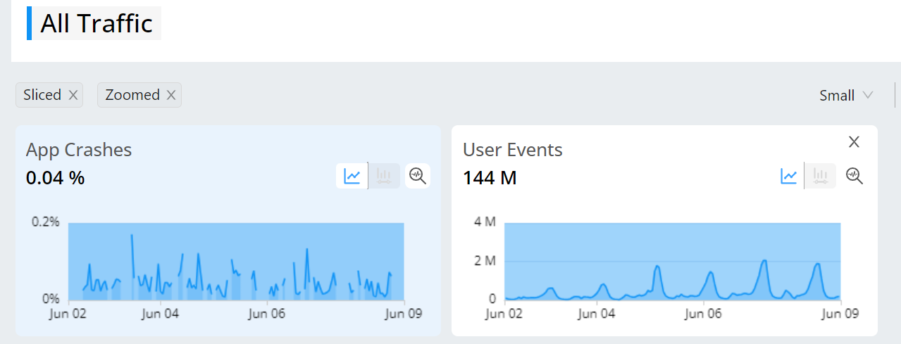

Metric Filter
The metric filter supplements the primary filter by adding an additional layer of data refinement. It enables a deeper analysis by allowing you to explore the distribution of selected data within specific buckets, complementing the primary filtering process.
Note: Only one secondary filter can be applied at a time.
When applying the metric filter to a metric, it presents the secondary metric alongside the Active Devices companion metric, facilitating further comparative analysis within the dimension tables. This table displays all metrics eligible for the metric filter and their respective secondary metrics.
| Metric Name | Secondary Metric |
|---|---|
| Avg Minutes Per Page |
[SF] page loads [SF] page loads % |
| Avg Network Request Duration |
[SF] Network Request Count, [SF] Network Request Count % |
| Avg Page Load Time |
[SF] Page Load Complete, [SF] Page Load Complete % |
| Avg Screen Load Time |
[SF] screen loads, [SF] screen loads % |
| Mobile App Startup Time |
[SF] App startup count, [SF] App startup count % |
| Time To First Attempt |
[SF] App sessions [SF] App sessions % |
Here are some use cases:
-
Examine instances where app sessions exhibit higher-than-normal metrics, such as average page load time, network response duration, screen load time, time per page, app startup time, and time to first attempt.
-
Evaluate the magnitude of the impact to effectively prioritize resolutions.
-
Identify the specific network request URLs responsible for prolonged load times.
-
Investigate the error codes linked to these network requests and assess their impact.
Using Metric Filters
To add an additional layer of analysis on data with an applied primary filter for analyzing distribution data, follow the steps to create a metric filter.
-
Click the Distribution icon on the metric widget.
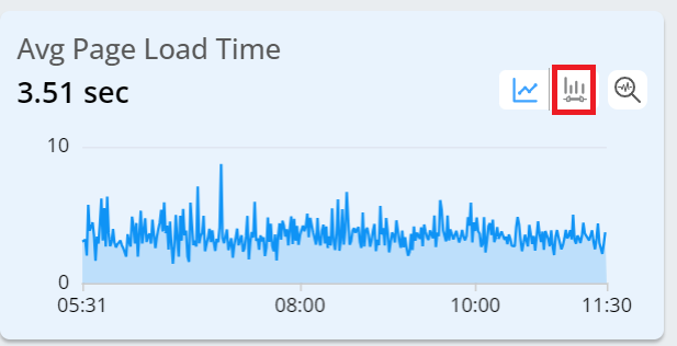
-
Select a distribution bucket.
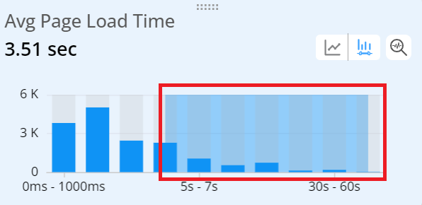
Note: This creates a metric filter and filters the data in all the other metric widgets, displaying the primary filter and the secondary trends in the time series.
-
Check the data.
-
Check the metrics calculated based on the data filtered by the secondary filter.

-
Check the dimension table to analyze the primary metrics along with their secondary/companion metrics.
Note: To enhance the analysis of custom metrics, DPI displays secondary custom metrics in the dimension tables using <metric_name> Init# for conversion metrics and <metric_name> Complete# for duration metrics. <metric_name> Init# shows the number of times the initial event was performed; <metric_name> Complete# shows the number of times both the initial and follow up events were performed, based on the successful and failed pairs from the first initial event to the first follow-up event.

-
Check the data related to network requests from the Network Request tab. Hover over a network request path and click the service performance icon for detail performance and root cause analysis.
Note: When performing a drill down under the Network Request tab with the metric filter, be aware that the applied filter is specific to this tab and is only visible here. The global filter does not reflect the drill down performed under the Network Request tab.

-
Note: The Custom and Flow Duration metrics also support thr Secondary filters.
DPI Trends DPI Trends secondary filter secondary filter metric filter metric filter