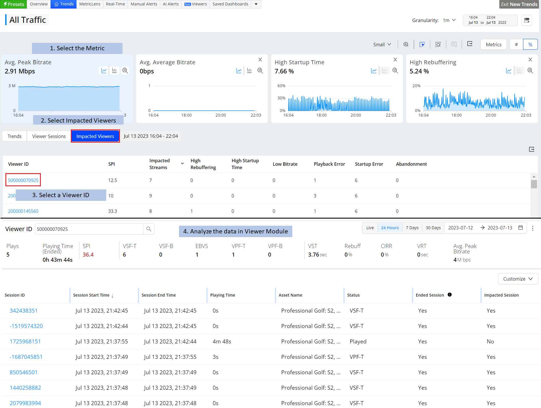
VSI provides a several different workflows to diagnose streaming session performance based on the dimensional drill-downs, session impacts, and impacted viewers.
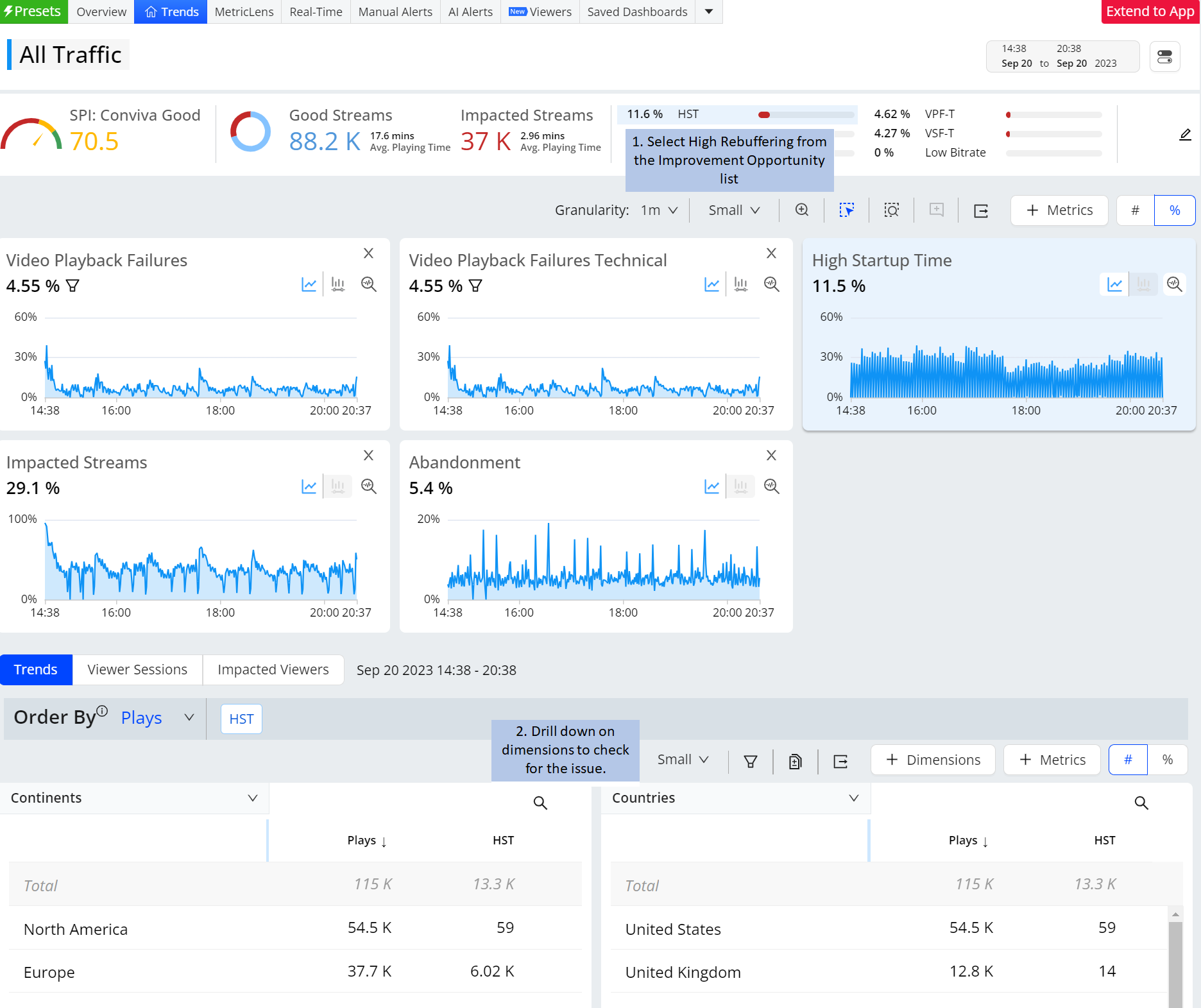
Clicking a metric in the Summary panel or a metric widget, such as High Rebuffering or VST, filters the displayed data to the related impacted sessions and displays secondary and companion metrics in the dimension tables.
| Diagnostics Path | Description |
|---|---|
|
The Improvement Opportunities in the Summary Panel enable you to quickly create single-click filters, instantly refreshing the diagnostic metric widget and dimension data, and setting up dimensions for more detailed anomaly discovery. For more details, see SPI Improvement Opportunities Diagnostics. |
|
|
Manual Alerts Bars in Metric Widgets to Alert Dashboard |
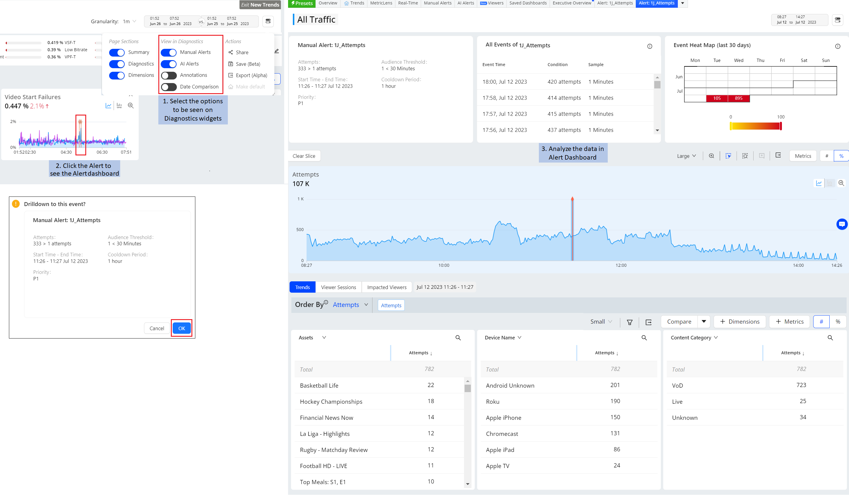
Within the metric widget time series, click a manual alert vertical bar to jump directly to the alert diagnostics to analyze alert frequency and details. For more details, see Manual Alerts. |
|
AI Alerts Bars in Metric Widgets to Alert Dashboard |
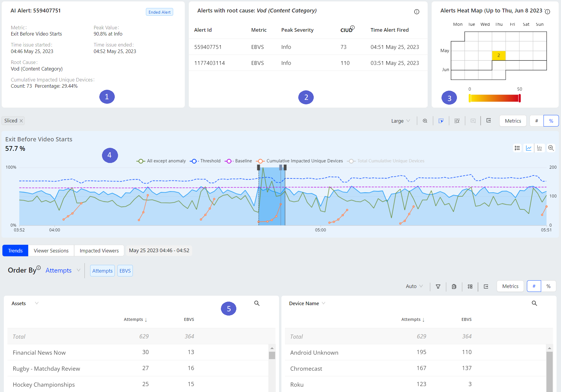
Within the metric widget time series, click an AI alert vertical bar to jump directly to the AI Alert diagnostics to analyze alert frequency and details. For more details, see AI Alerts. |
|
AI Alert Diagnostics (AI Alert Menu) |
With Trends you can view the selected alerts detailed view in the alerts dashboard. This dashboard provides:
|
|
Metric Selection to Viewer Sessions and Timelines |
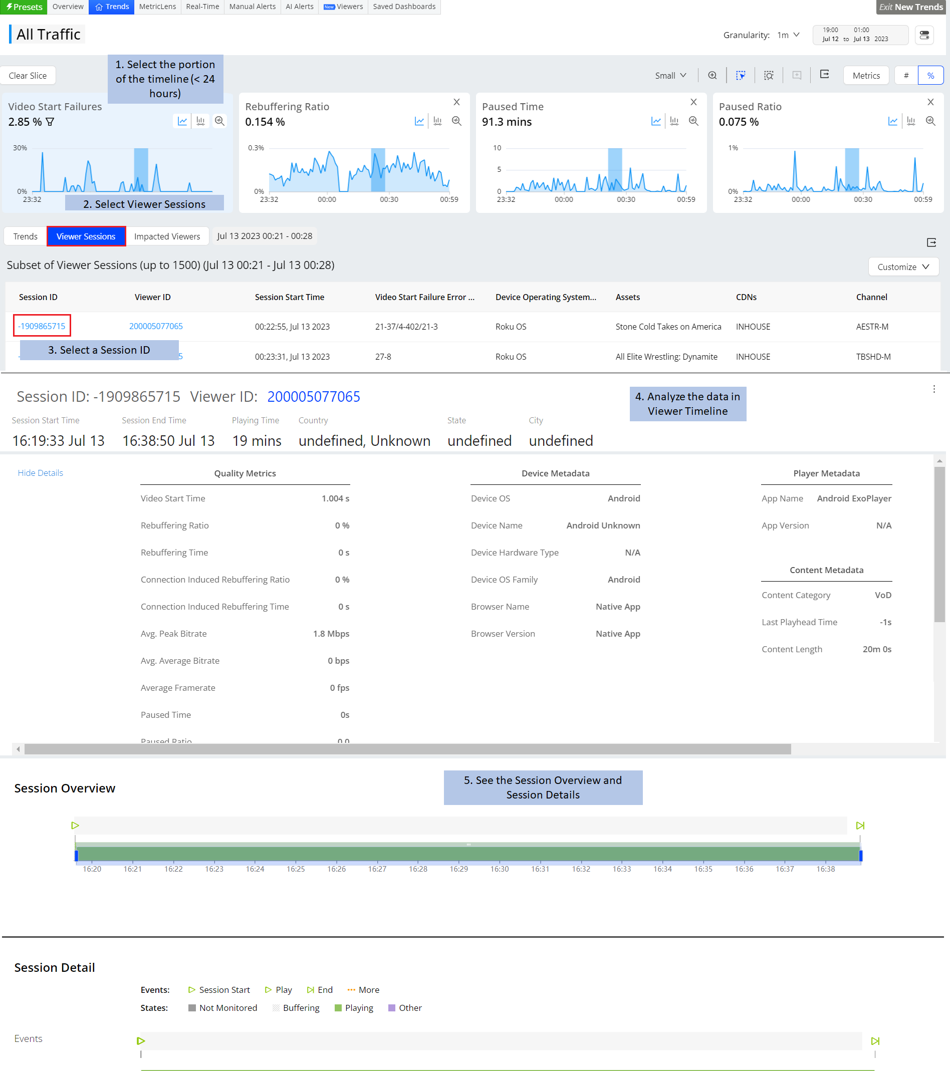
Select an up to 24 hour window in a metric widget and click the Viewer Sessions tab to display the list of sessions impacted by the selected metrics and data. Click a session id to quickly open the session timeline diagnostics for that session. For more details, see Session Timeline diagnostics. |
|
Metric Selection to Impacted Viewers and Timelines |
Click a viewer id to quickly open the viewer module with diagnostic data for that viewer's sessions. Note: You can also access the viewers tab from the Overview dashboard. For more information, see Viewer Experience Diagnostics. |
|
Secondary Filters in Metric Widgets to Dimension Drill-downs |
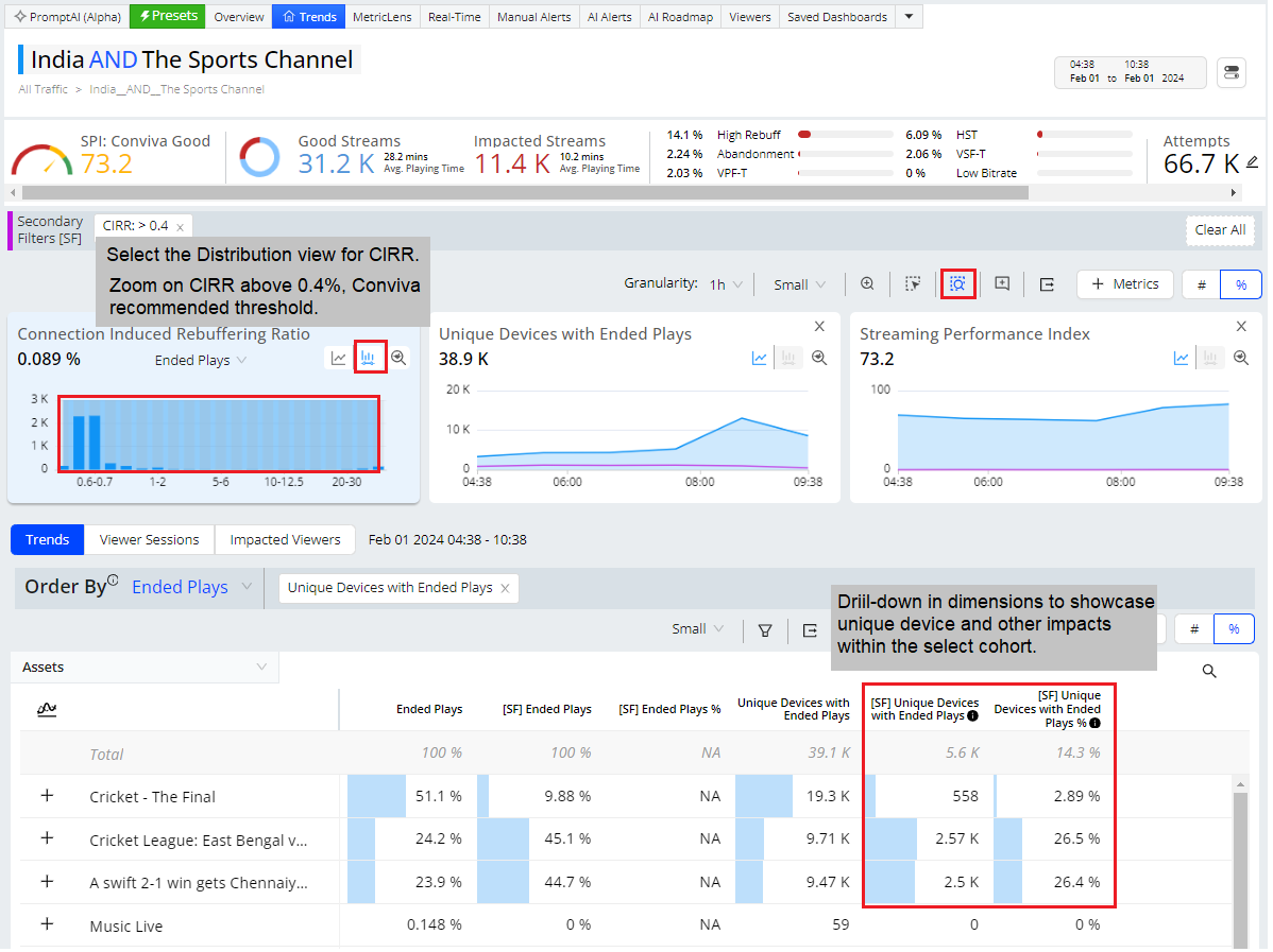
Apply an advanced layer of filtering to discover the sessions and viewers impacted by a combination of metric values. For example, sessions with both high CIRR and high average bitrates. Secondary filters use the data buckets in metric distributions to select detailed ranges of metric values. For more information, see Secondary Filtering Diagnostics. |
|
Apply secondary filters for a specific metric to quickly discover the device and viewer impacts, such as devices and viewers with high rebuffering above 0.4%. Then access details for the selected cohort, such as impacted session timelines and impacted viewer activities. |
