There are several ways to approach the Diagnostics page, and the way you get to the page determines what you initially see. Once you get to the page, however, you have a number of controls that let you customize the display of information to best suit your needs. These are the ways you can get to the Diagnostics page:
- From the Manage Alerts page, where you can click a link to see the most recent event for each alert in your system. The Diagnostics page displays information and metrics about the most recent event (or the most recent five events) for the alert you selected.
- From an Events List page. This page is available from the Manage Alerts page when you expand an alert and click to view all events.
- From an Alert email notification. The Diagnostics page displays information and metrics for the event you received email about.
- From the Pulse navigation bar. The Diagnostics page Time Series and Analysis Window display metric data, but the Alert Information block reflects the fact that no alert is selected. You can quickly choose a metric, filters, and an alert to see event data, or you can simply look at the metrics for the time range you select. You might arrive at the Diagnostics page this way when you are already in Pulse and want to investigate a spike in Video Start Failures, for example.
These are the components that make up the Diagnostics page.
Displaying event data
When you come to the Diagnostics page from an alert event or an email, the page is already focused on the alert that brought you here. However, regardless of how you arrive at the Diagnostics page, there are a number of ways that you can customize the display to your needs. For example, you can add or remove filters, choose another metric to focus on, choose from the alerts that use your new metric, change the date range, change the analysis time scale, and more. If a filter is applied, the timeline only displays the data available after the filter was created.
This illustration shows some of the controls you can use.
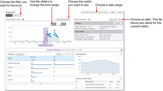
Here are some suggestions for displaying event data in the Diagnostics page.
- First, choose a metric. This determines the alerts that are available and the data that appears in the Analysis Window. If there's only one alert for the metric you select, you see data in the Time Series and can use the gray sliders to adjust the timeline to see more data. If the Time Series contains events, you can click a specific event to see alert information.
- If you have multiple alerts, choose the one you want, adjust the timeline as needed, and select an event.
- If a filter is applied, the timeline only displays the data available after the filter was created.
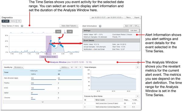
Diagnostics components
The Diagnostics page shows three grouping of information: the Time Series, Alert Information, and the Analysis Window.
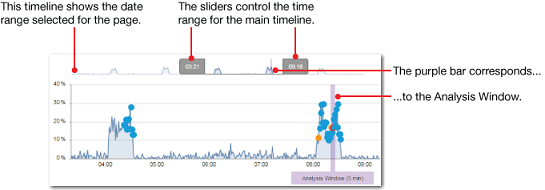
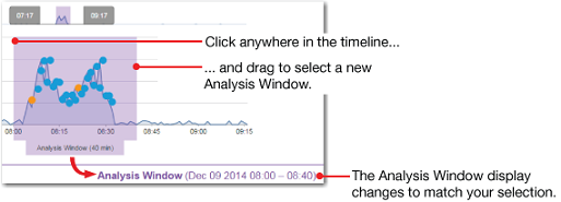
Time Series shows two timelines and an Analysis Window indicator.
- The timeline at the top of the widget shows the entire time range selected for the Diagnostics page. The two gray sliders determine the range displayed in the lower (larger) timeline. You can drag the gray sliders to alter the timeline display. The purple bar is a miniature version of the Analysis Window indicator.
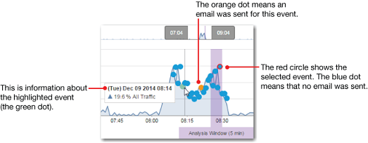
- The main timeline shows all of the activity during the selected time segment, with dots to indicate events. Blue dots are events without notification, the green dot is the one you’re hovering over, and orange dots are events with notifications. The currently selected event has a red circle around the dot. The intervals for this timeline are based on the selected time range (between the two gray sliders). If the time range is less than 6 hours, you see one-minute intervals. If the range is more than 6 hours, you see five-minute intervals.
- The purple Analysis Window marker shows the interval during which a selected event occurred. The Analysis Window defaults to a 5-minute range, but you can drag the analysis marker to change the Analysis Window time range.
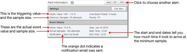
Alert Information shows you the alert settings and event details for the current alert event. If no event is selected, you see just the settings for the current alert. To view information for a specific event, click the event dot in the Time Series widget. Basically, in order to tell when an event occurs, we look at the metric value and the size of the sample. For example, a VSF of 12% and a sample of 100 attempts. If both values are over their respective thresholds, the alert fires. If, however, the metric is high enough but the sample isn't large enough, the systems collect additional sample data, using up to 60 minutes of historical data, until the required sample size and confidence level are reached. At that point, the alert fires with details about the metric, sample size and collected data.
See Alerts for more information.